publication design
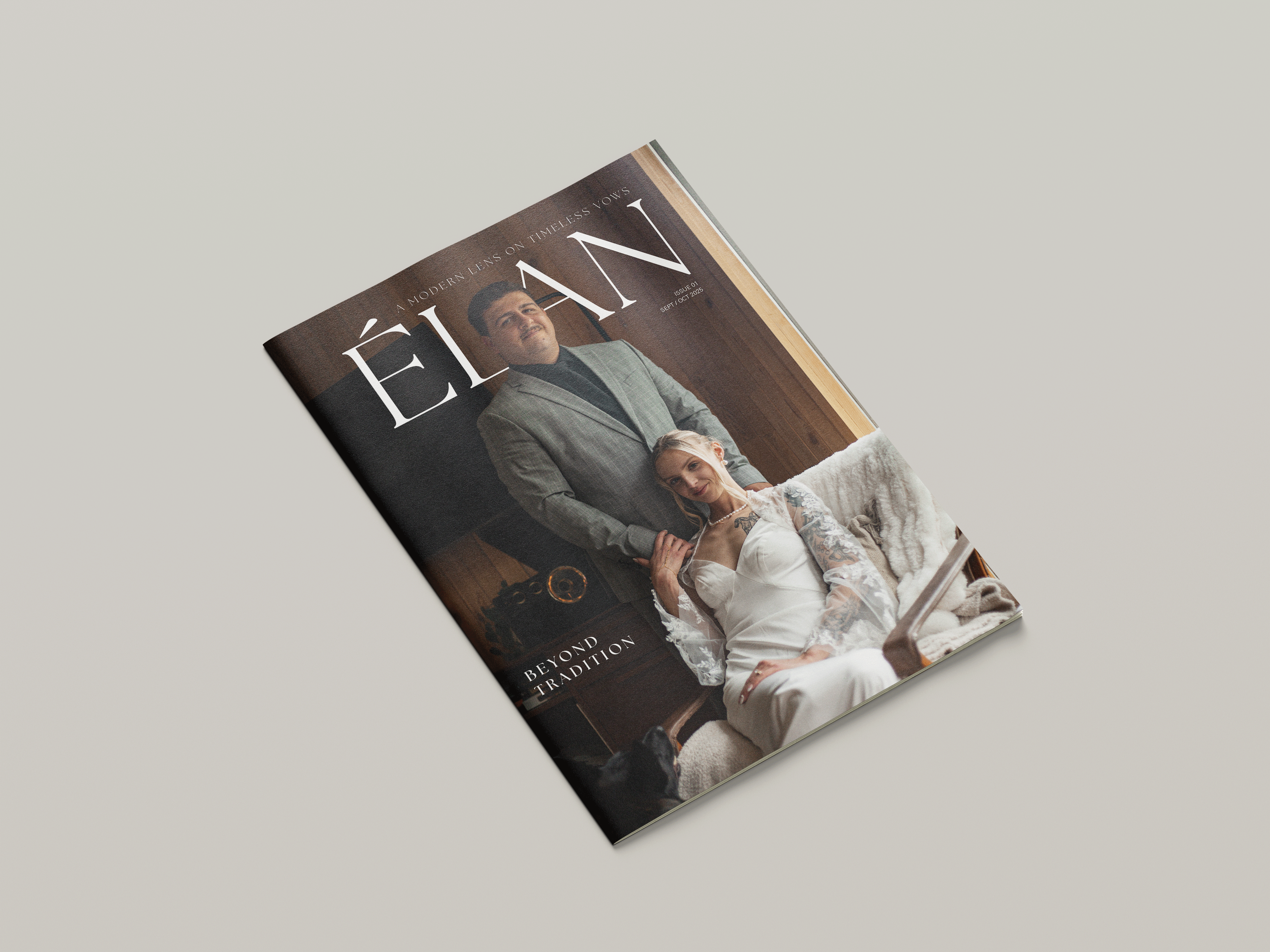
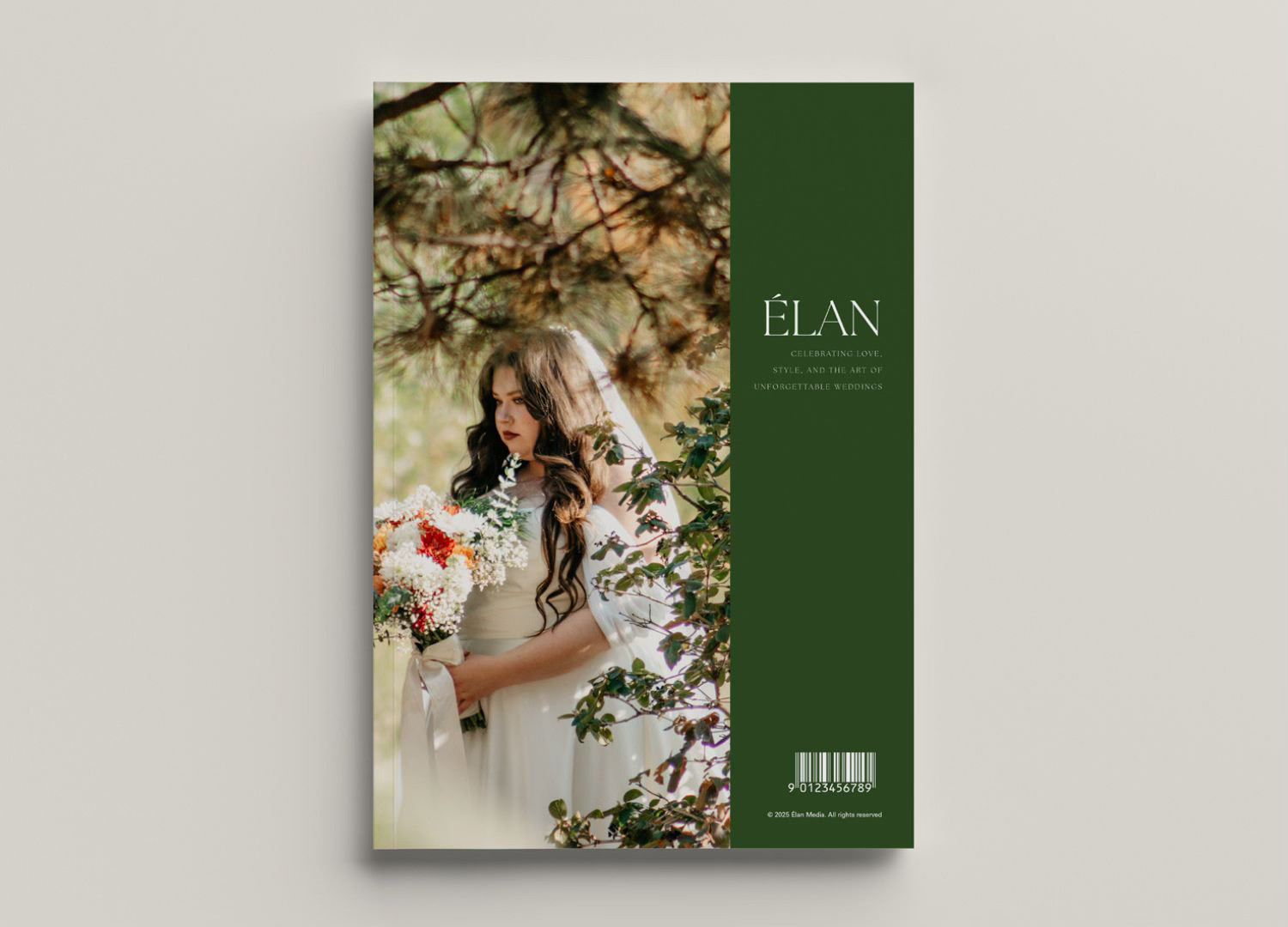
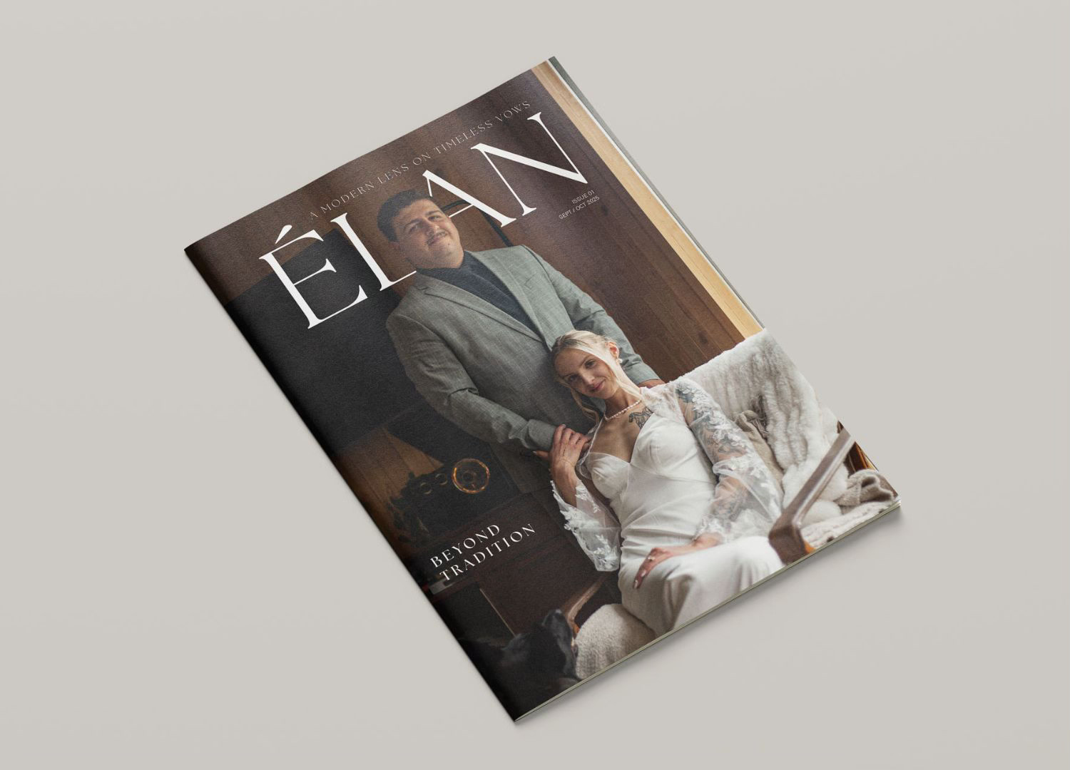
Élan
client
Student Concept Project
date
2025
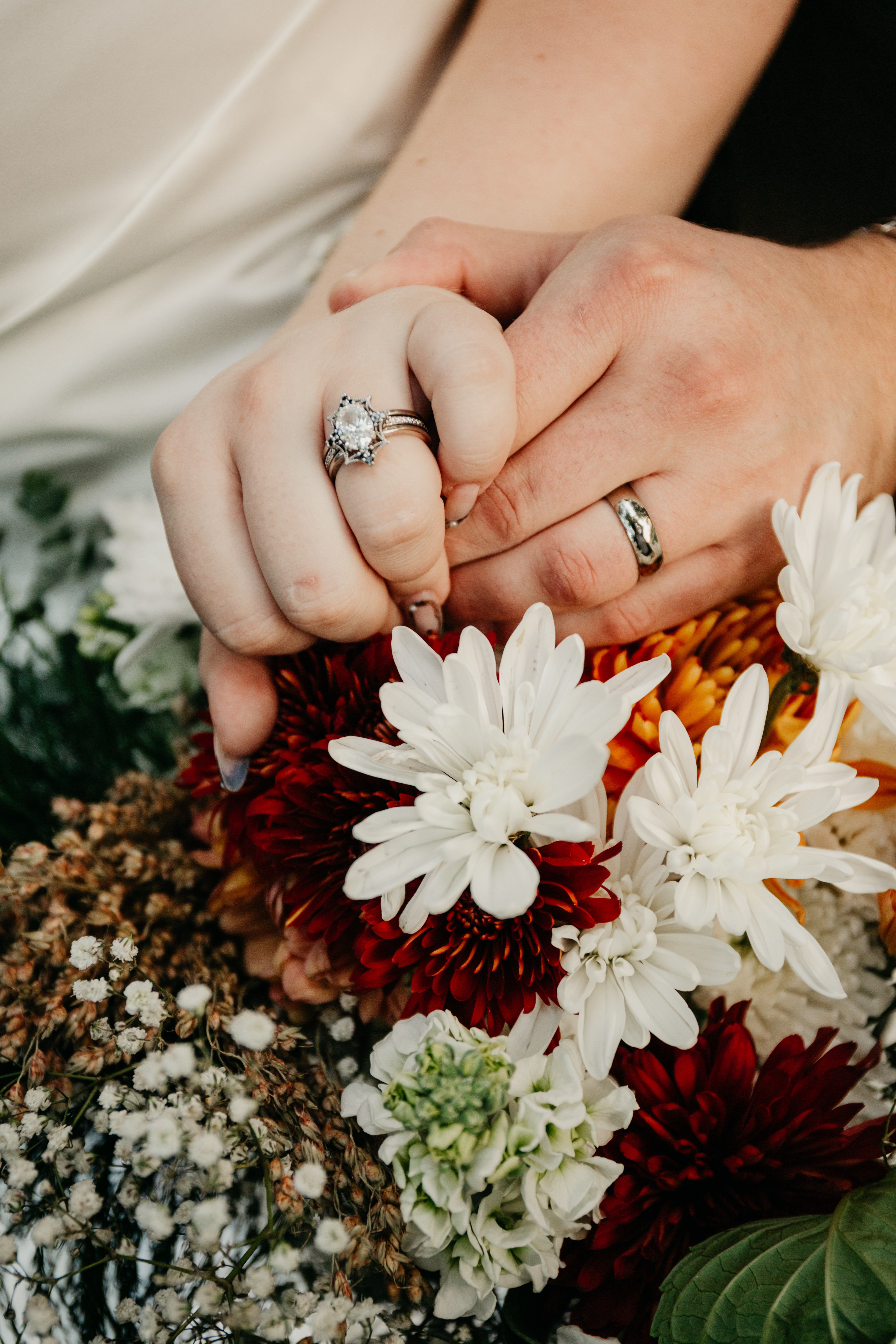
Élan is a wedding inspiration magazine featuring photography by NBG Photography, designed for engaged couples. Clean layouts, refined typography, and spacious compositions create a timeless editorial aesthetic while guiding readers through photography, inspiration, and planning features.

01
Discovery & Strategy
problem
Many existing wedding magazines feel cluttered, overly trend-driven, and visually inconsistent, overwhelming with competing aesthetics.
solution
An elegant wedding planning magazine rooted in timeless sophistication. The publication features a cohesive cover and thoughtfully structured interior spreads that prioritize refined typography, intentional white space, and a restrained color palette to create an elevated reading experience.
key questions
- Who is reading this magazine?
- How are they reading it?
- What features will reach the intended audience?
- What are your readers looking for (information, images, purchasing info, etc.)? How can you draw attention to these things?
02
Research
photography
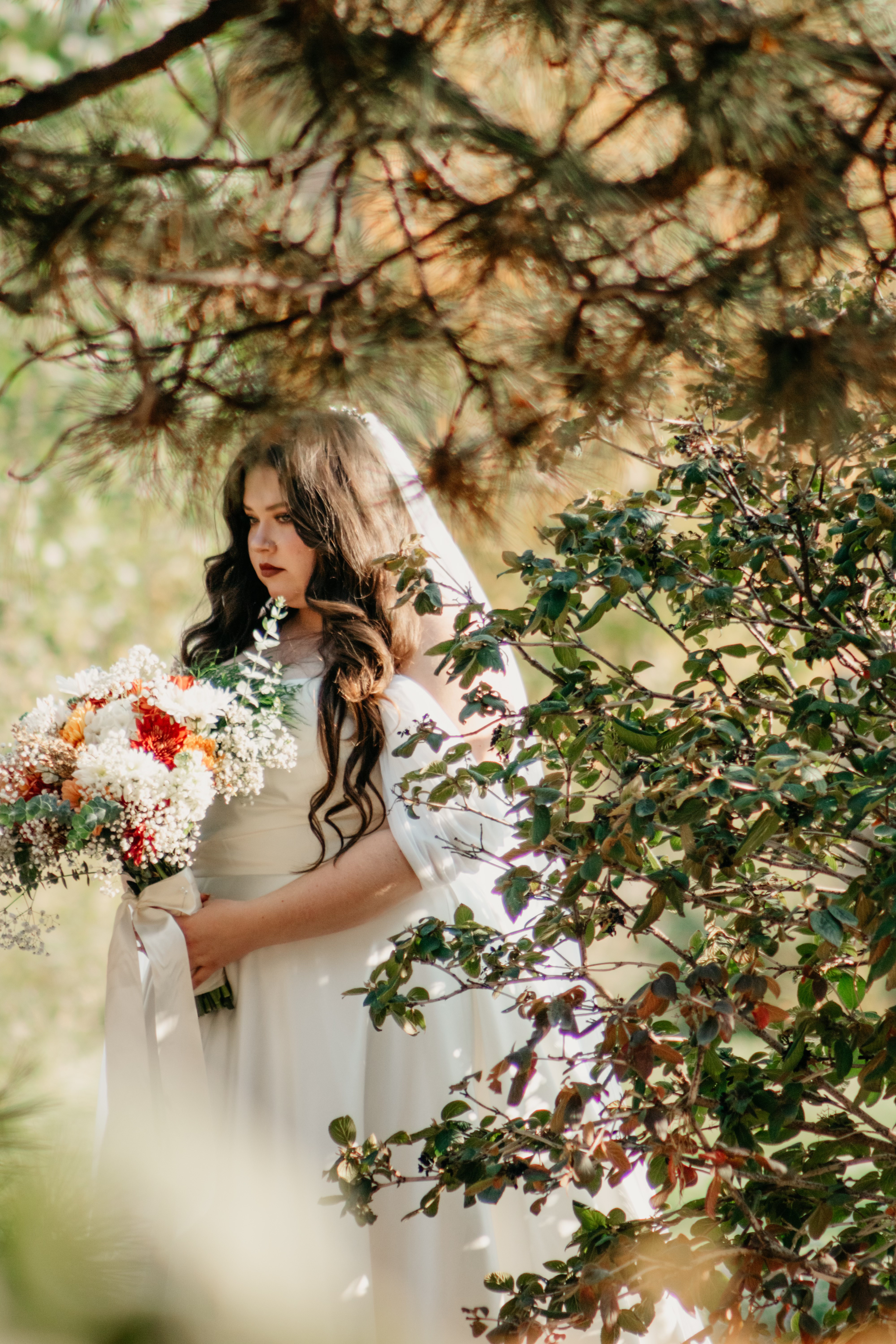
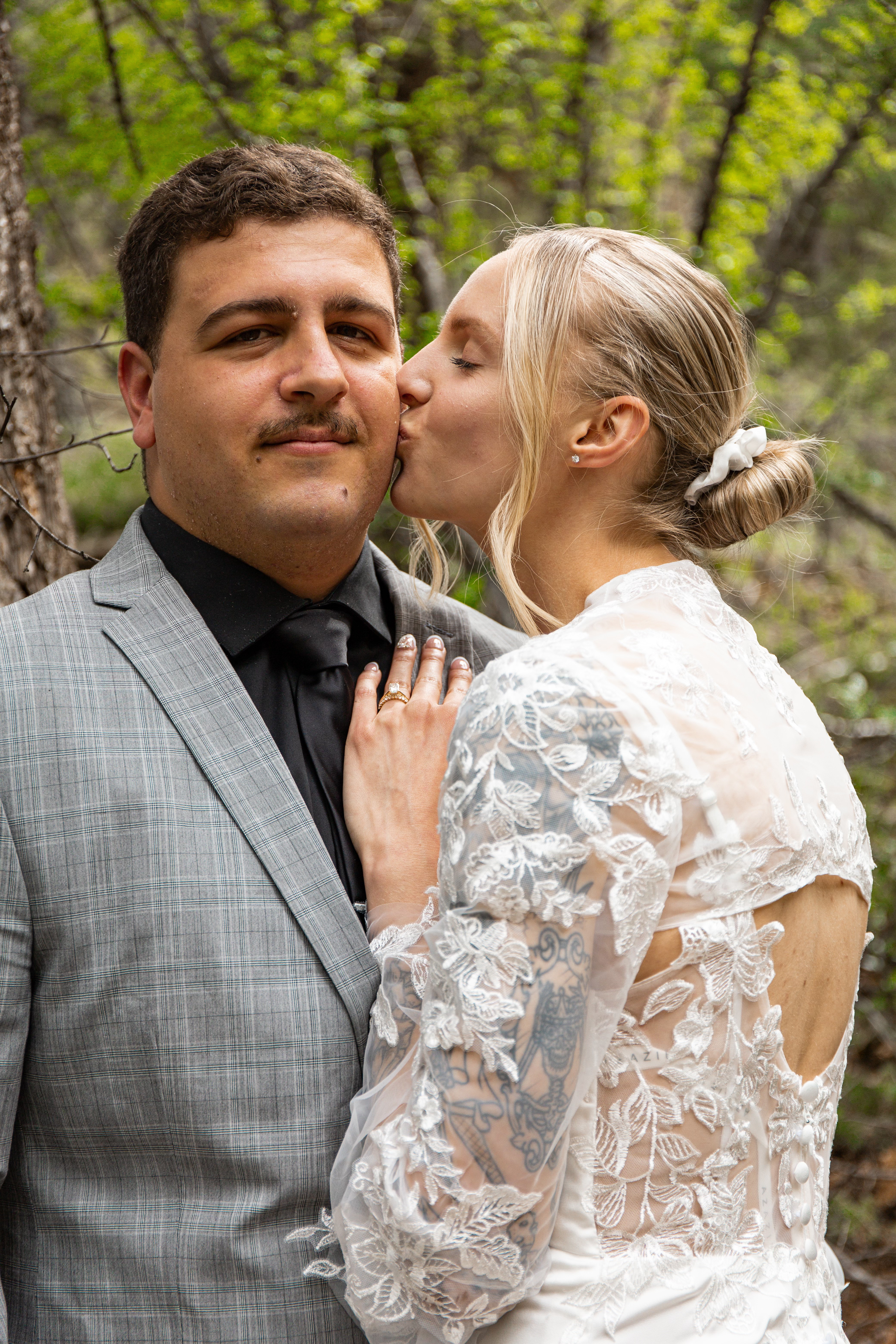
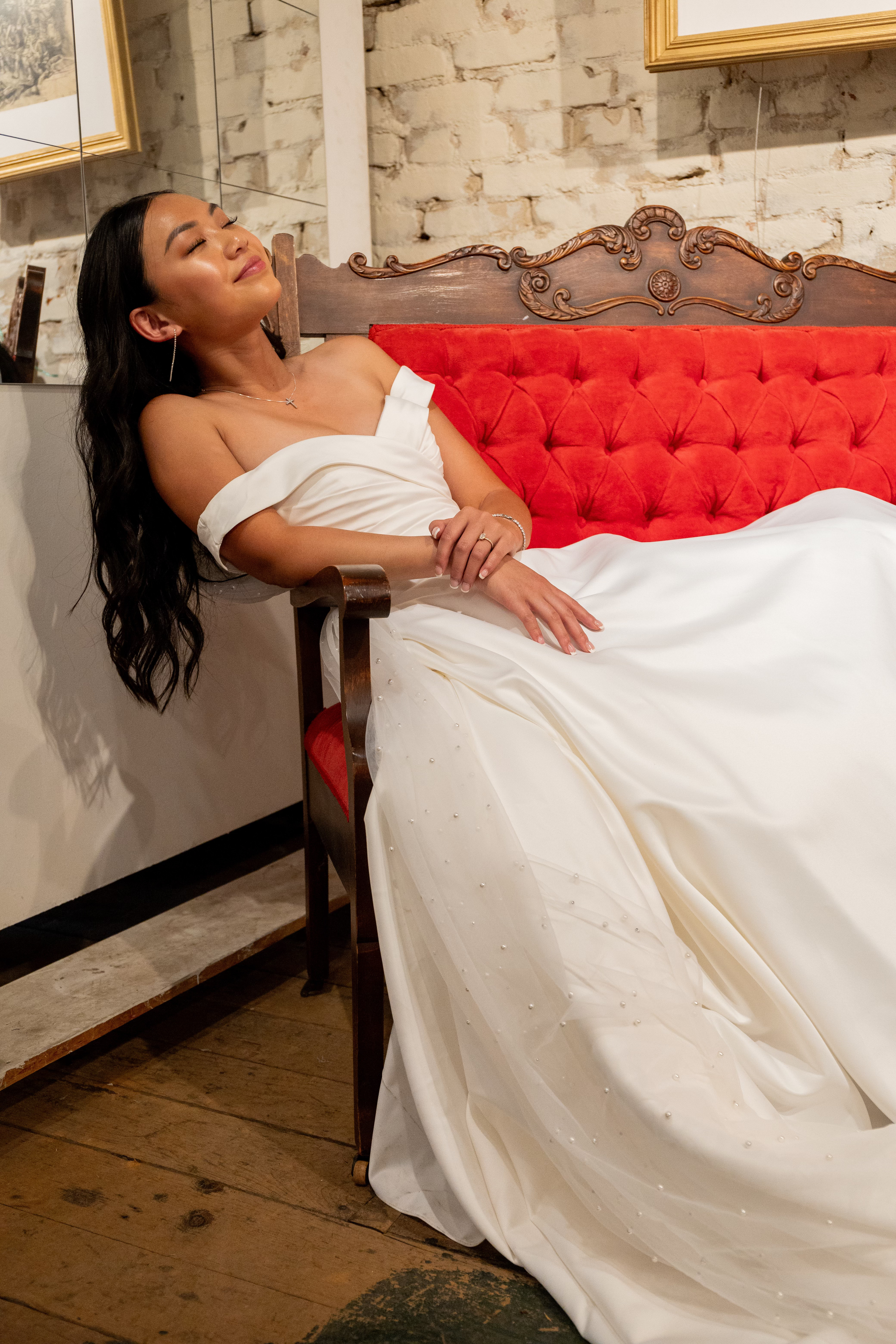
When conceptualizing my magazine, I started with the photography. Strong photography would elevate my design and make my magazine more professional. My roommate is a photographer (NBG Photography), and I partnered with her to promote her work and improve my magazine. She has done a lot of wedding photography in the past, so I decided to create a magazine based on this.
market research
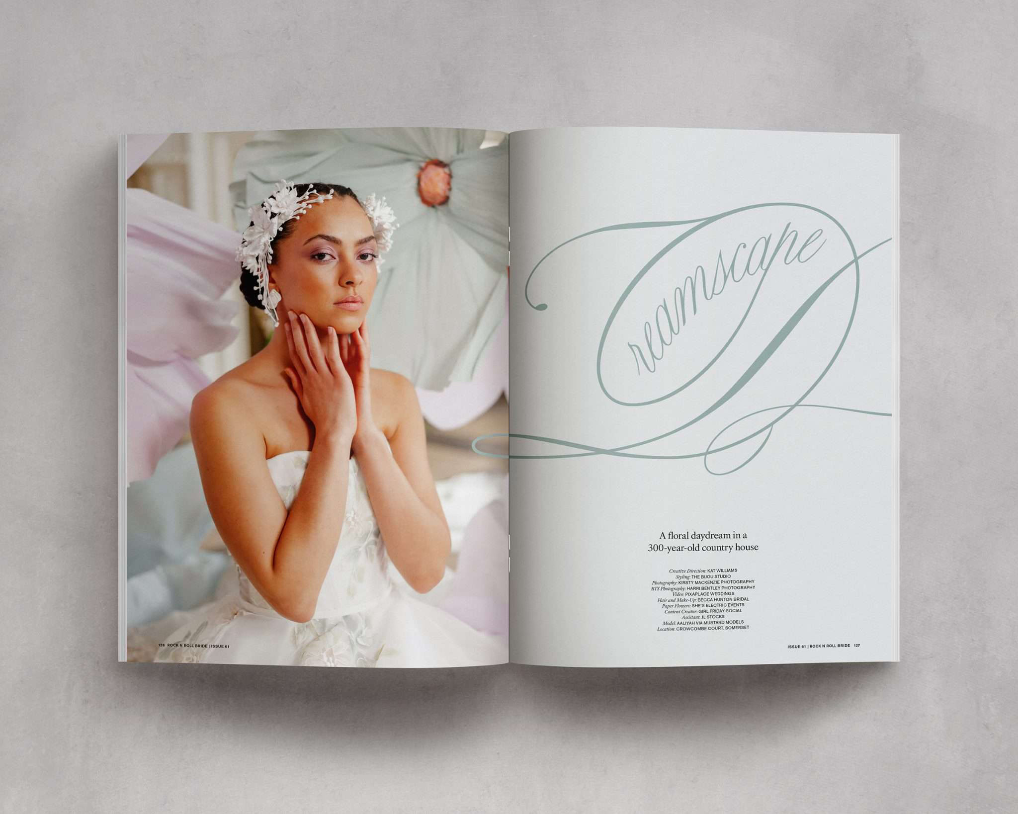
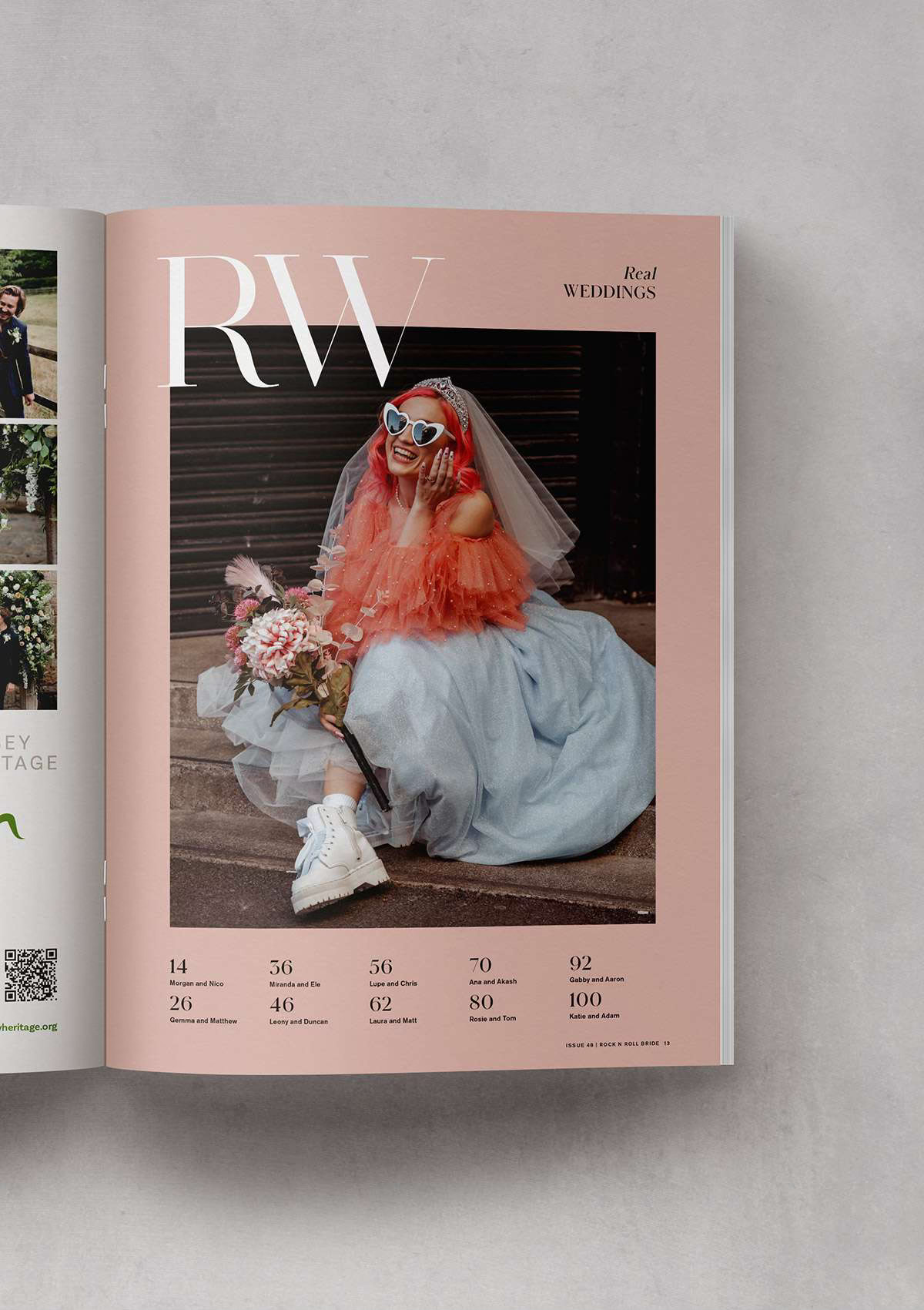
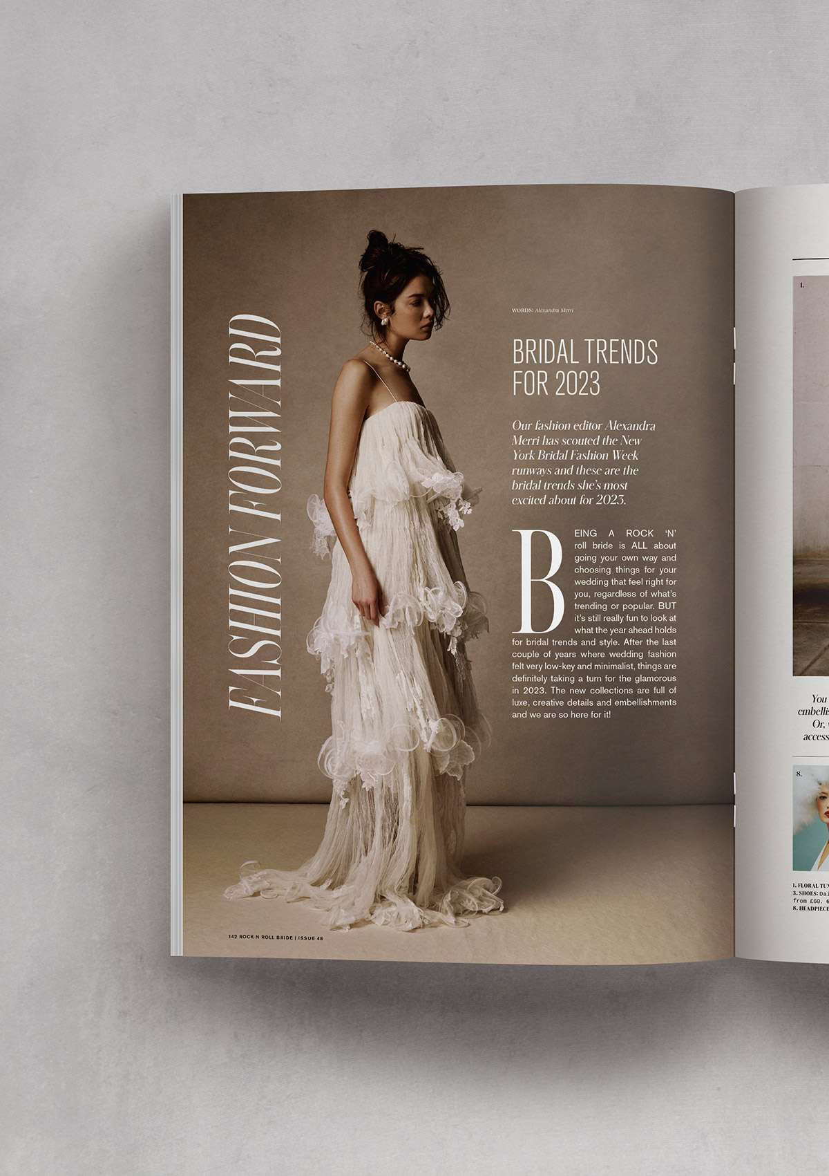
After choosing my photographer, my next step was to research current wedding magazines. I looked at more mainstream ones like The Knot, as well as niche magazines like Rock 'n Roll Bride. The second magazine was a better fit with how I wanted my magazine to look and feel, so I used Rock 'n Roll Bride as my main inspiration.
03
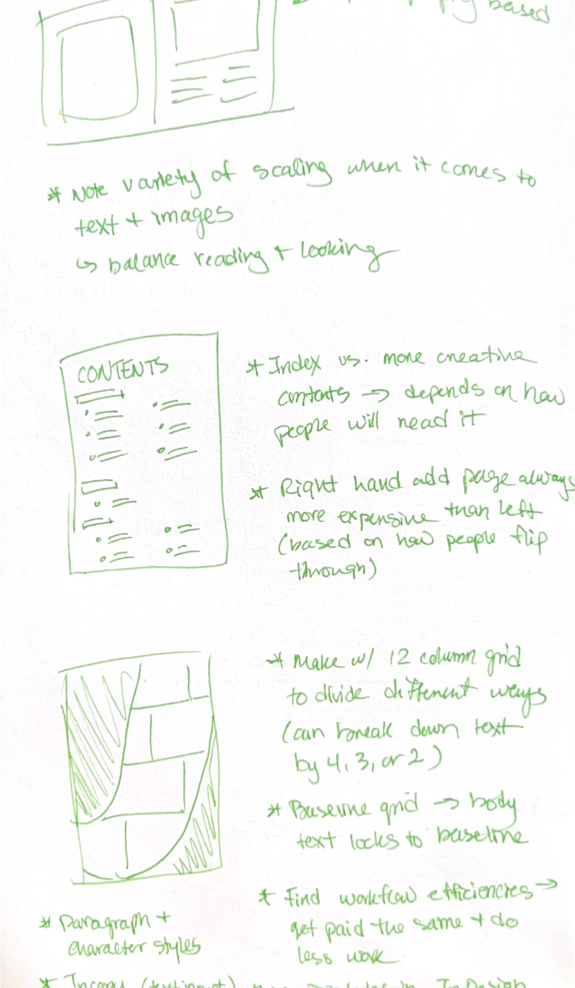
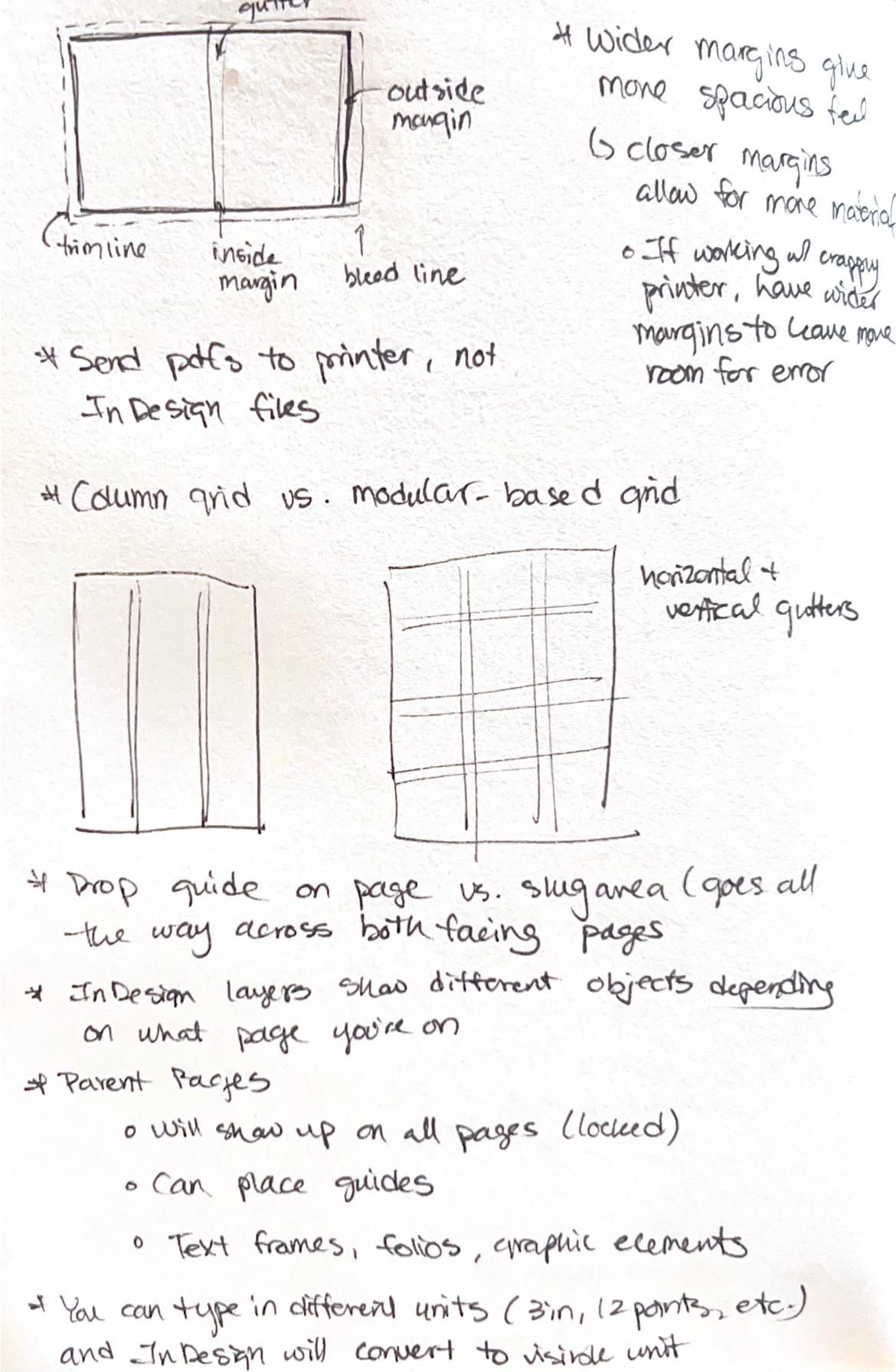
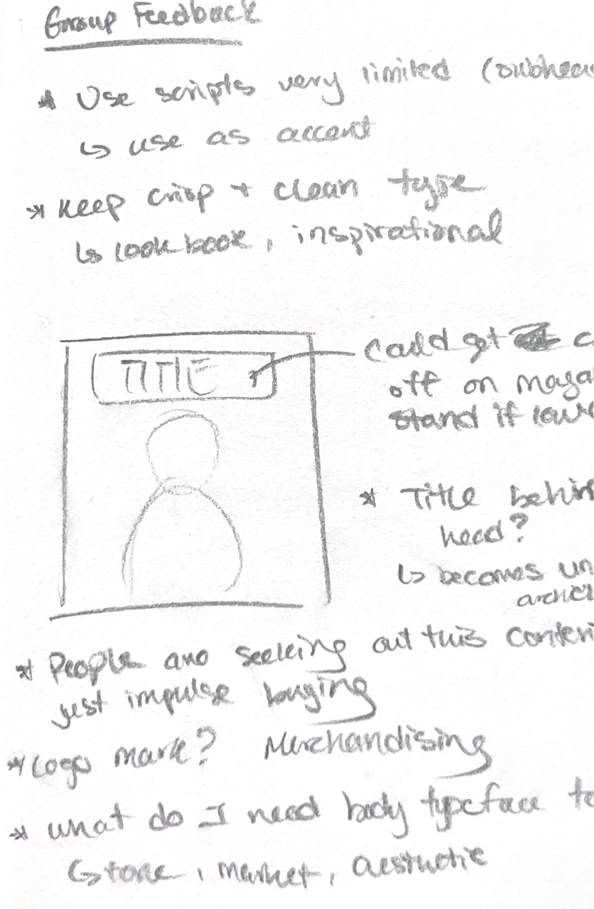
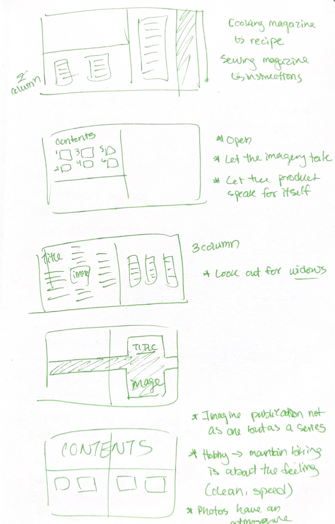
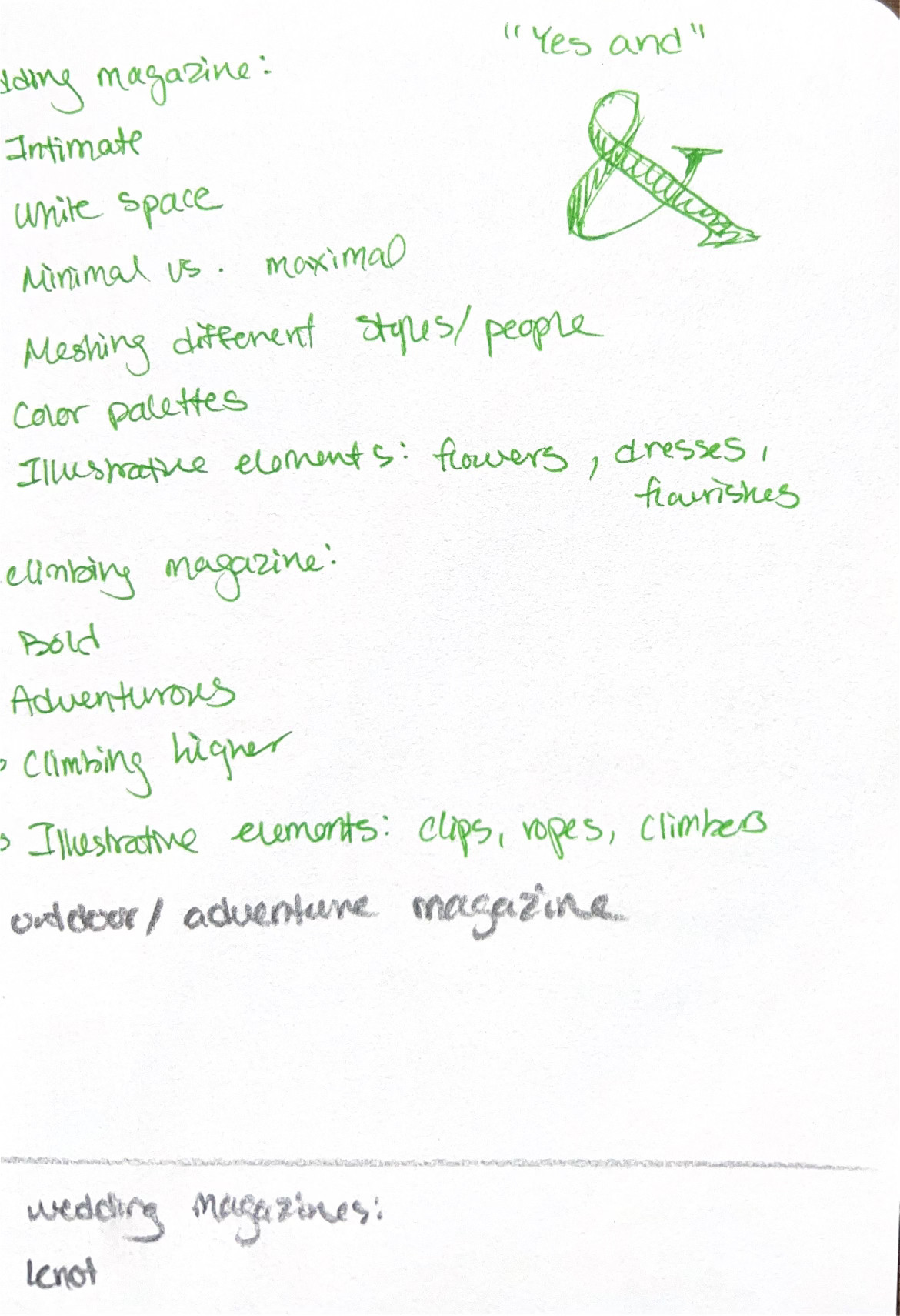
Sketches & Notes
04
Execution
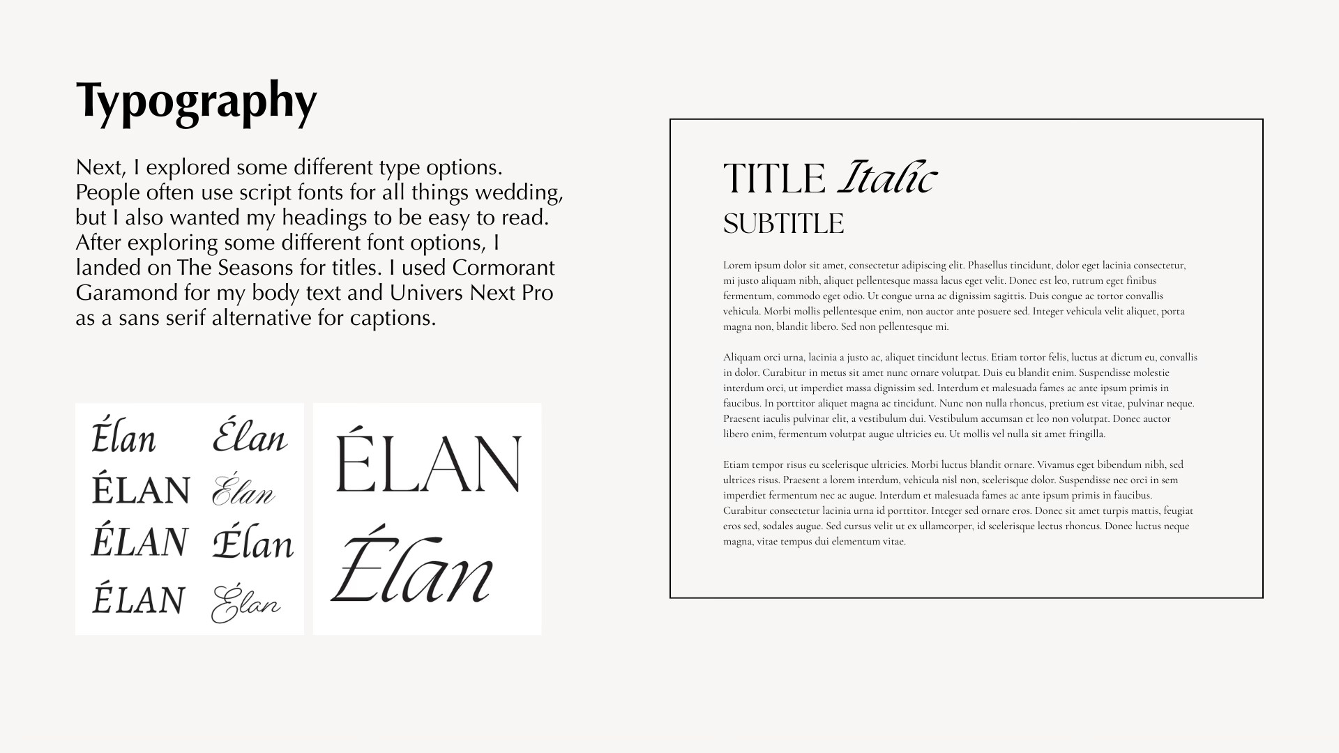
Typography
Next, I explored some different type options. People often use script fonts for all things wedding, but I also wanted my headings to be easy to read. After exploring some different font options, I landed on The Seasons for titles. I used Cormorant Garamond for my body text and Univers Next Pro as a sans serif alternative for captions.
colors
As this is the fall edition of the magazine, I chose colors in line with the season that matched the photos I was using. The lighter versions were used as backgrounds for callouts, sidebars, etc.

Process
publication design
Élan
client
Student Concept Project
Date
2025
Élan is a wedding inspiration magazine featuring photography by NBG Photography, designed for engaged couples. Clean layouts, refined typography, and spacious compositions create a timeless editorial aesthetic while guiding readers through photography, inspiration, and planning features.

01
Discovery & Strategy
problem
Many existing wedding magazines feel cluttered, overly trend-driven, and visually inconsistent, overwhelming with competing aesthetics.
solution
An elegant wedding planning magazine rooted in timeless sophistication. The publication features a cohesive cover and thoughtfully structured interior spreads that prioritize refined typography, intentional white space, and a restrained color palette to create an elevated reading experience.
key questions
- Who is reading this magazine?
- How are they reading it?
- What features will reach the intended audience?
- What are your readers looking for (information, images, purchasing info, etc.)? How can you draw attention to these things?
02
Research
photography
When conceptualizing my magazine, I started with the photography. Strong photography would elevate my design and make my magazine more professional. My roommate is a photographer (NBG Photography), and I partnered with her to promote her work and improve my magazine. She has done a lot of wedding photography in the past, so I decided to create a magazine based on this.
market research
After choosing my photographer, my next step was to research current wedding magazines. I looked at more mainstream ones like The Knot, as well as niche magazines like Rock 'n Roll Bride. The second magazine was a better fit with how I wanted my magazine to look and feel, so I used Rock 'n Roll Bride as my main inspiration.
03
Sketches & Notes
04
Execution
Typography
Next, I explored some different type options. People often use script fonts for all things wedding, but I also wanted my headings to be easy to read. After exploring some different font options, I landed on The Seasons for titles. I used Cormorant Garamond for my body text and Univers Next Pro as a sans serif alternative for captions.
colors
As this is the fall edition of the magazine, I chose colors in line with the season that matched the photos I was using. The lighter versions were used as backgrounds for callouts, sidebars, etc.
Process
publication design
Élan
Élan is a wedding inspiration magazine featuring photography by NBG Photography, designed for engaged couples. Clean layouts, refined typography, and spacious compositions create a timeless editorial aesthetic while guiding readers through photography, inspiration, and planning features.
client
Student Concept Project
date
2025
Process

01
Discovery & Strategy
problem
Many existing wedding magazines feel cluttered, overly trend-driven, and visually inconsistent, overwhelming with competing aesthetics.
solution
An elegant wedding planning magazine rooted in timeless sophistication. The publication features a cohesive cover and thoughtfully structured interior spreads that prioritize refined typography, intentional white space, and a restrained color palette to create an elevated reading experience.
key questions
- Who is reading this magazine?
- How are they reading it?
- What features will reach the intended audience?
- What are your readers looking for (information, images, purchasing info, etc.)? How can you draw attention to these things?
02
Research
photography
When conceptualizing my magazine, I started with the photography. Strong photography would elevate my design and make my magazine more professional. My roommate is a photographer (NBG Photography), and I partnered with her to promote her work and improve my magazine. She has done a lot of wedding photography in the past, so I decided to create a magazine based on this.
market research
After choosing my photographer, my next step was to research current wedding magazines. I looked at more mainstream ones like The Knot, as well as niche magazines like Rock 'n Roll Bride. The second magazine was a better fit with how I wanted my magazine to look and feel, so I used Rock 'n Roll Bride as my main inspiration.
03
Sketches & Notes
04
Execution
Typography
Next, I explored some different type options. People often use script fonts for all things wedding, but I also wanted my headings to be easy to read. After exploring some different font options, I landed on The Seasons for titles. I used Cormorant Garamond for my body text and Univers Next Pro as a sans serif alternative for captions.
colors
As this is the fall edition of the magazine, I chose colors in line with the season that matched the photos I was using. The lighter versions were used as backgrounds for callouts, sidebars, etc.