book cover design
Red End
client
Student Concept Project
date
2024
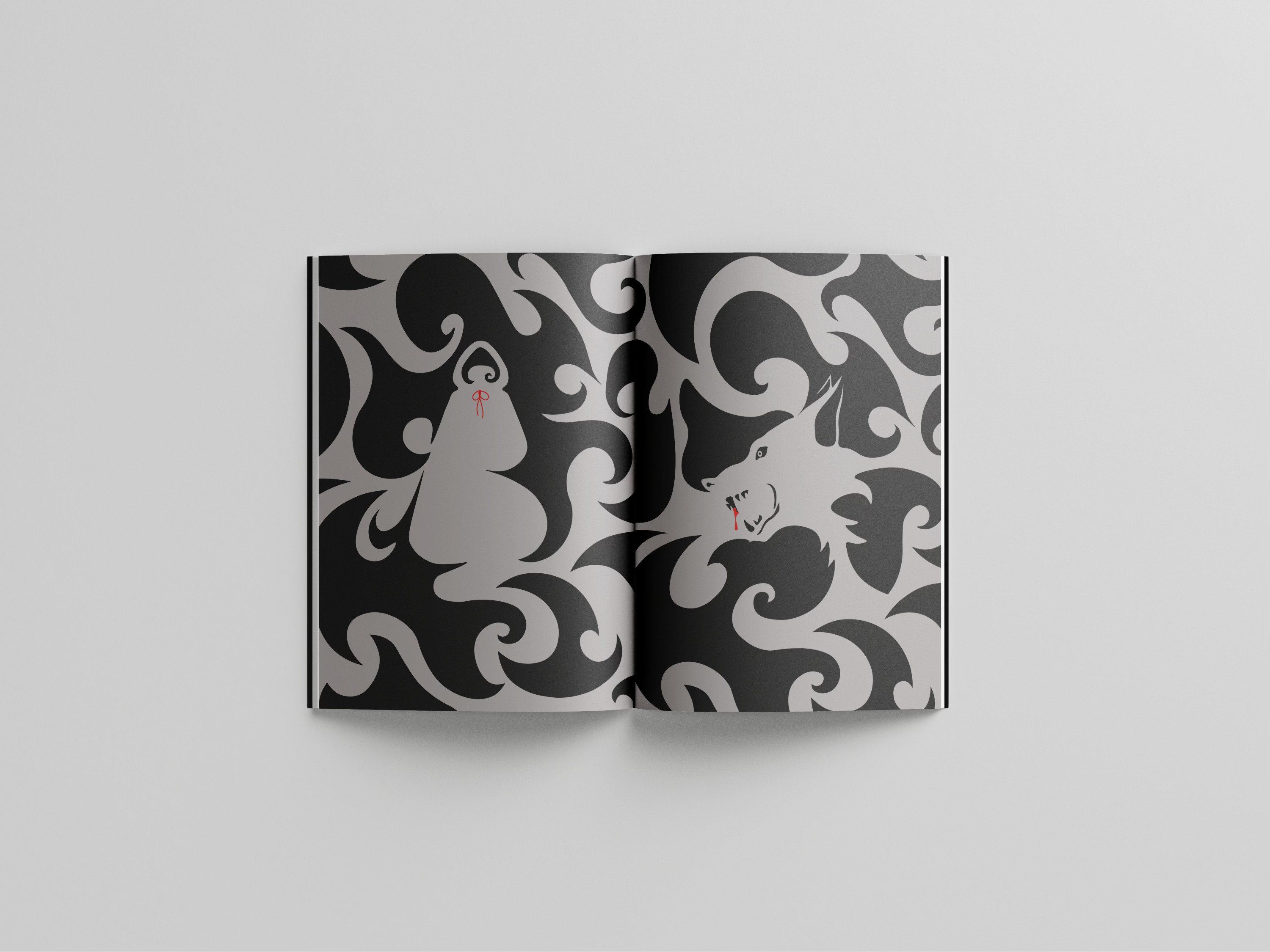
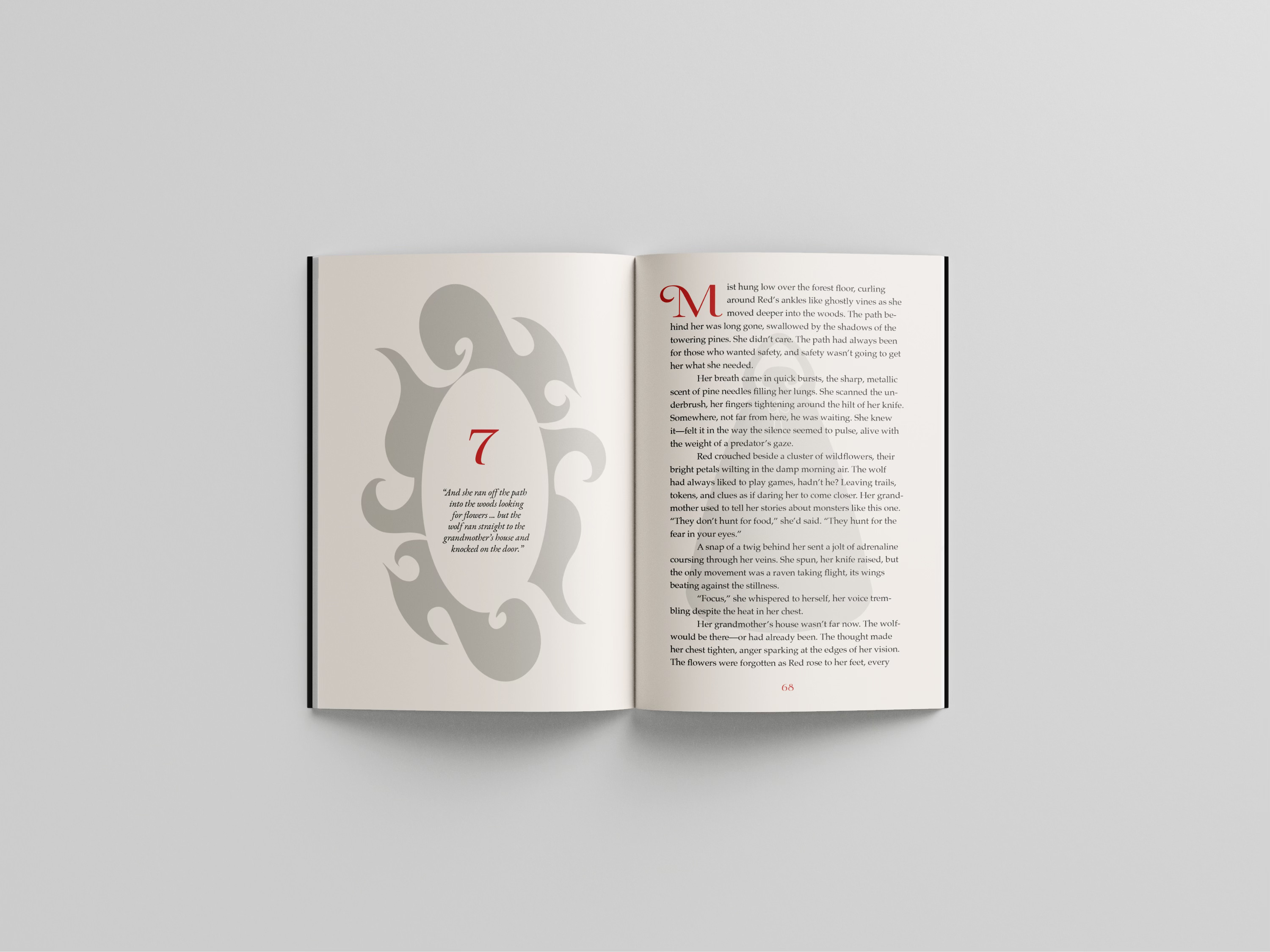
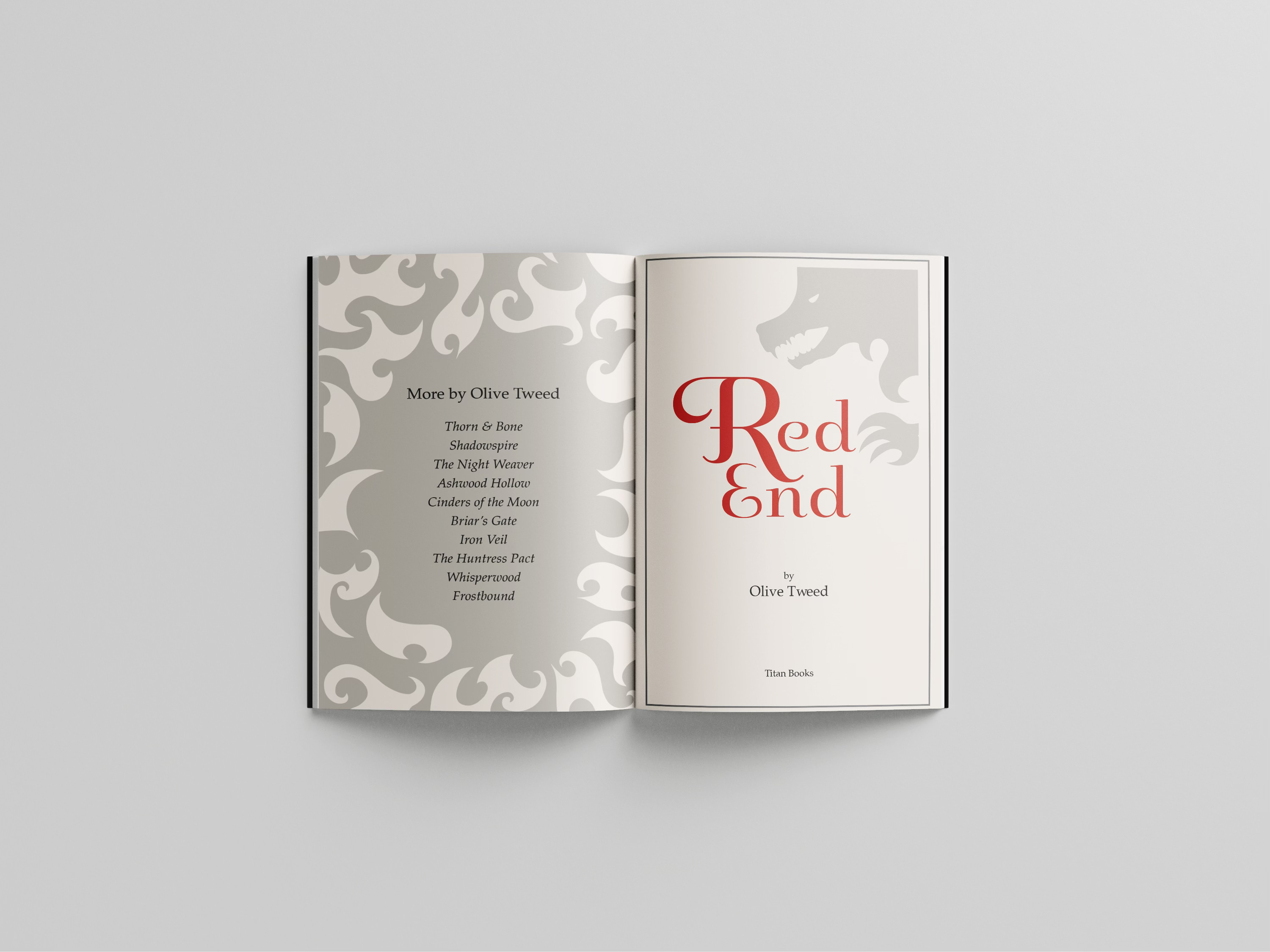
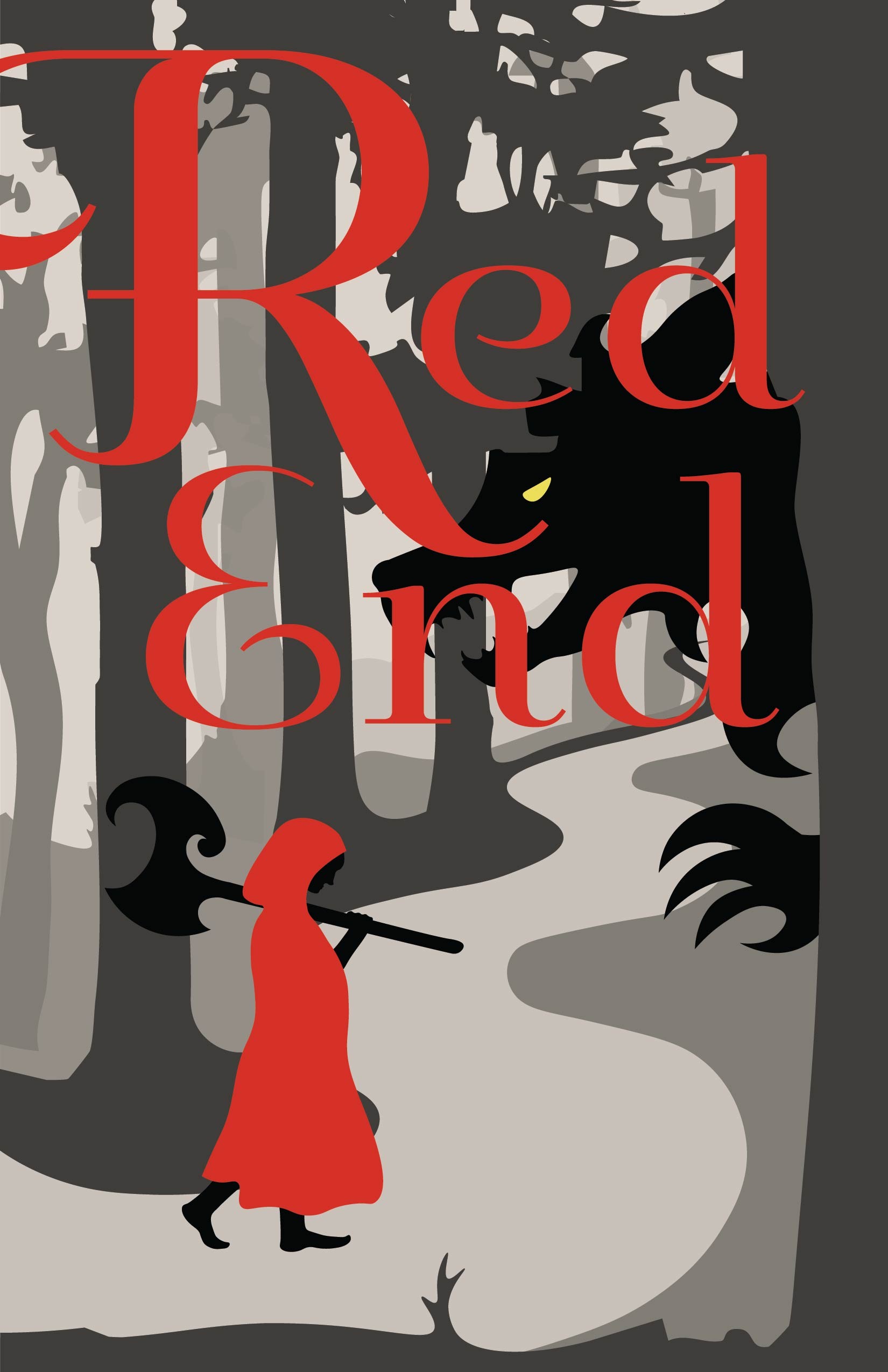
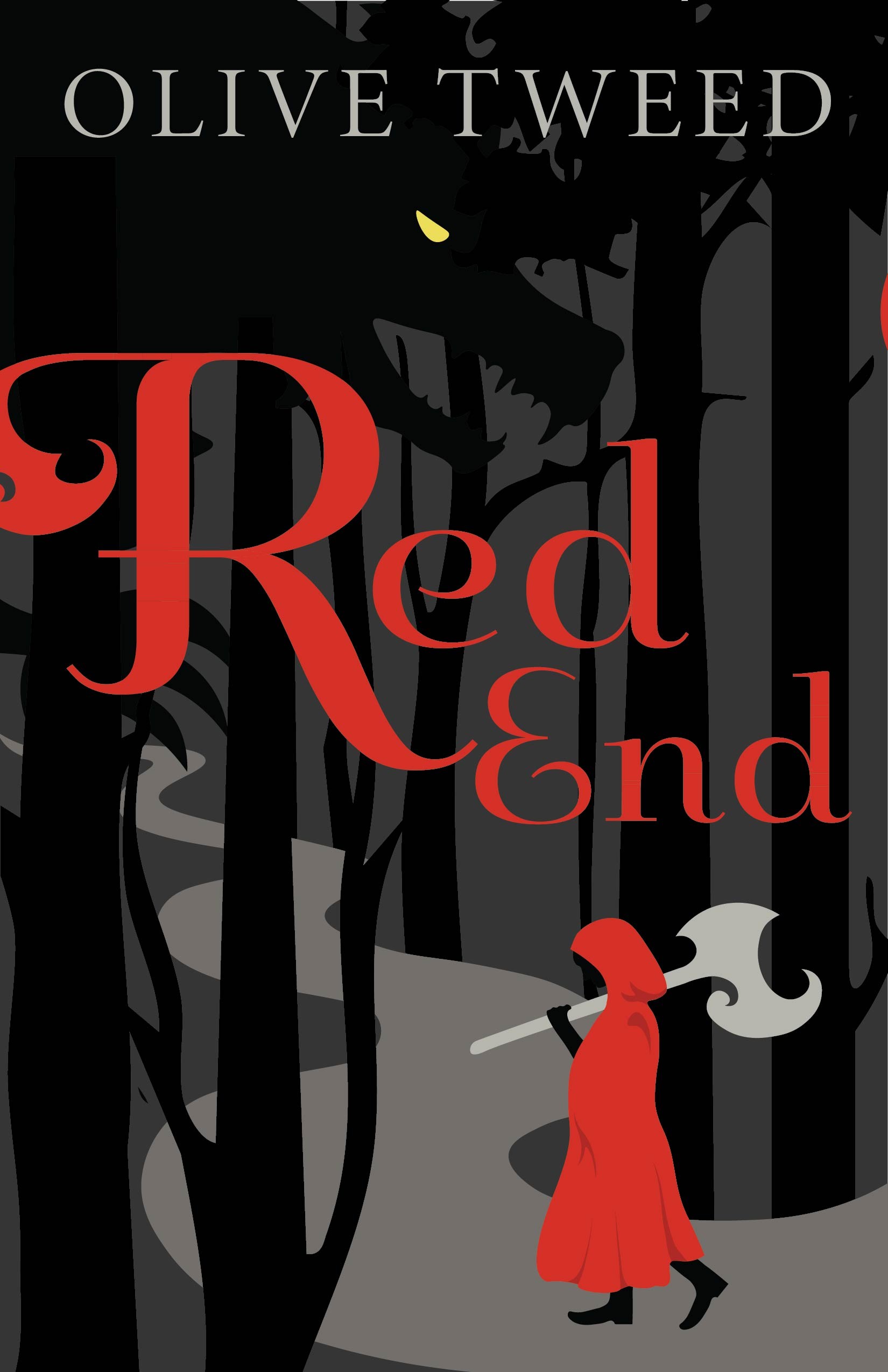
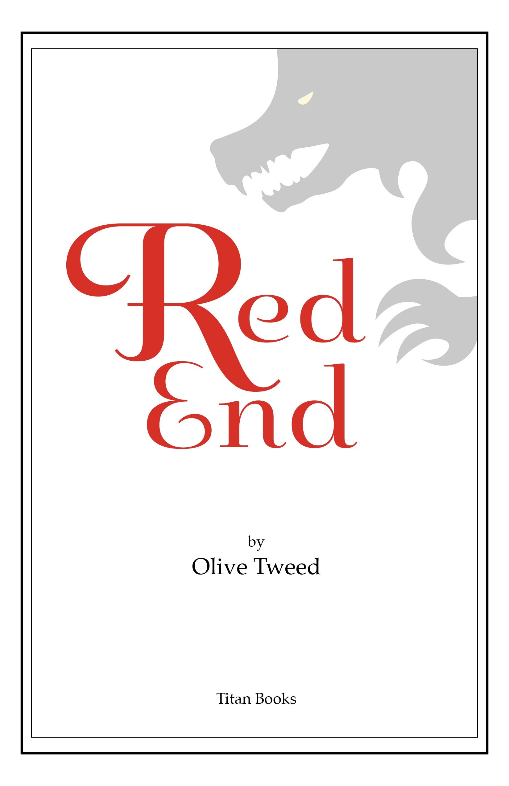
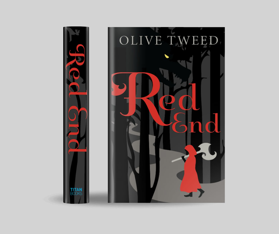
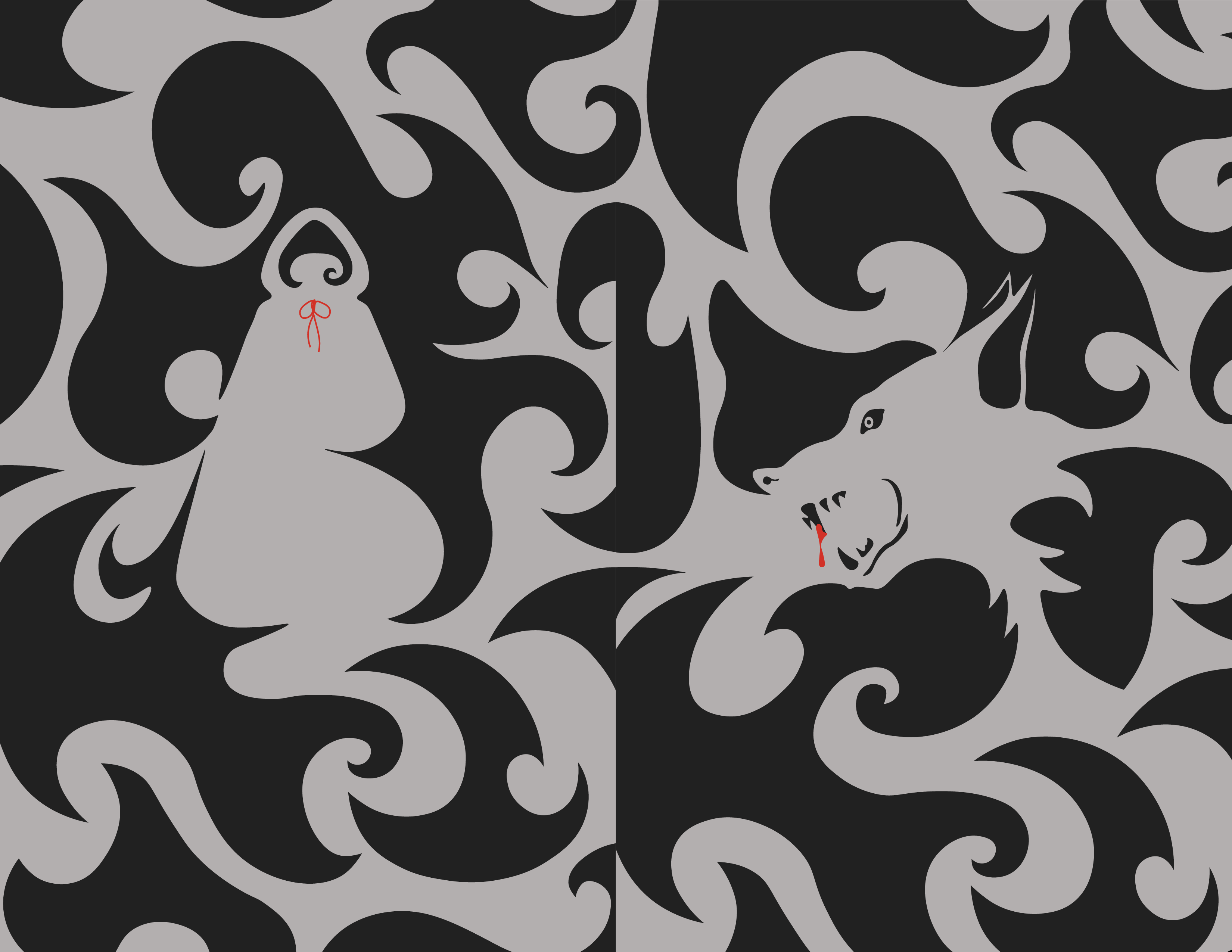
YA book concept reimagining the Red Riding Hood narrative. The project includes a cover and interior spreads using expressive typography and axe-blade-inspired forms. Awarded Gold in the Graphis New Talent Awards 2025.
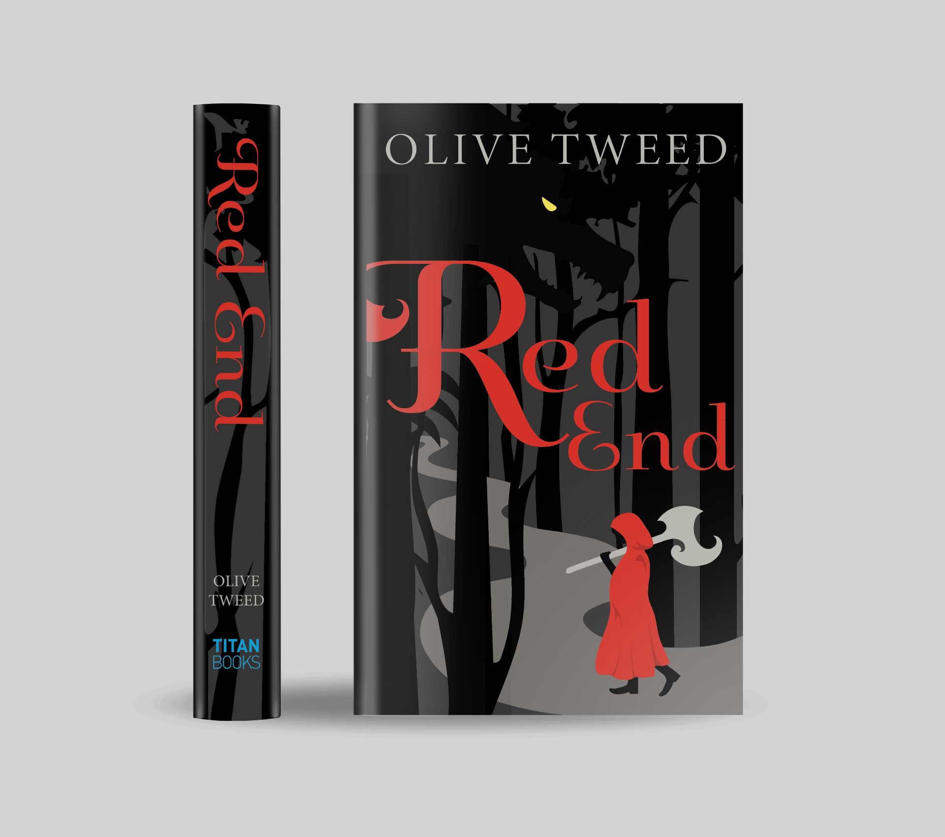
book cover design
Red End
client
Student Concept Project
Date
2024
YA book concept reimagining the Red Riding Hood narrative. The project includes a cover and interior spreads using expressive typography and axe-blade-inspired forms. Awarded Gold in the Graphis New Talent Awards 2025.
Process

01
Conceptualization
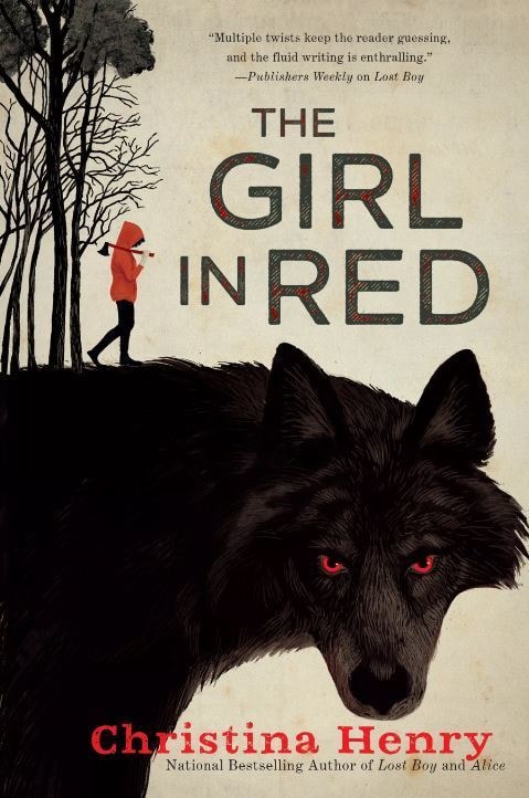
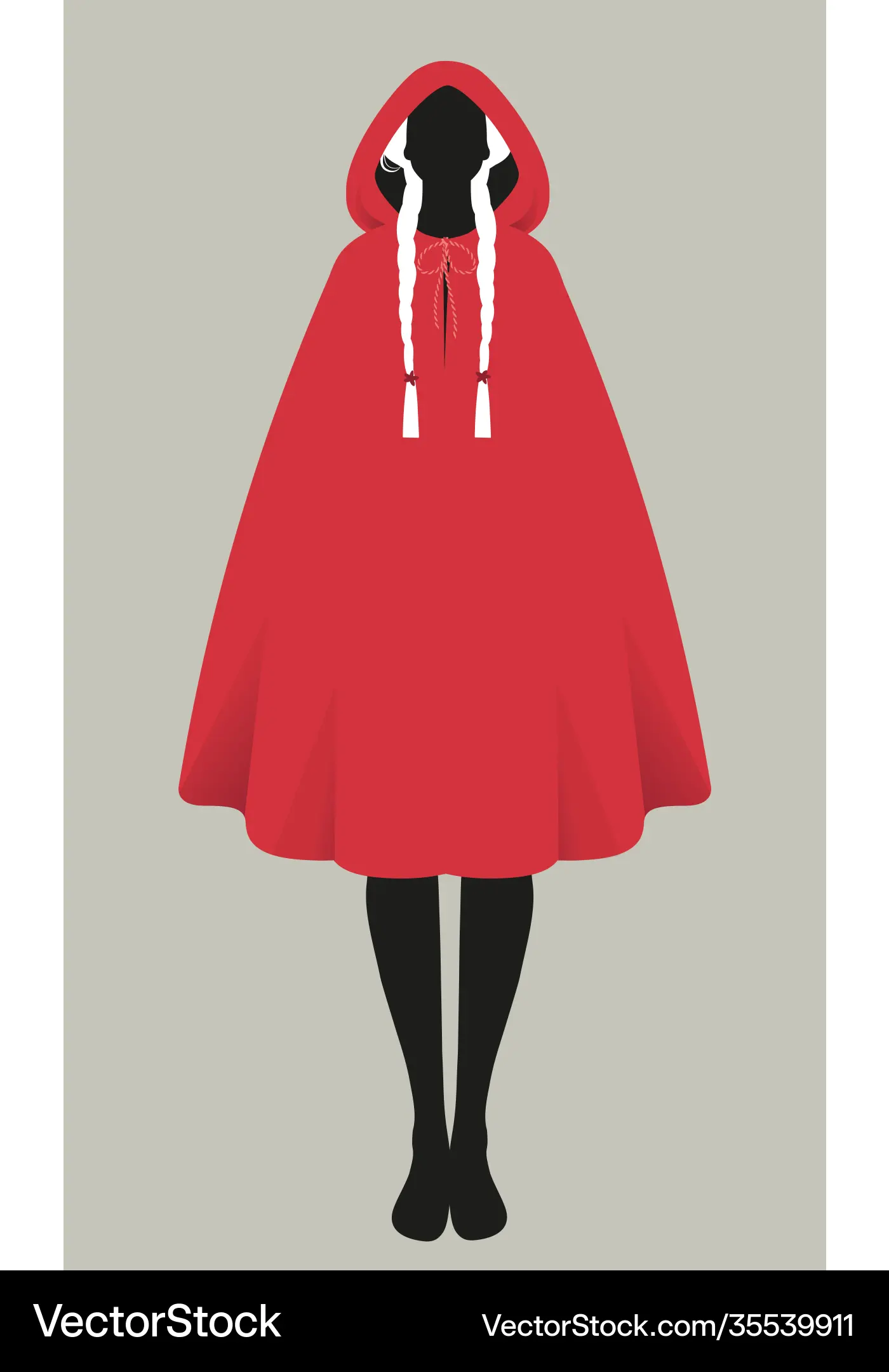
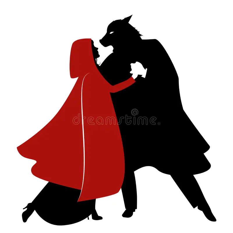
When tasked with designing a book cover and interior spreads, my mind immediately went to fairy tales. As an avid reader, I’ve always been drawn to how books transport you into new worlds. I chose to concept a Young Adult reimagining of Little Red Riding Hood, drawing inspiration from a fantasy novel I was reading at the time.
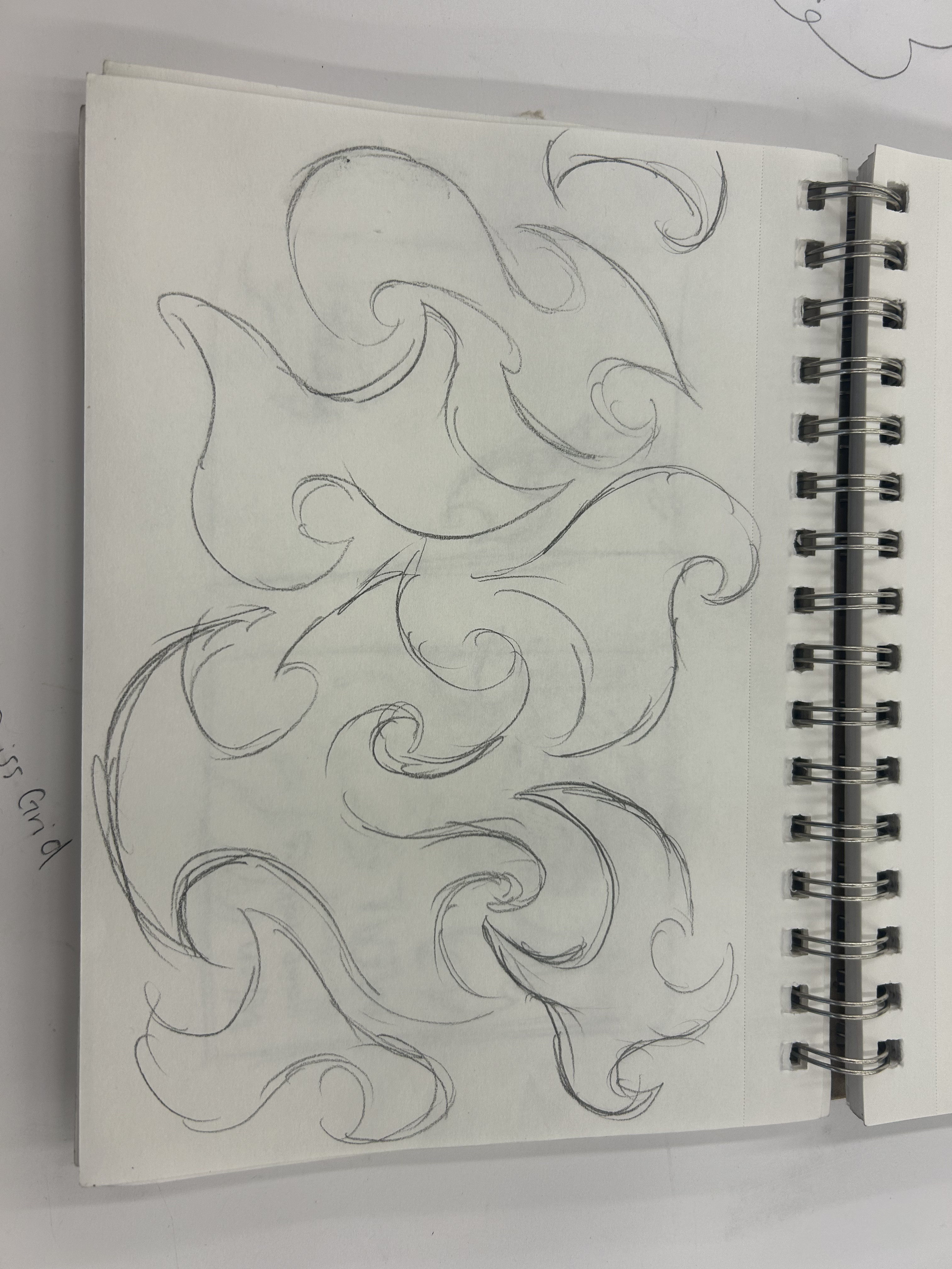
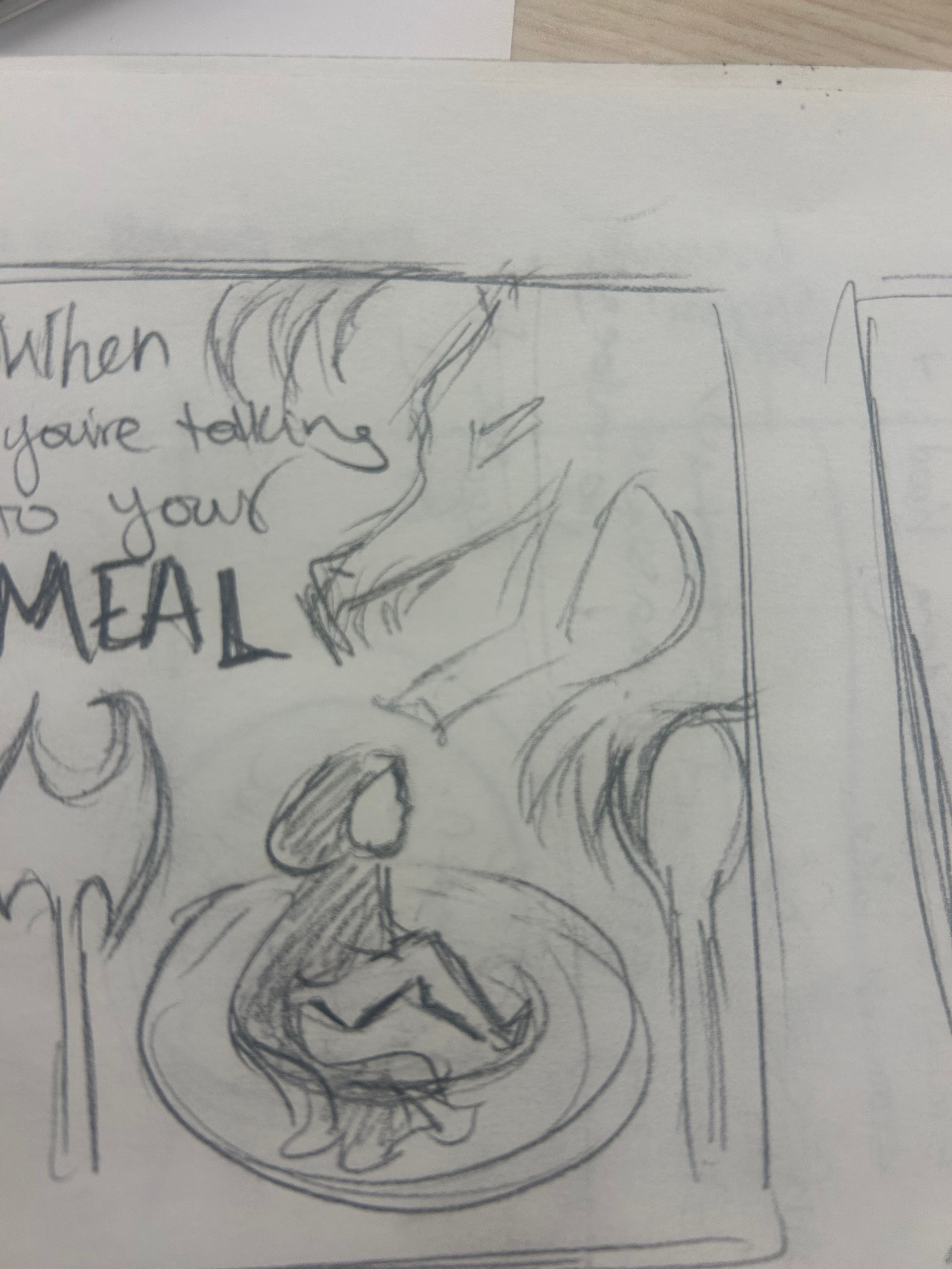
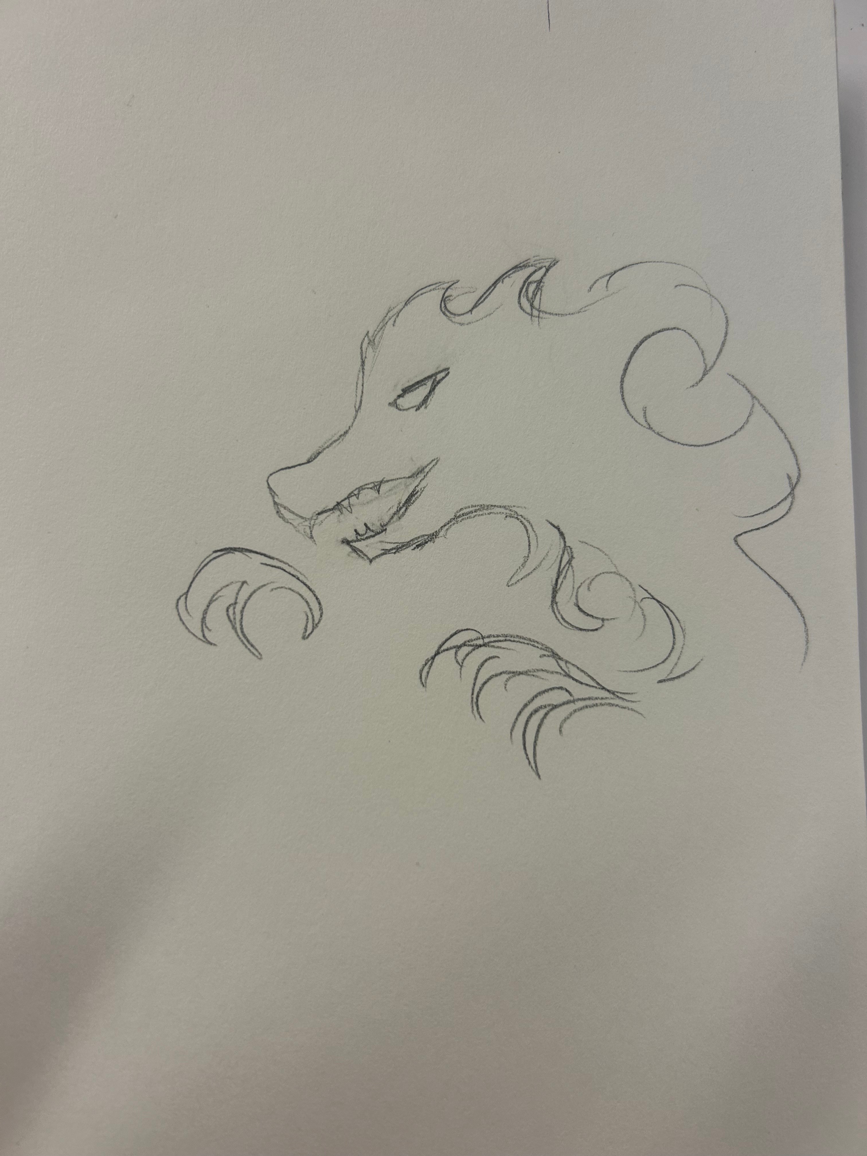
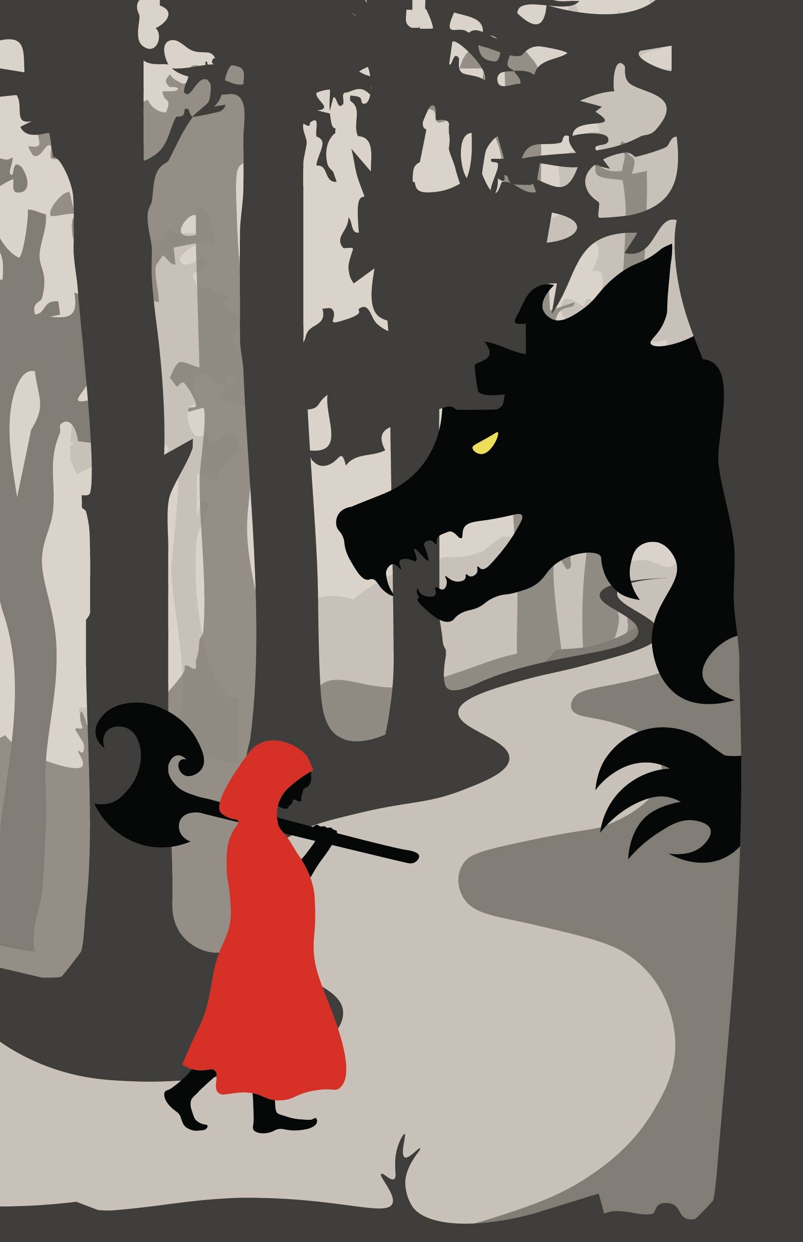
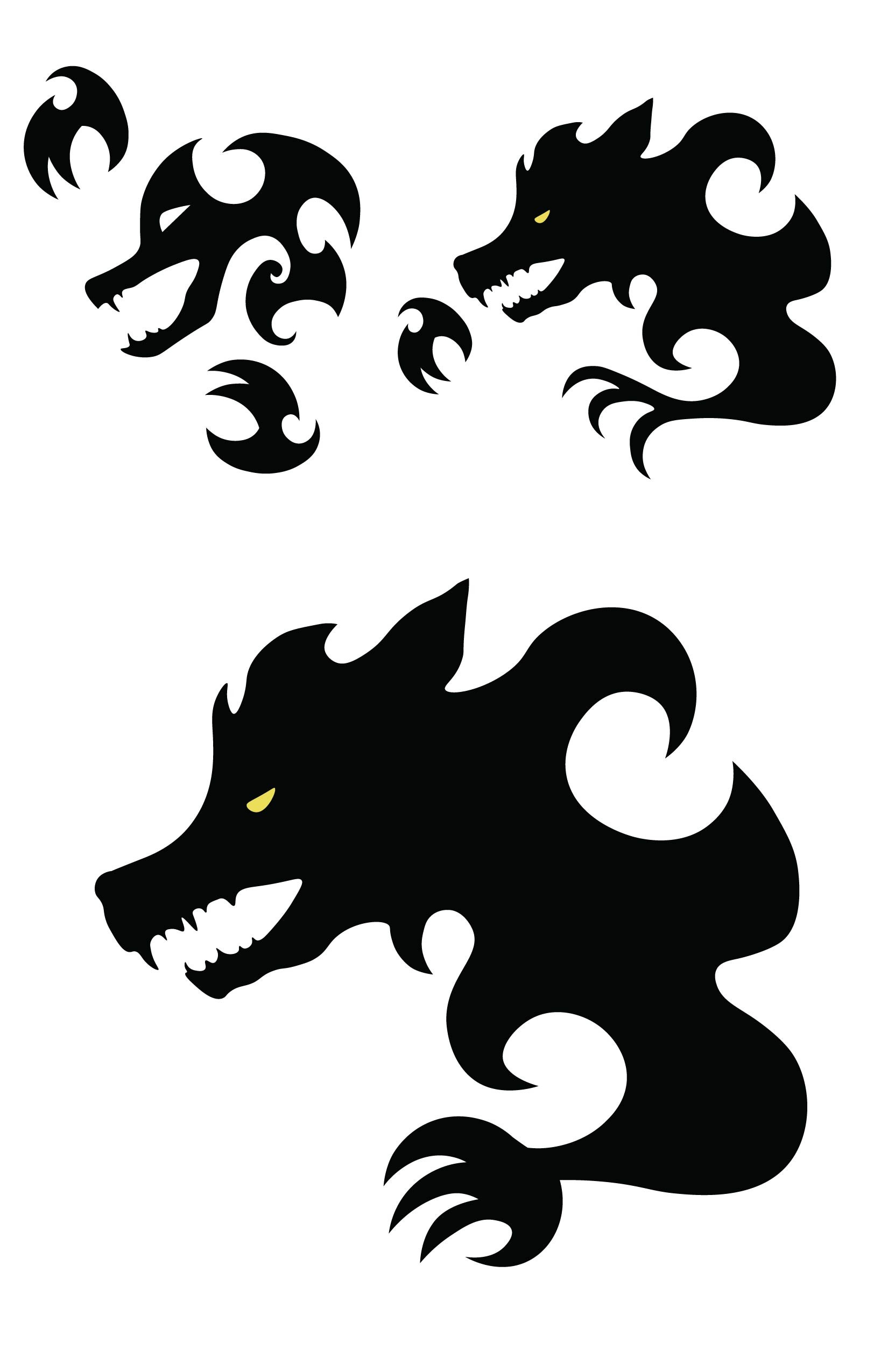
The visual anchor for the project came from a real-world observation: a sharp, curving shape that evoked an axe blade. I translated this form into a signature design motif, carrying the sharp, curving pattern throughout the entire experience—from the endpages and cover typography to the silhouette of the axe itself.
02
Inspiration
03
Sketches
04
Vector Art



05
Final Spreads
book cover design
Red End
YA book concept reimagining the Red Riding Hood narrative. The project includes a cover and interior spreads using expressive typography and axe-blade-inspired forms. Awarded Gold in the Graphis New Talent Awards 2025.
client
Student Concept Project
date
2024
Process

01
Conceptualization
When tasked with designing a book cover and interior spreads, my mind immediately went to fairy tales. As an avid reader, I’ve always been drawn to how books transport you into new worlds. I chose to concept a Young Adult reimagining of Little Red Riding Hood, drawing inspiration from a fantasy novel I was reading at the time.
The visual anchor for the project came from a real-world observation: a sharp, curving shape that evoked an axe blade. I translated this form into a signature design motif, carrying the sharp, curving pattern throughout the entire experience—from the endpages and cover typography to the silhouette of the axe itself.
02
Inspiration
03
Sketches
04
Vector Art
05
Final Spreads