packaging design · branding
Thriving
Table
client
CSU Department of Food Science and Human Nutrition
date
2026
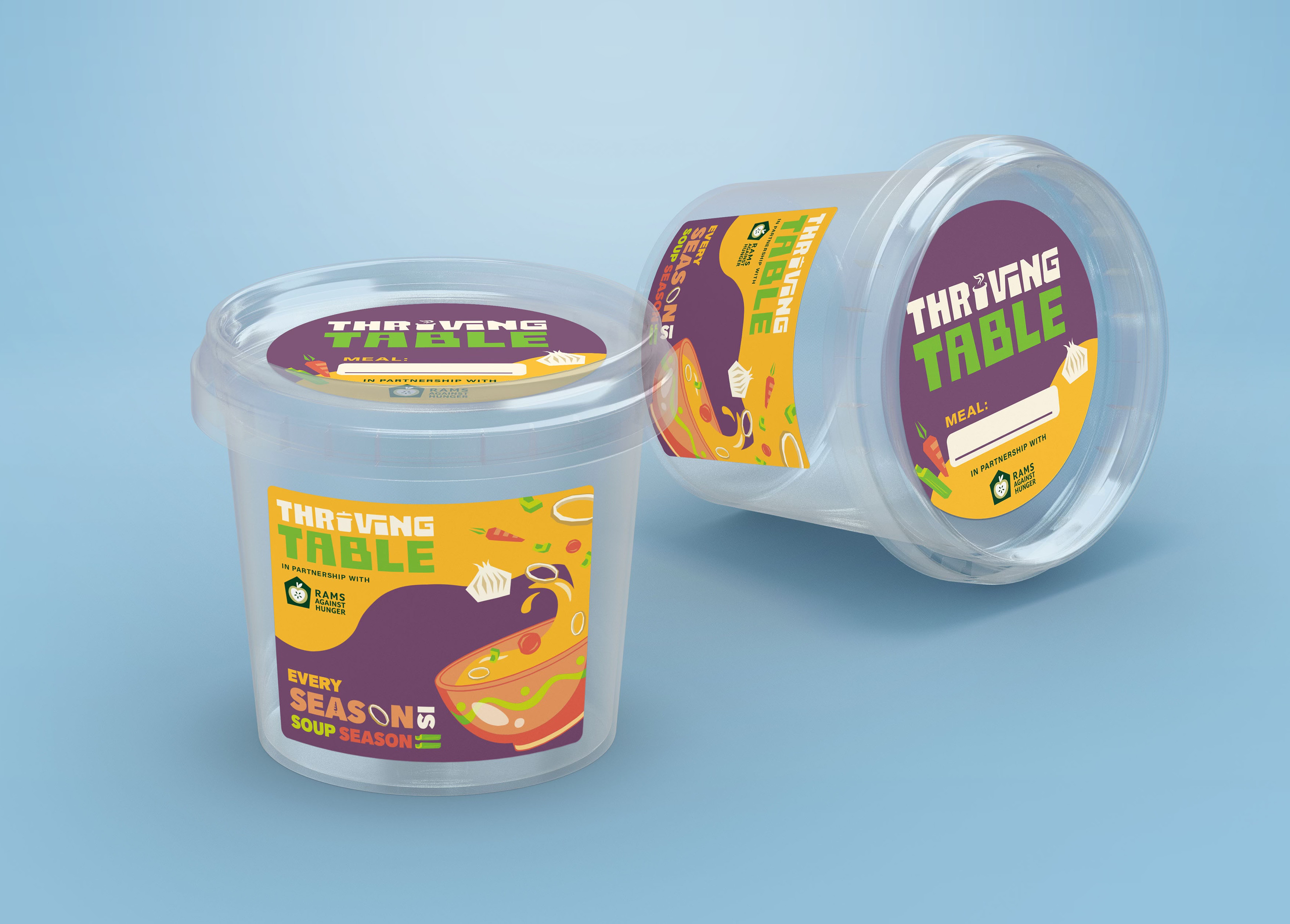
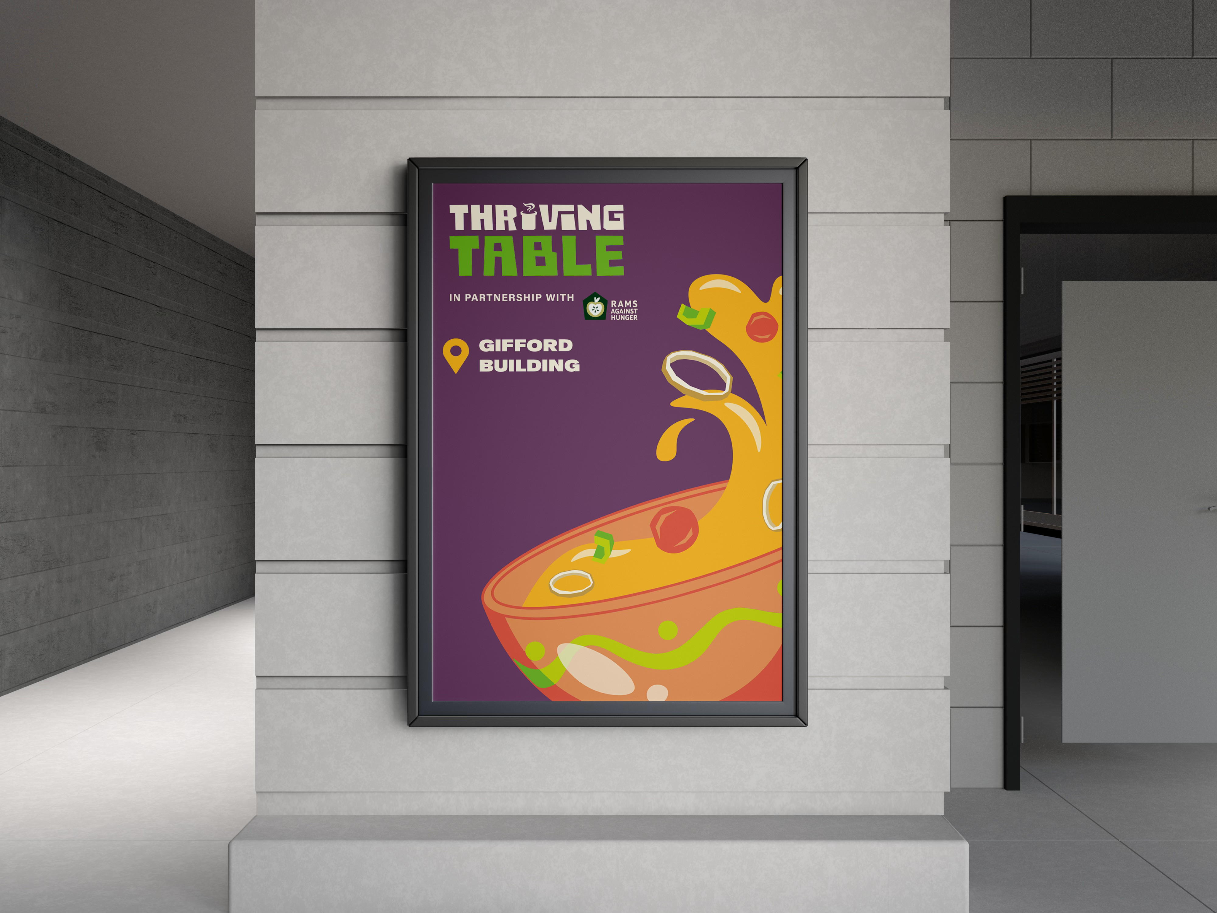
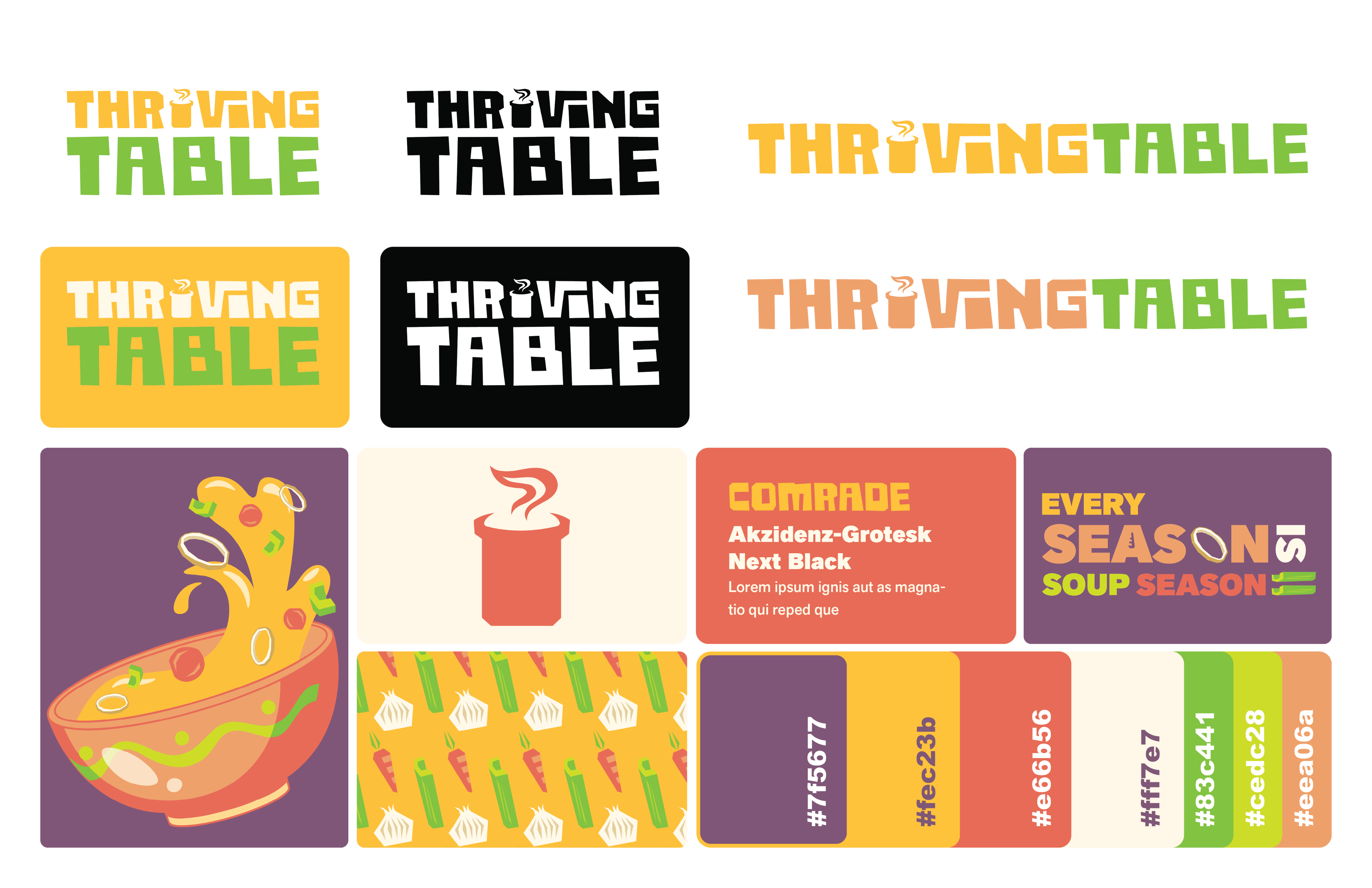
Thriving Table is a brand identity for a new program launched by the CSU Department of Food Science and Human Nutrition. The program uses donated food items to create nutritious soups and stews that are distributed freely on campus to combat food insecurity. The goal is to create a fun and appealing brand that doesn’t feel like charity.
packaging design · branding
Thriving Table
client
CSU Department of Food Science and Human Nutrition
Date
2026
Thriving Table is a brand identity for a new program launched by the CSU Department of Food Science and Human Nutrition. The program uses donated food items to create nutritious soups and stews that are distributed freely on campus to combat food insecurity. The goal is to create a fun and appealing brand that doesn’t feel like charity.
Process

01
Discovery & Strategy
problem
CSU is starting a new program to combat food insecurity on campus, and they want branding that is fun and appealing to students. They want to avoid creating stigma around accepting free food, so the brand shouldn’t look like a charity brand. The program will include various soups and stews, so they need packaging that can be produced affordably and used across a variety of meals.
solution
Thriving Table, a colorful brand that emphasizes good meals as a necessity in order to thrive in an academic environment. Everyone should have a seat at the table regardless of their economic means.
key questions
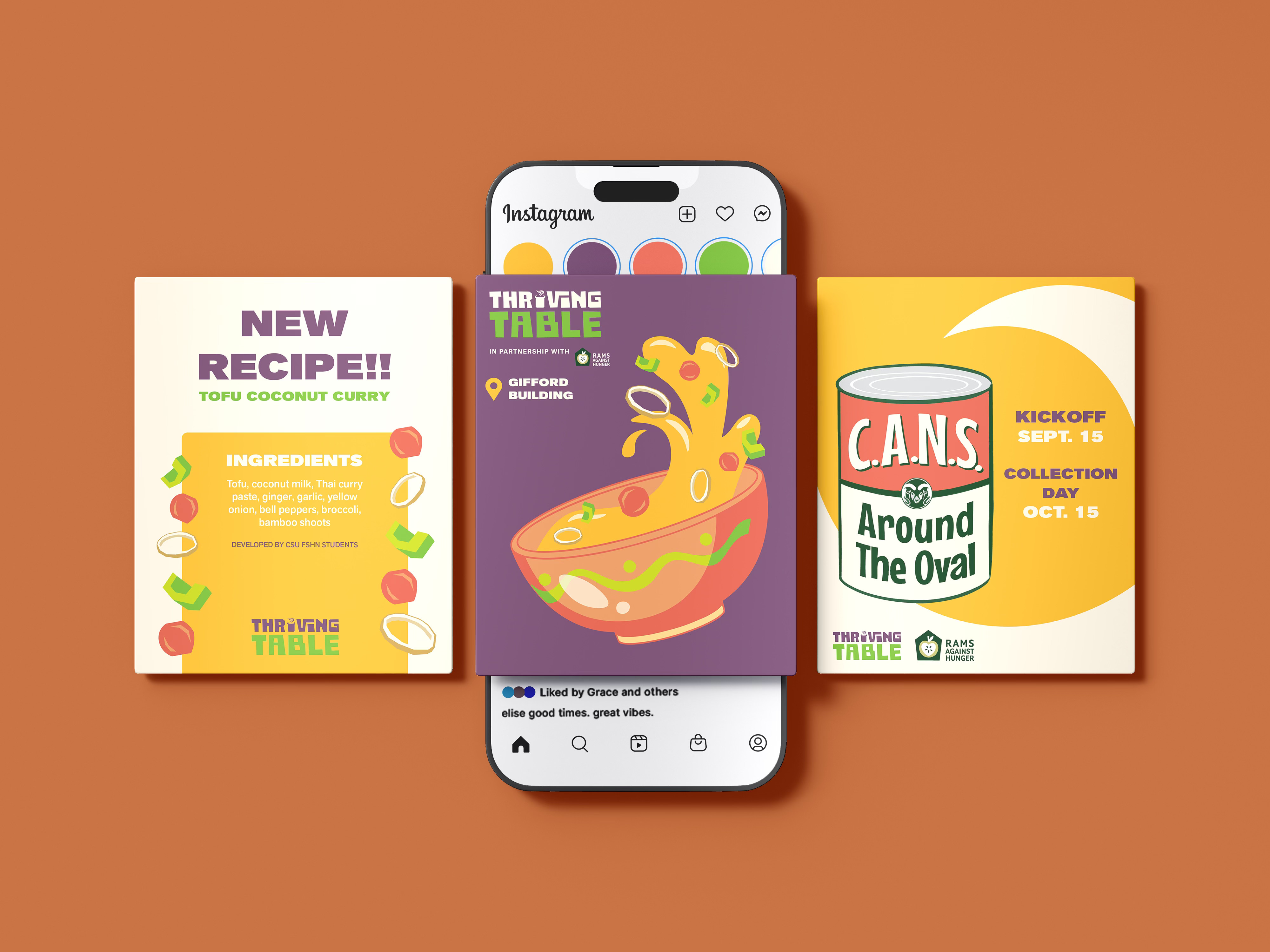
- How does this brand reach its target audience? (CSU students, international students)
- How can the packaging be versatile and not geared toward one specific recipe or ingredient?
- Can the CSU energy color palette be incorporated?
- Where will this food be accessed and what designs are necessary to represent the brand in a physical space? (flyers, freezer, etc.)
02
Research
GroCery store
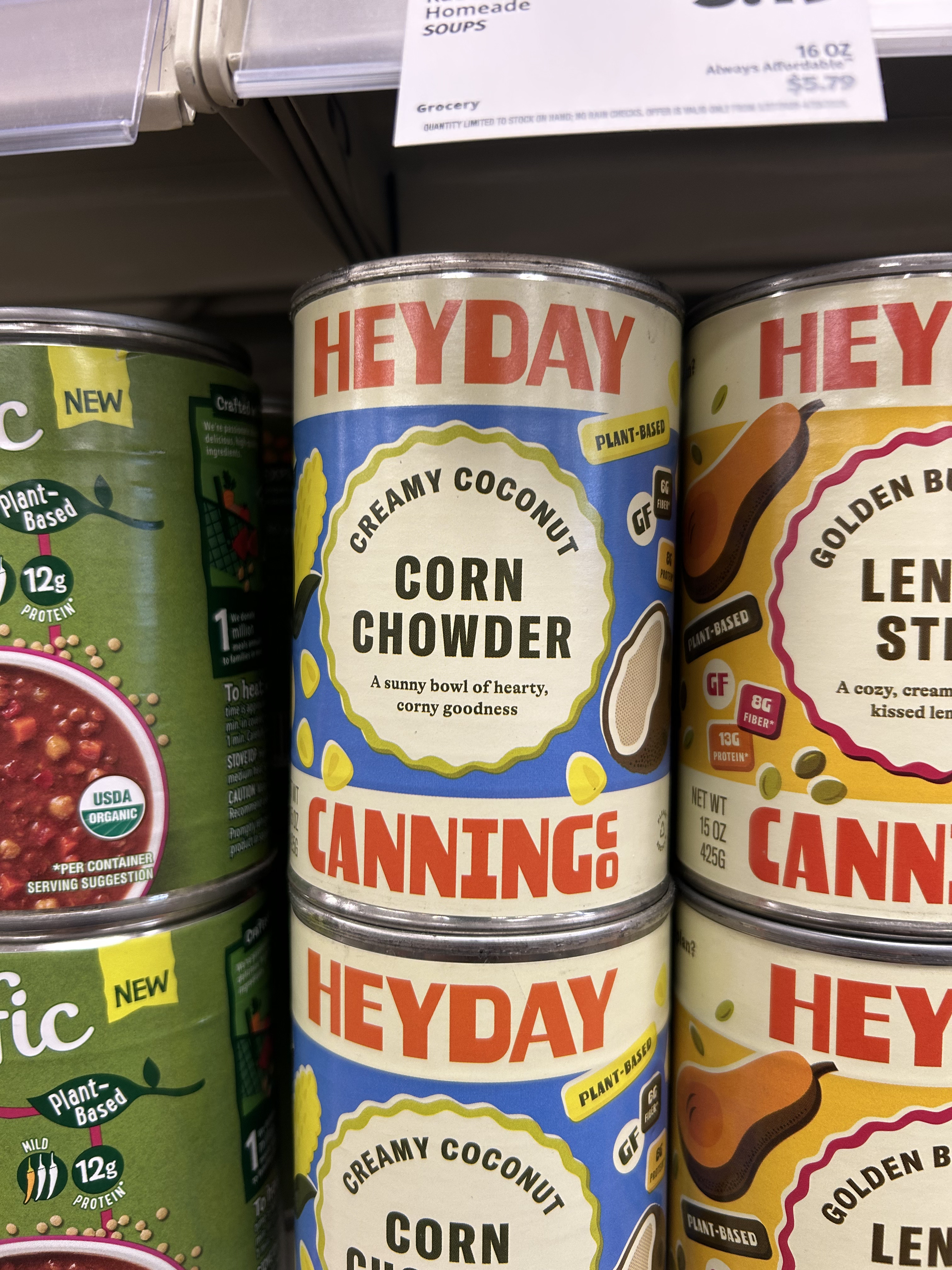
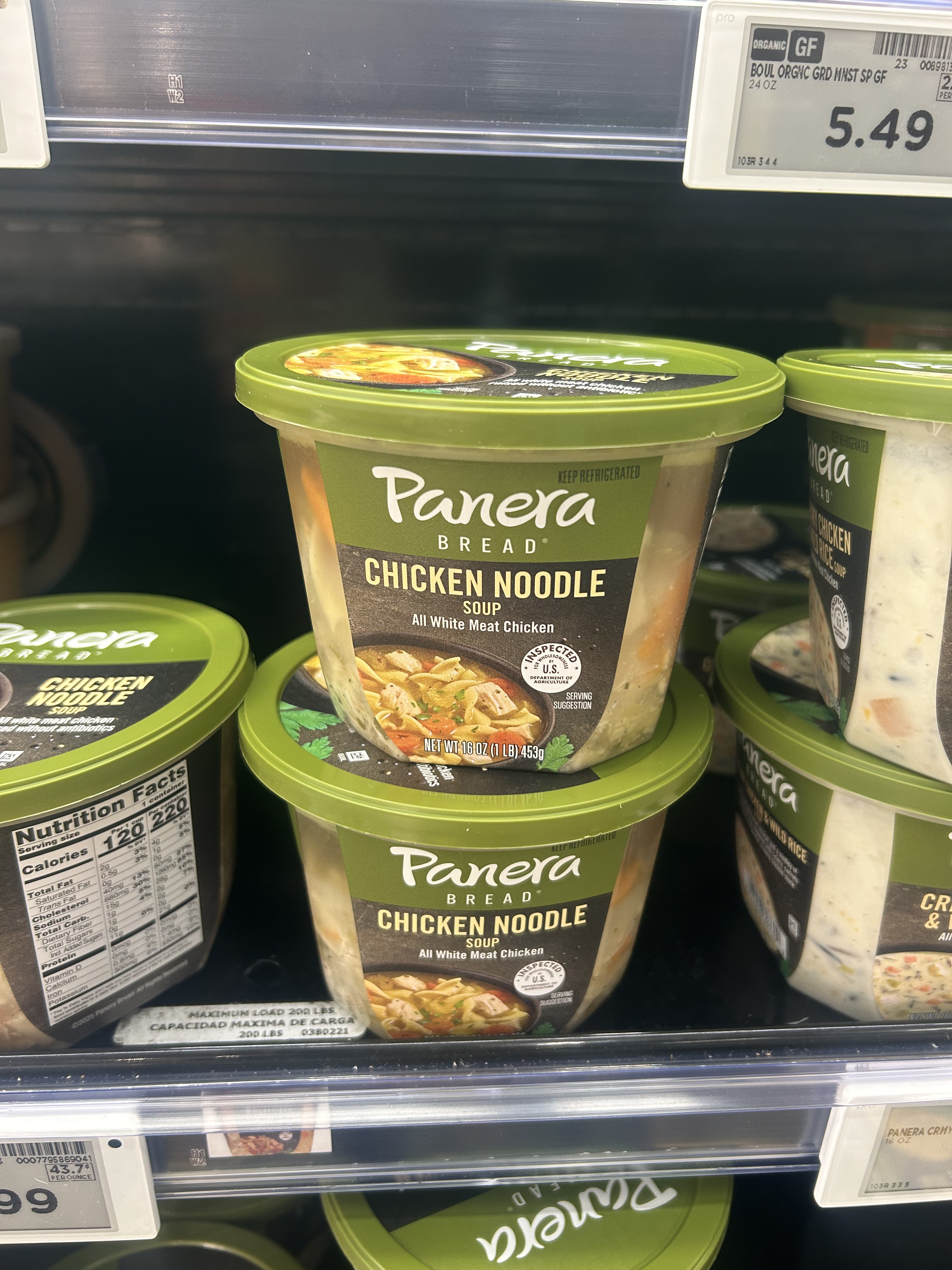
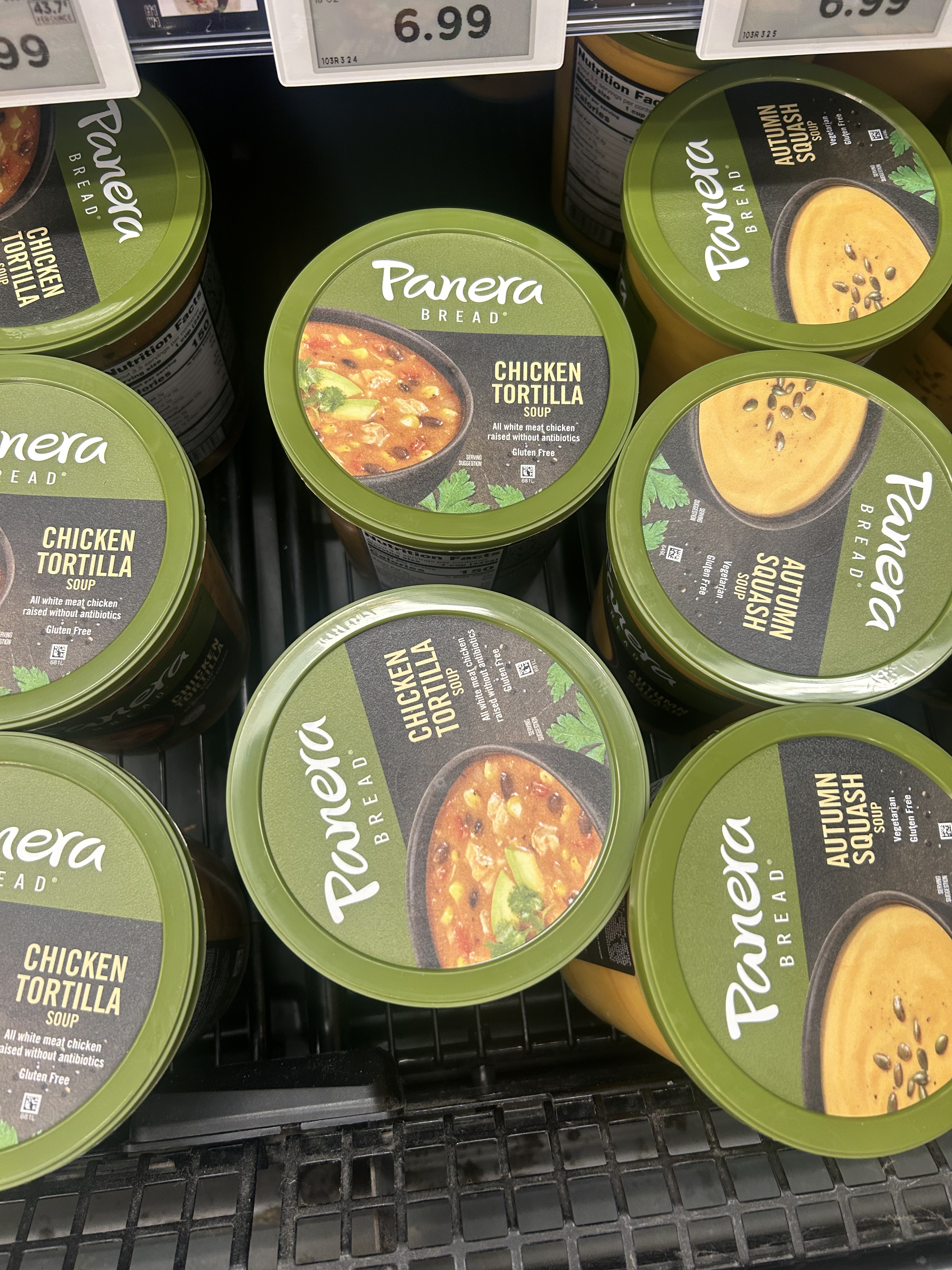
When conceptualizing the food brand and packaging, I went to King Soopers and Natural Grocers to look at similar brands. I took photos, identified trends, and noted what worked and what didn’t. I looked for healthy brands, those that appealed to a younger audience, or soup brands. I especially liked Heyday Canning Co. because it modernizes the tradition of canned food, makes the food feel more fresh and less processed, and aims to remove some of the stigmatism around canned food.
03
Sketches & Name Ideas
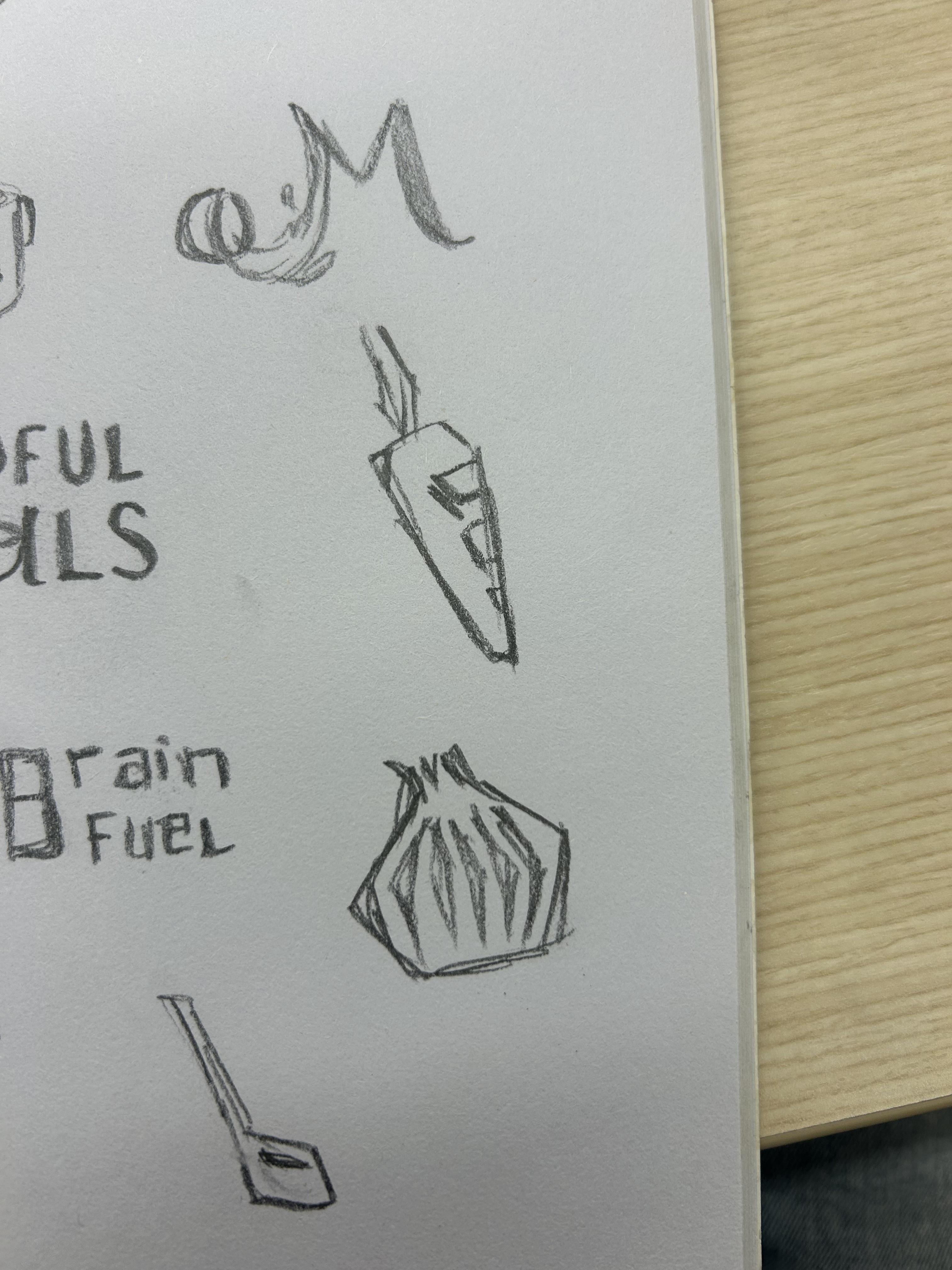
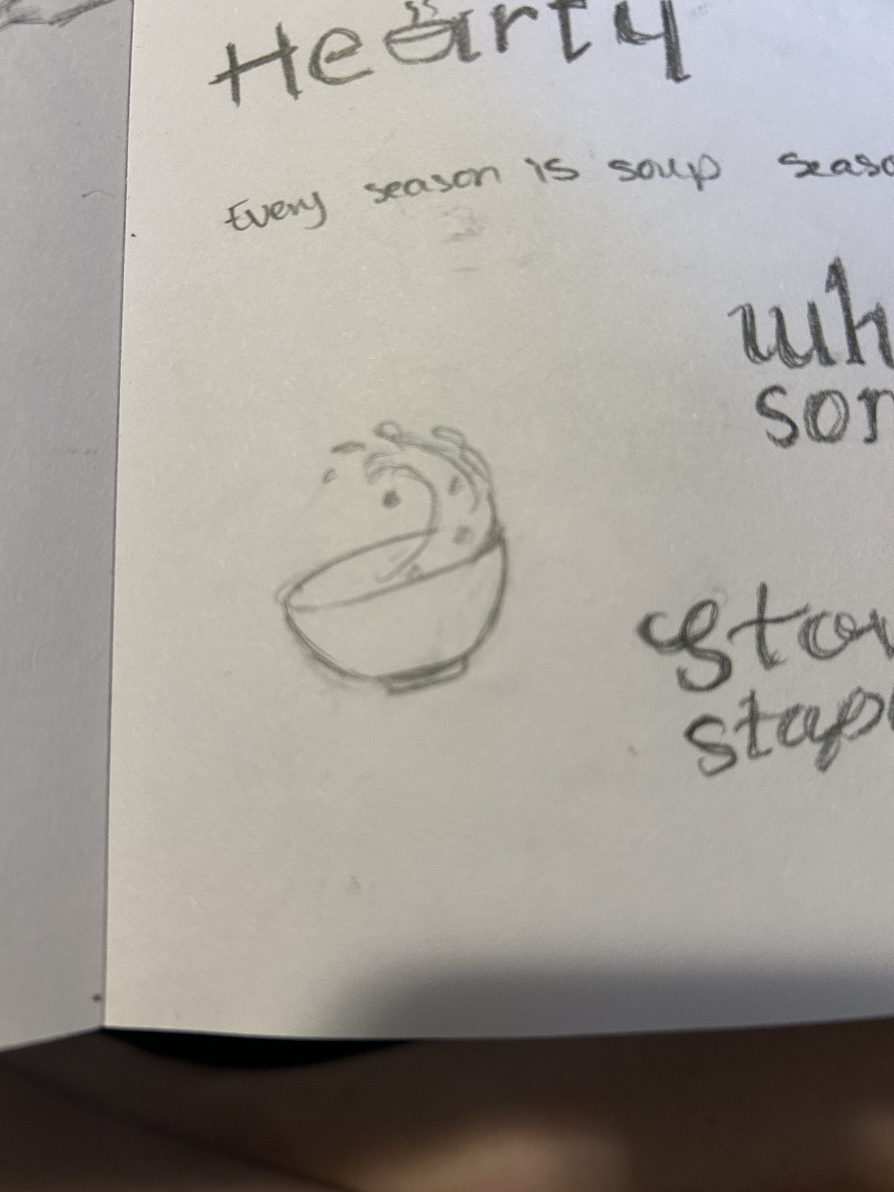
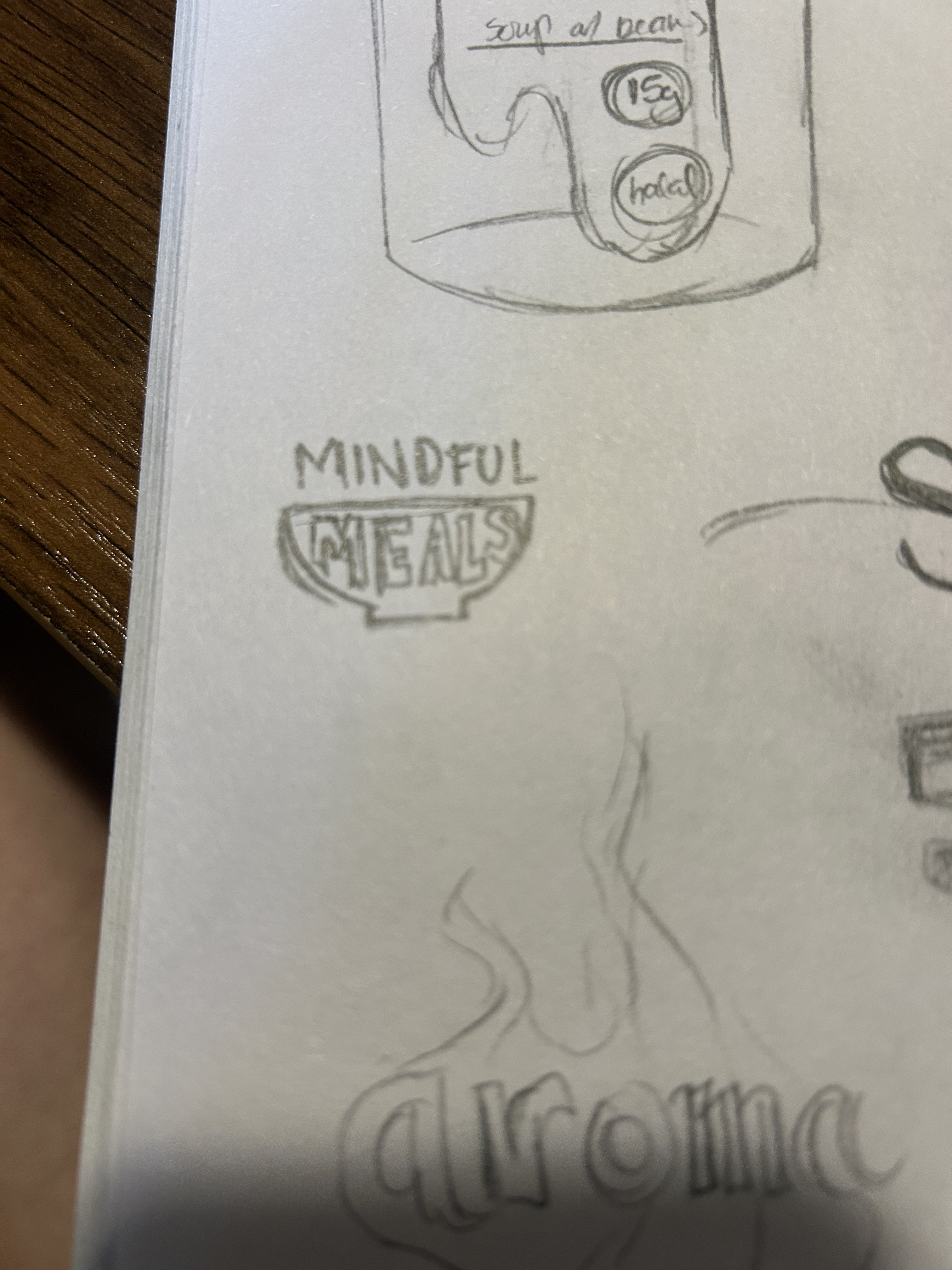
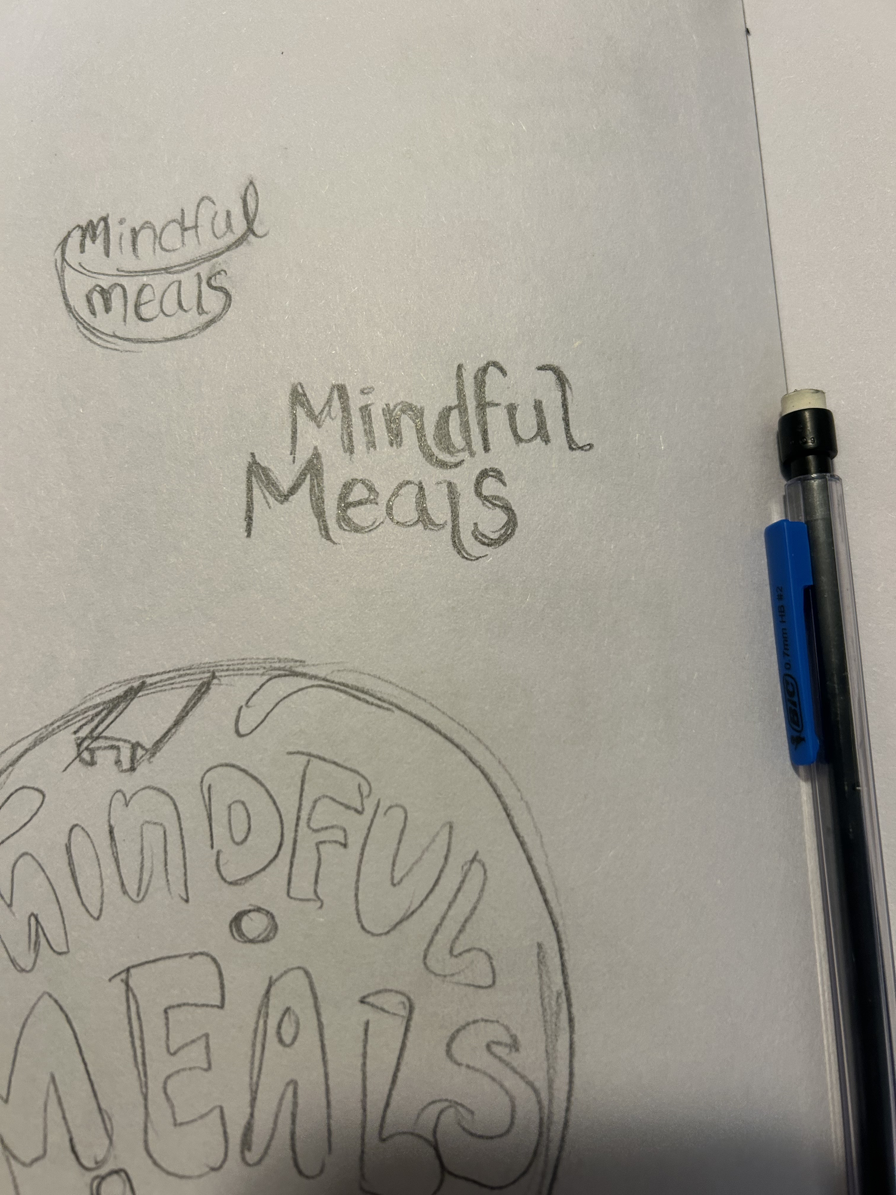
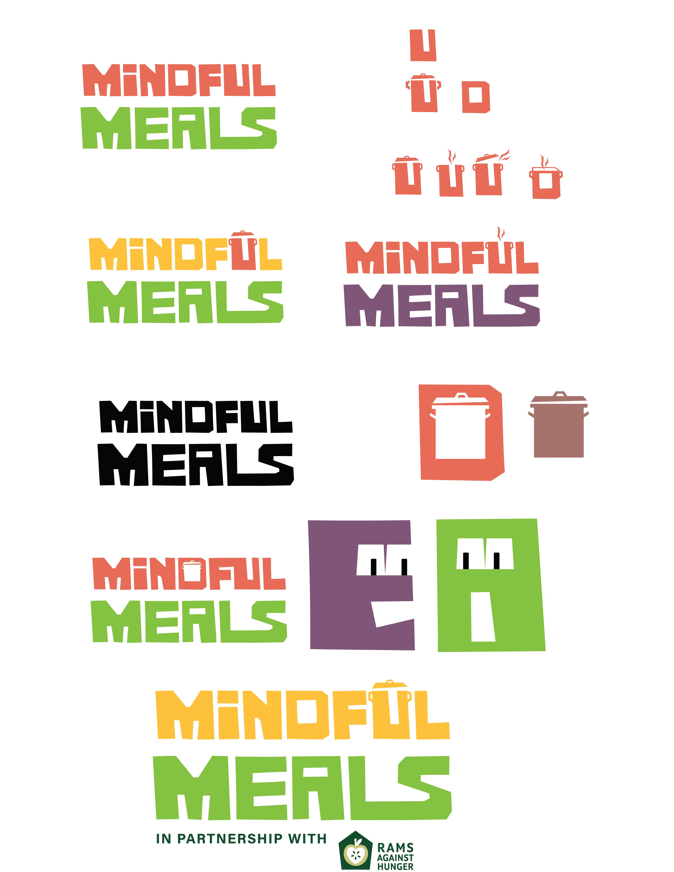
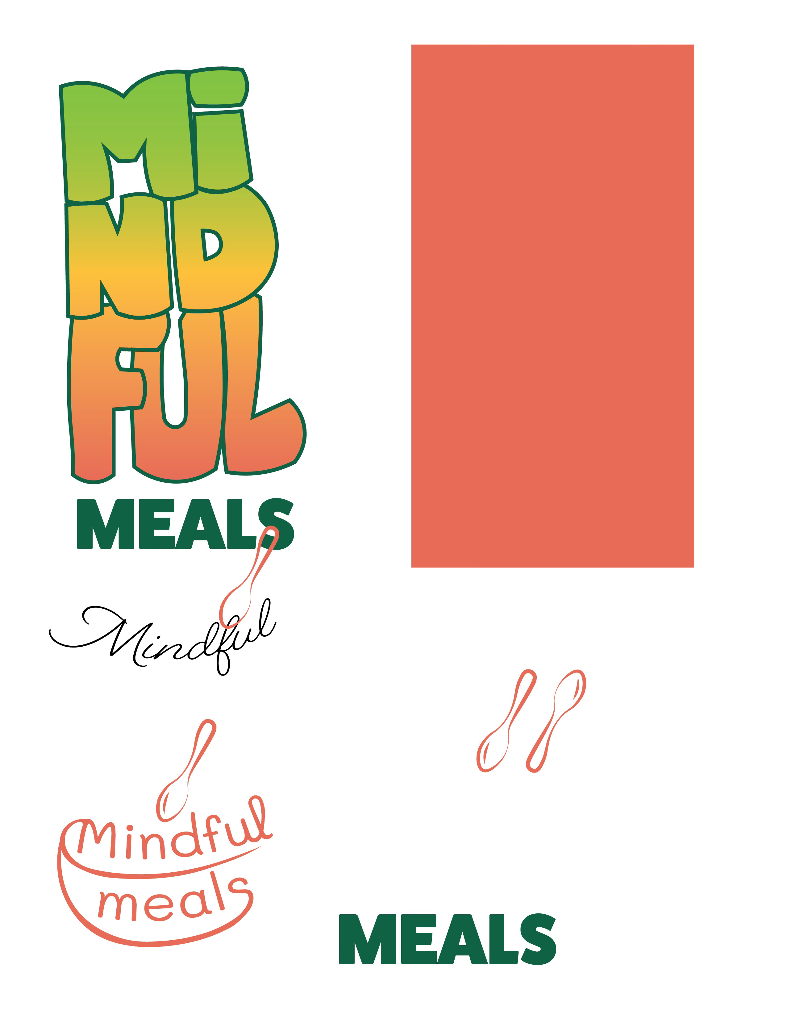
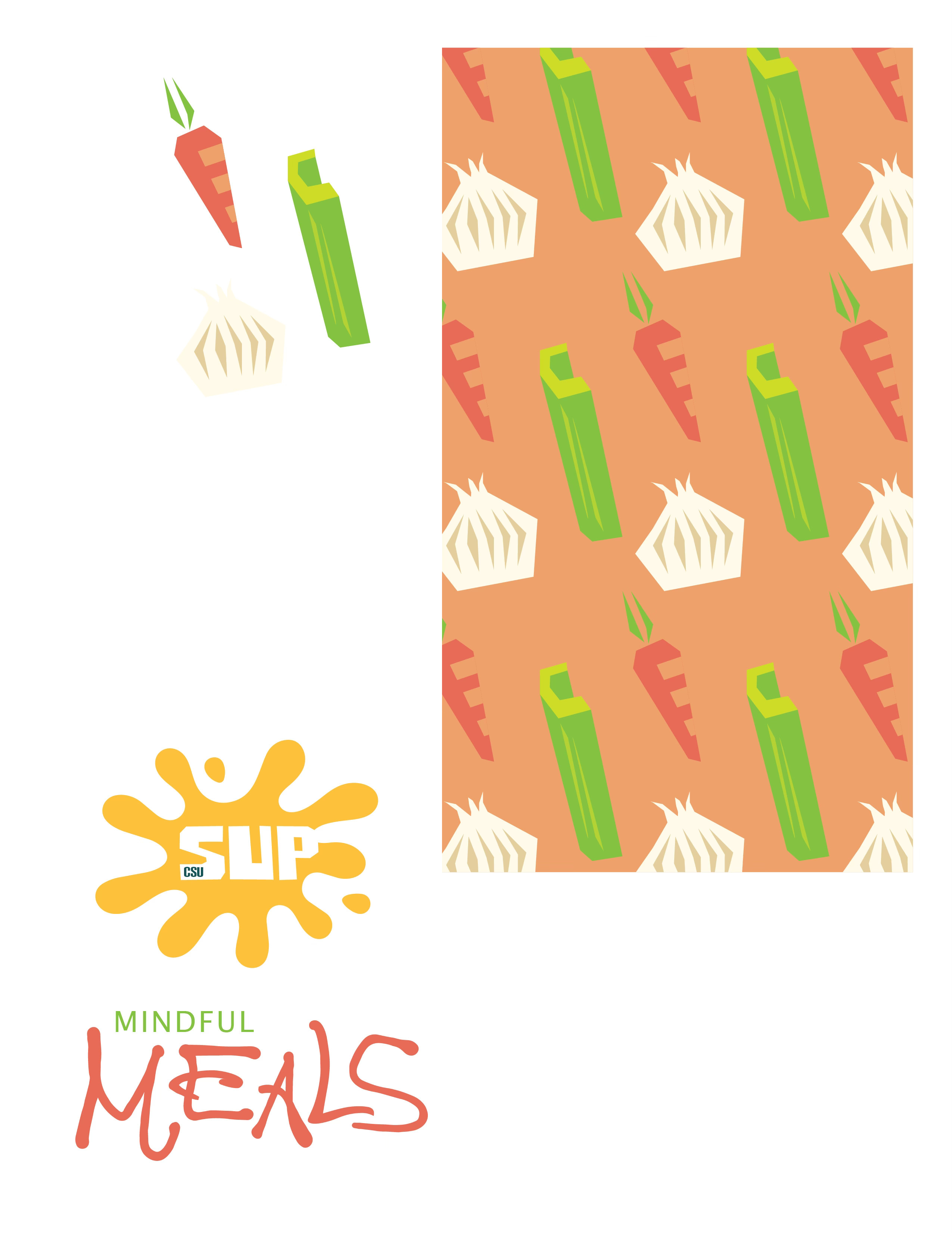
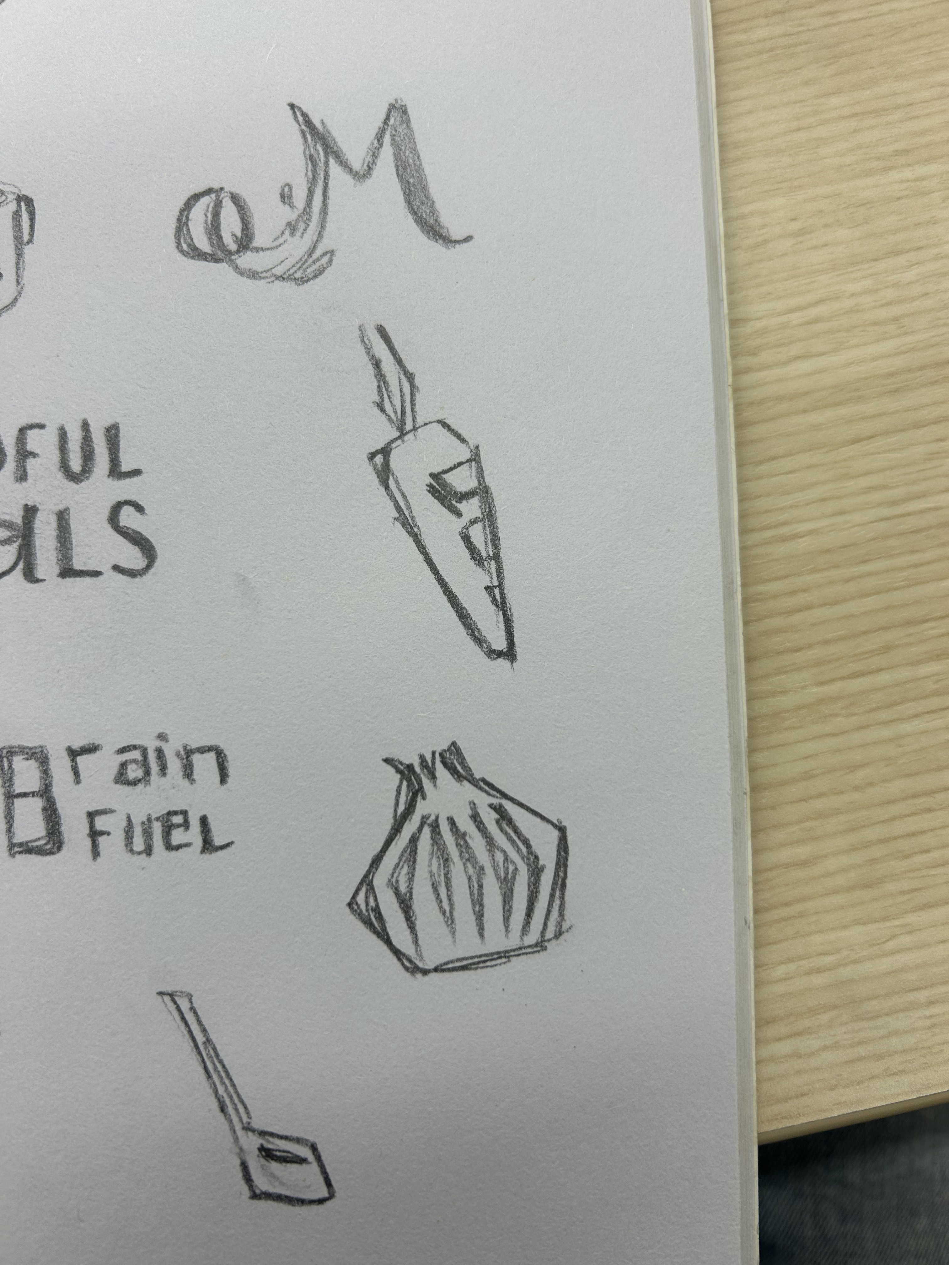
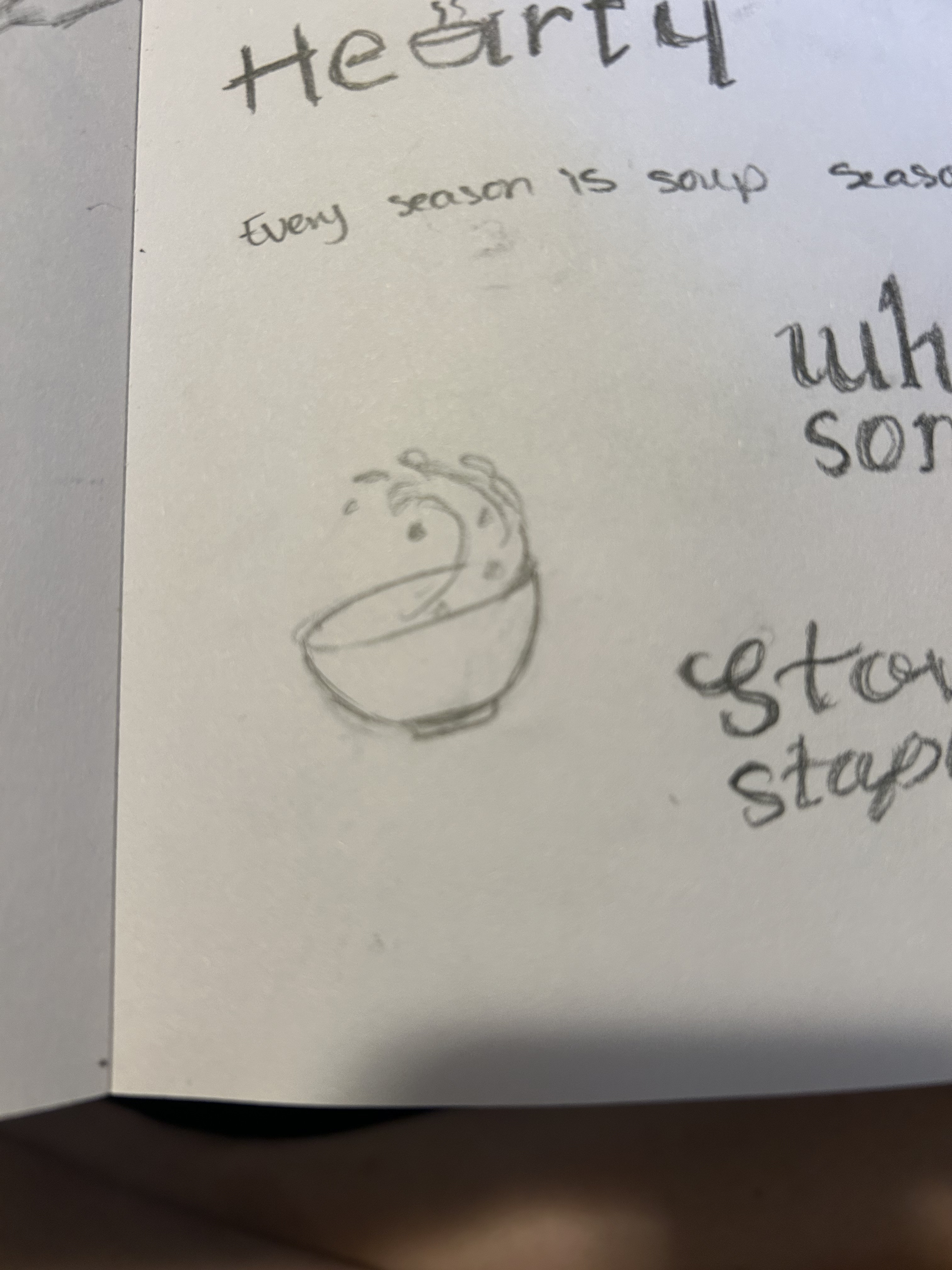
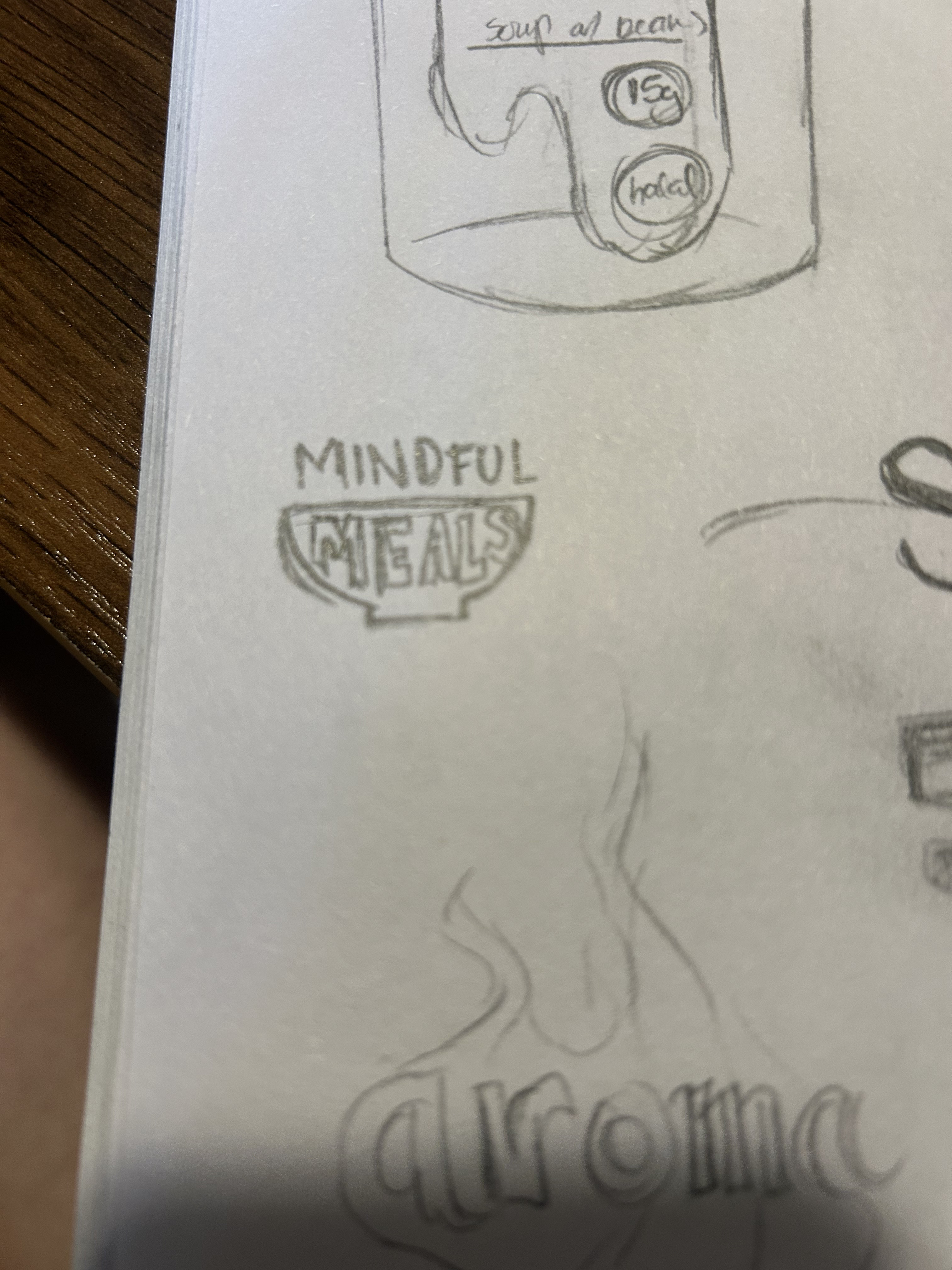
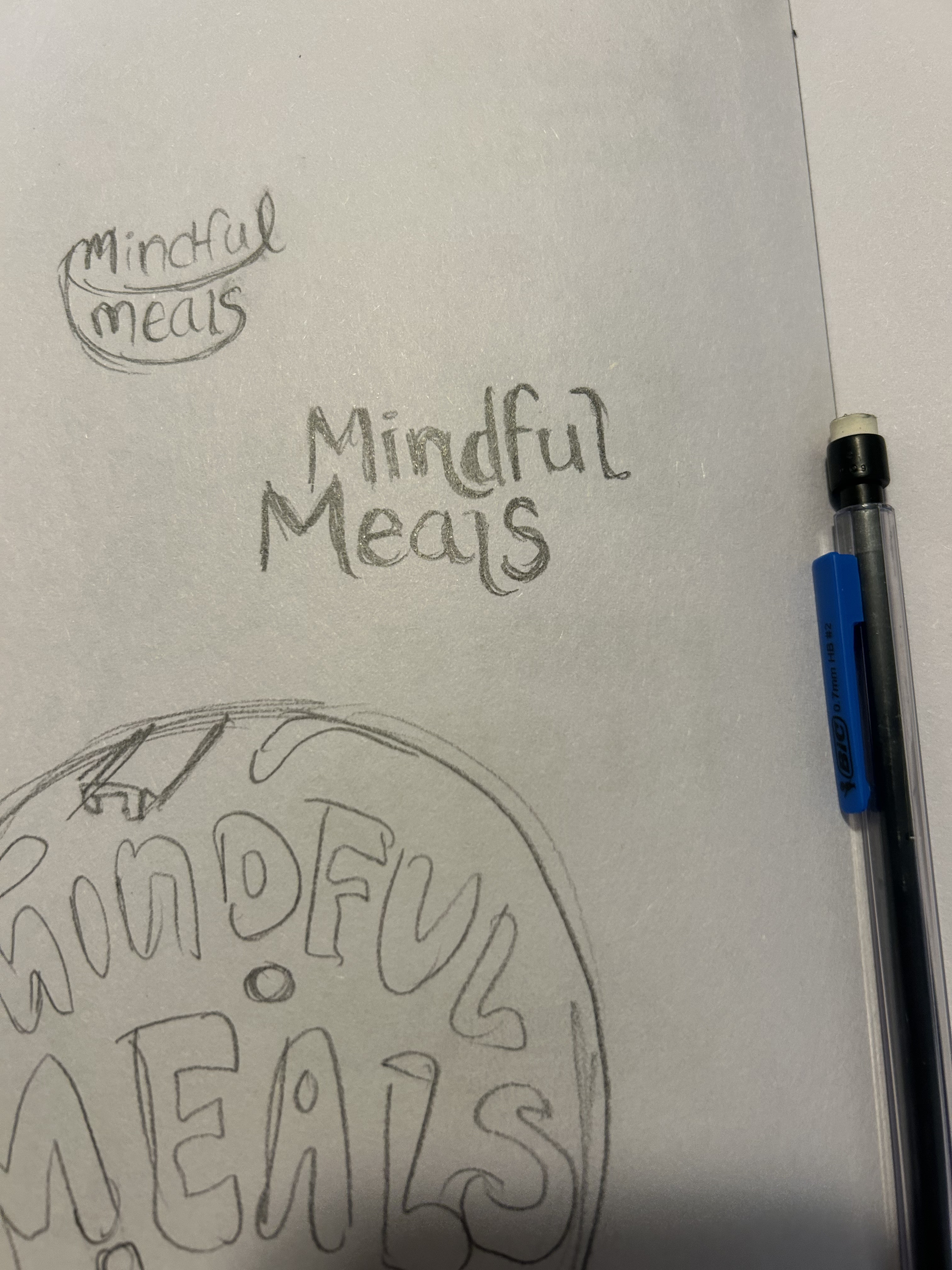
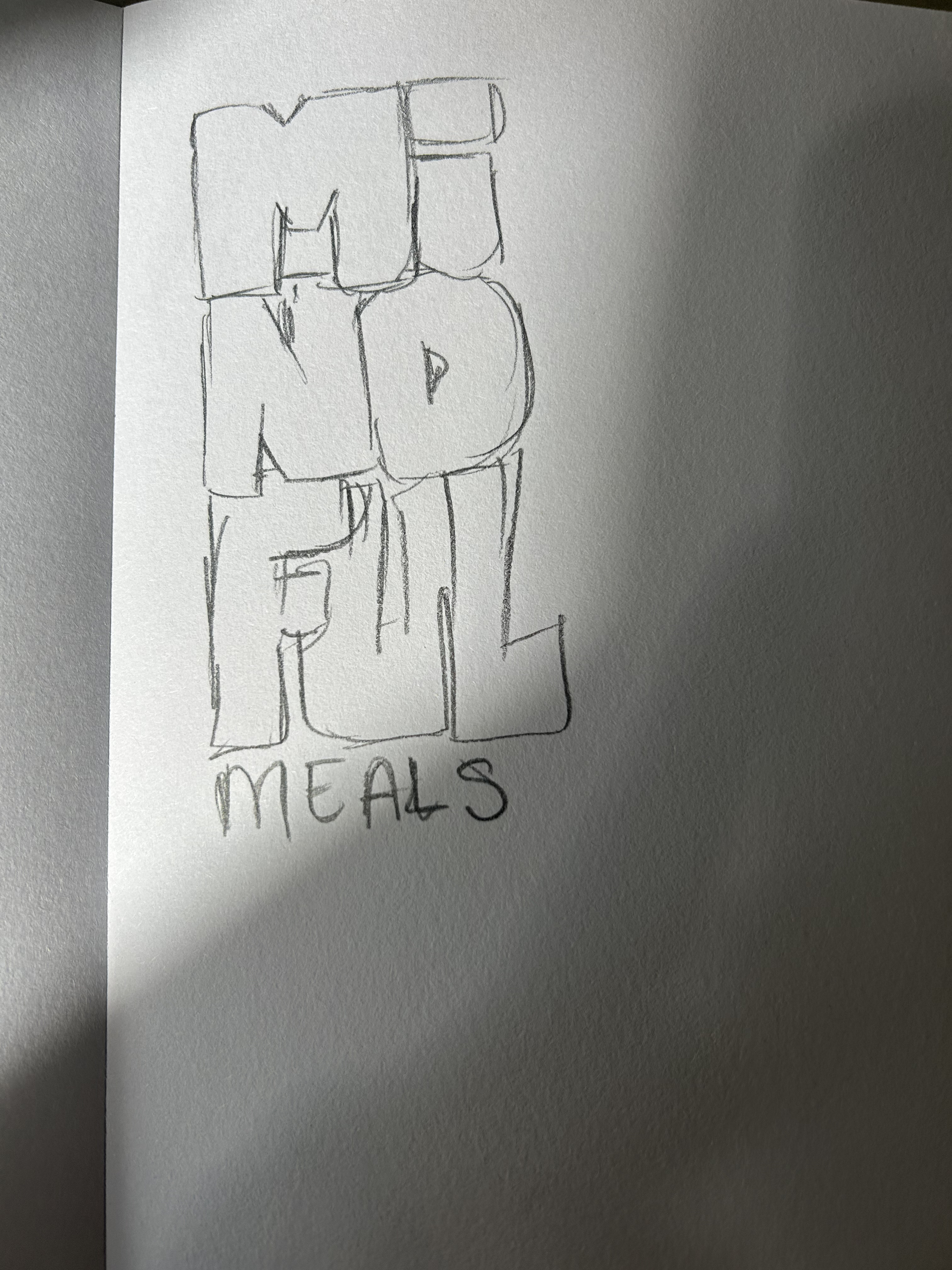
In my sketches, I explored a variety of name options for the program, as well as various illustrations and visual systems. I originally landed on the name “Mindful Meals,” but then I realized that this is an existing and very similar program. I changed the name to Thriving Table instead.
04
Execution
Typography
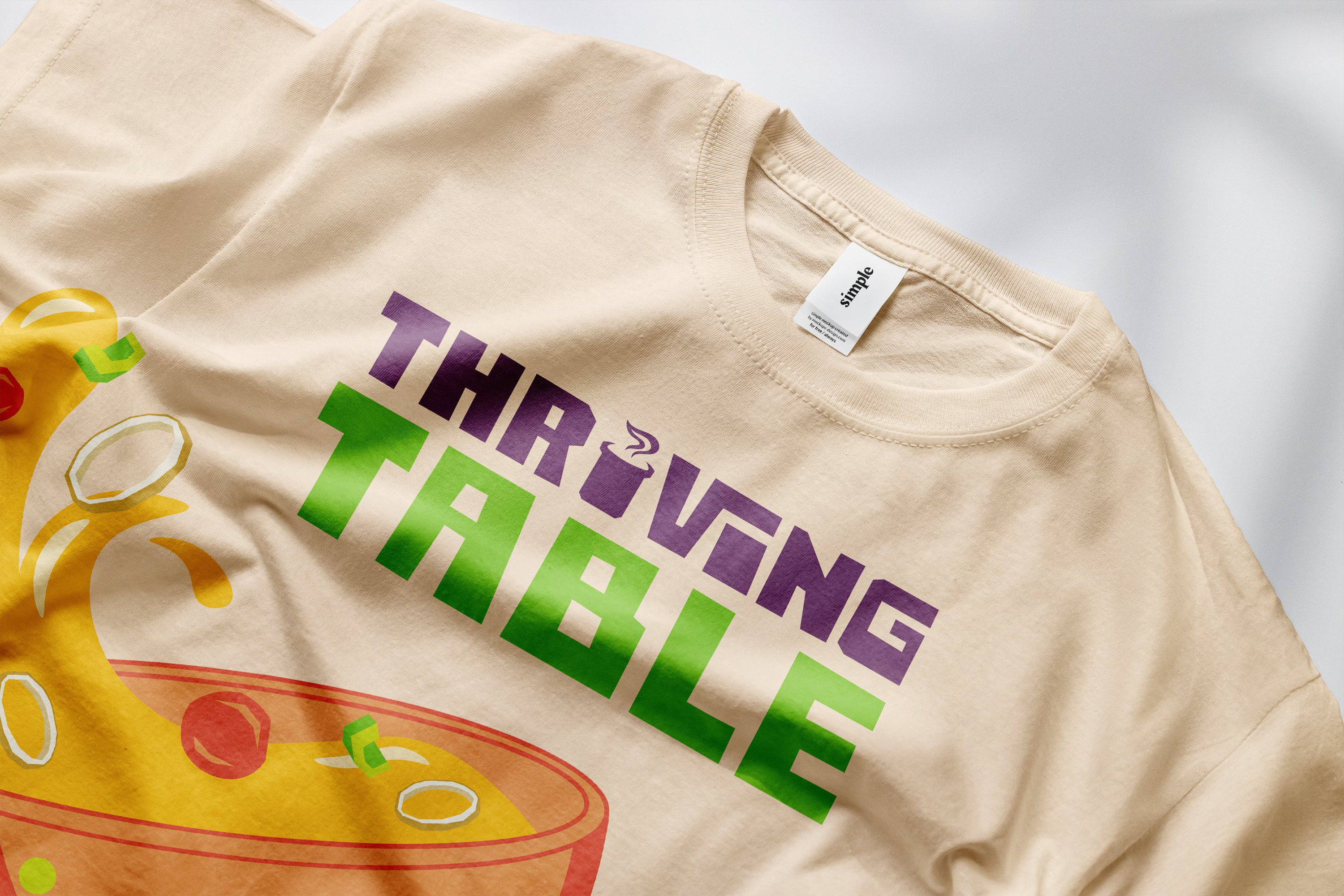
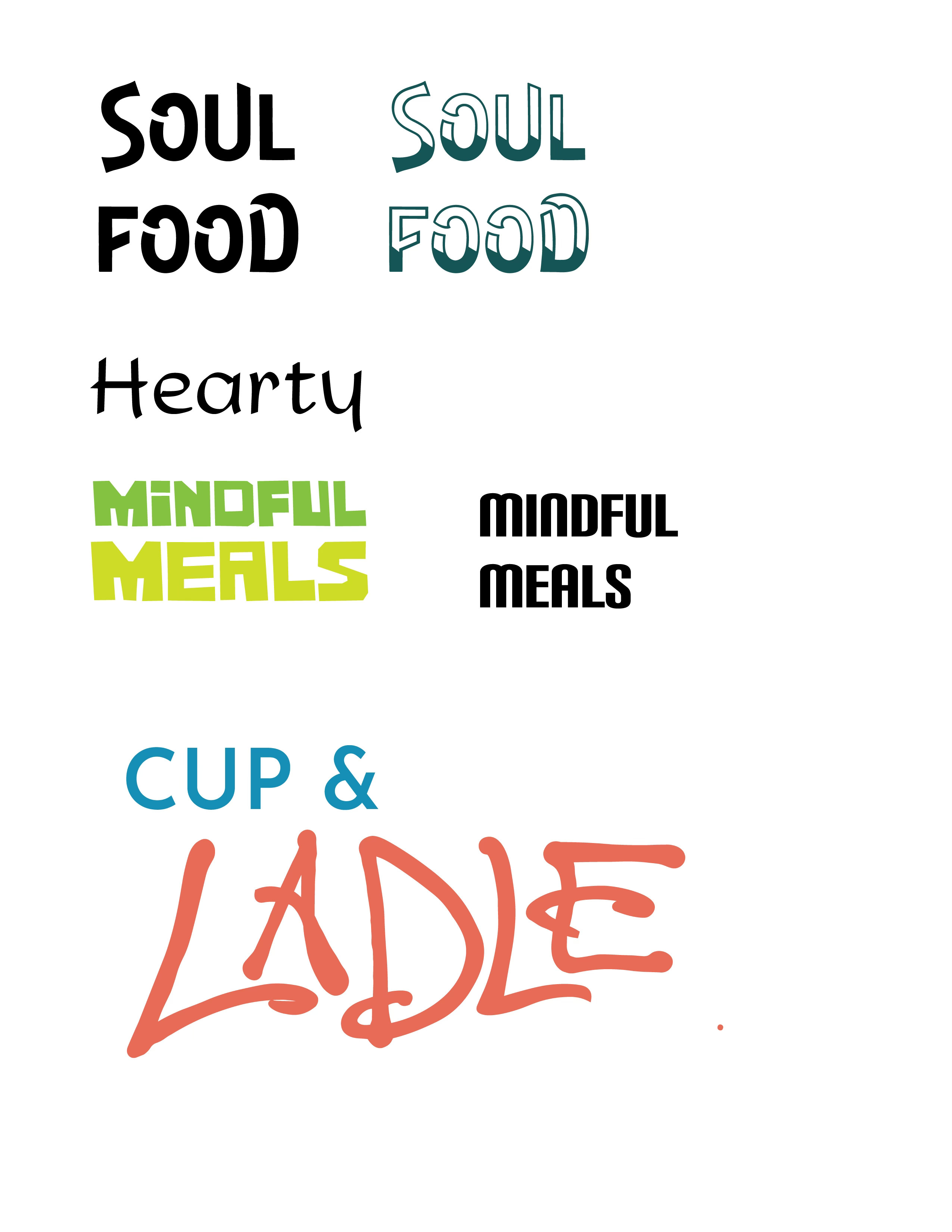
Next, I explored some different type options. I knew I wanted the brand to be bold and colorful, so when I came upon the font Comrade, I knew it was perfect. I still explored other options, but this was the most successful direction.

colors
Thriving Table is a program hosted by CSU, so I chose to use colors from their Energy Palette. I also augmented these with a few colors of my own choosing, to best represent the illustrations.
packaging design · branding
Thriving Table
Thriving Table is a brand identity for a new program launched by the CSU Department of Food Science and Human Nutrition. The program uses donated food items to create nutritious soups and stews that are distributed freely on campus to combat food insecurity. The goal is to create a fun and appealing brand that doesn’t feel like charity.
client
CSU Department of Food Science and Human Nutrition
date
2026
Process

01
Discovery & Strategy
problem
CSU is starting a new program to combat food insecurity on campus, and they want branding that is fun and appealing to students. They want to avoid creating stigma around accepting free food, so the brand shouldn’t look like a charity brand. The program will include various soups and stews, so they need packaging that can be produced affordably and used across a variety of meals.
solution
Thriving Table, a colorful brand that emphasizes good meals as a necessity in order to thrive in an academic environment. Everyone should have a seat at the table regardless of their economic means.
key questions
- How does this brand reach its target audience? (CSU students, international students)
- How can the packaging be versatile and not geared toward one specific recipe or ingredient?
- Can the CSU energy color palette be incorporated?
- Where will this food be accessed and what designs are necessary to represent the brand in a physical space? (flyers, freezer, etc.)
02
Research
Grocery store
When conceptualizing the food brand and packaging, I went to King Soopers and Natural Grocers to look at similar brands. I took photos, identified trends, and noted what worked and what didn’t. I looked for healthy brands, those that appealed to a younger audience, or soup brands. I especially liked Heyday Canning Co. because it modernizes the tradition of canned food, makes the food feel more fresh and less processed, and aims to remove some of the stigmatism around canned food.
03
Sketches & Name Ideas
In my sketches, I explored a variety of name options for the program, as well as various illustrations and visual systems. I originally landed on the name “Mindful Meals,” but then I realized that this is an existing and very similar program. I changed the name to Thriving Table instead.
04
Execution
Typography
Next, I explored some different type options. I knew I wanted the brand to be bold and colorful, so when I came upon the font Comrade, I knew it was perfect. I still explored other options, but this was the most successful direction.
colors
Thriving Table is a program hosted by CSU, so I chose to use colors from their Energy Palette. I also augmented these with a few colors of my own choosing, to best represent the illustrations.