Summer internship ·
book cover design
Tyndale House Publishers
client
Tyndale House Publishers
date
2025
Tyndale House Publishers is a faith-based publishing company that produces books in both English and Spanish. As a summer intern, I completed these 5 published book covers in 3 months. I collaborated with the acquisitions teams, presented 3-4 compositions for each book, made revisions, and polished the final covers.
Brown, LeatherLike
A timeless approach to scripture design featuring a supple faux-leather finish, a minimalist blind debossed mountain motif, and traditional gold foil edging. Designed to age beautifully with daily use.
Purchase
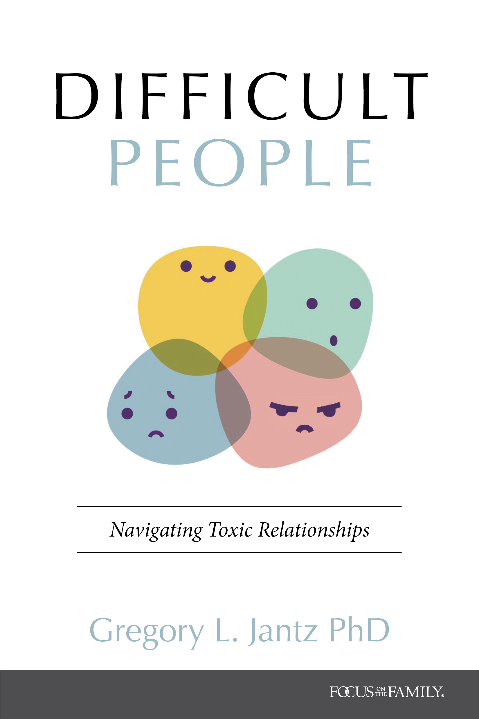
Difficult People
Nonfiction book cover developed during a summer internship at Tyndale House Publishers. The acquisitions team requested a tone that felt approachable rather than confrontational, resulting in a playful visual interpretation of complex emotions.
Designer: Zoe Coats, Art Director: Ron Kauffman
Purchase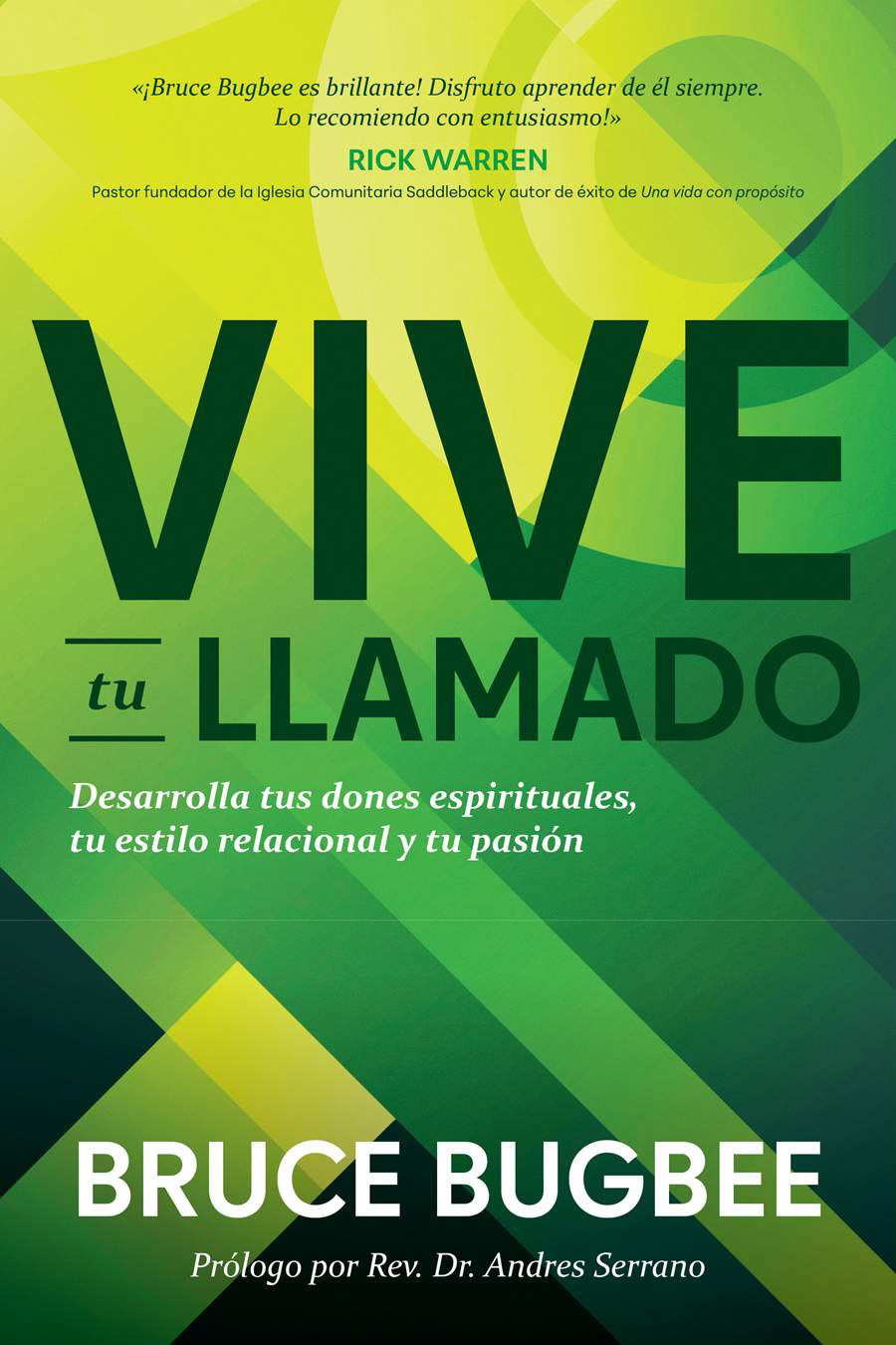
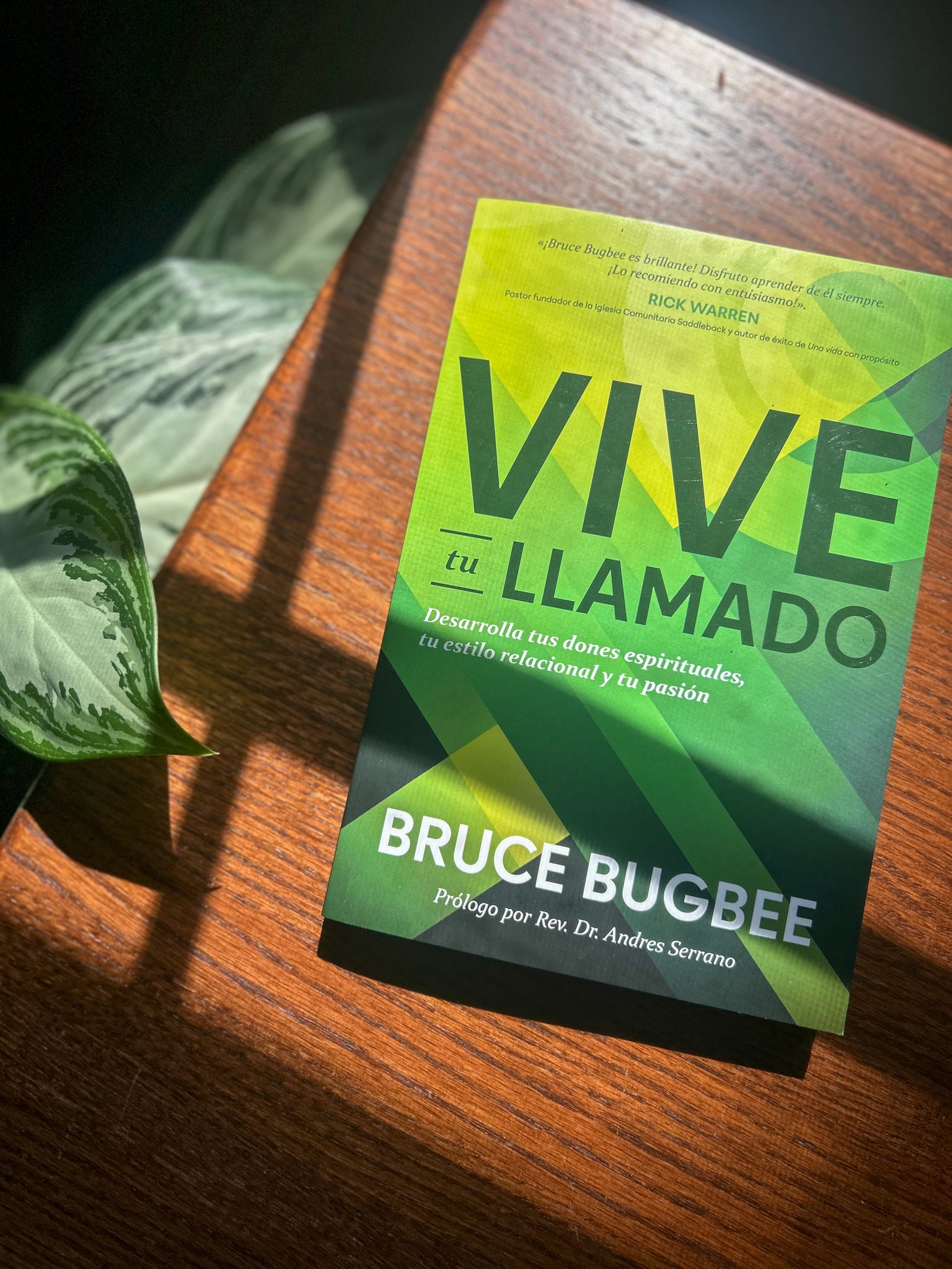
Vive tu Llamado
Spanish-language book cover adapted from an English edition. Bold typography and geometric forms were developed within a two-day concept sprint, balancing editorial direction with a strong visual presence.
Designer: Zoe Coats, Art Director: Al Navata
Purchase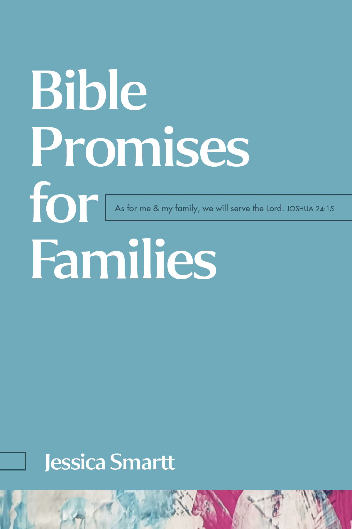
Bible Promises for Families
Cover developed for the Bible Promises series at Tyndale House Publishers. The project focused on creating a new color palette and selecting artwork while maintaining the established typographic system of the series.
Designer: Zoe Coats, Series Designer: Libby Dykstra
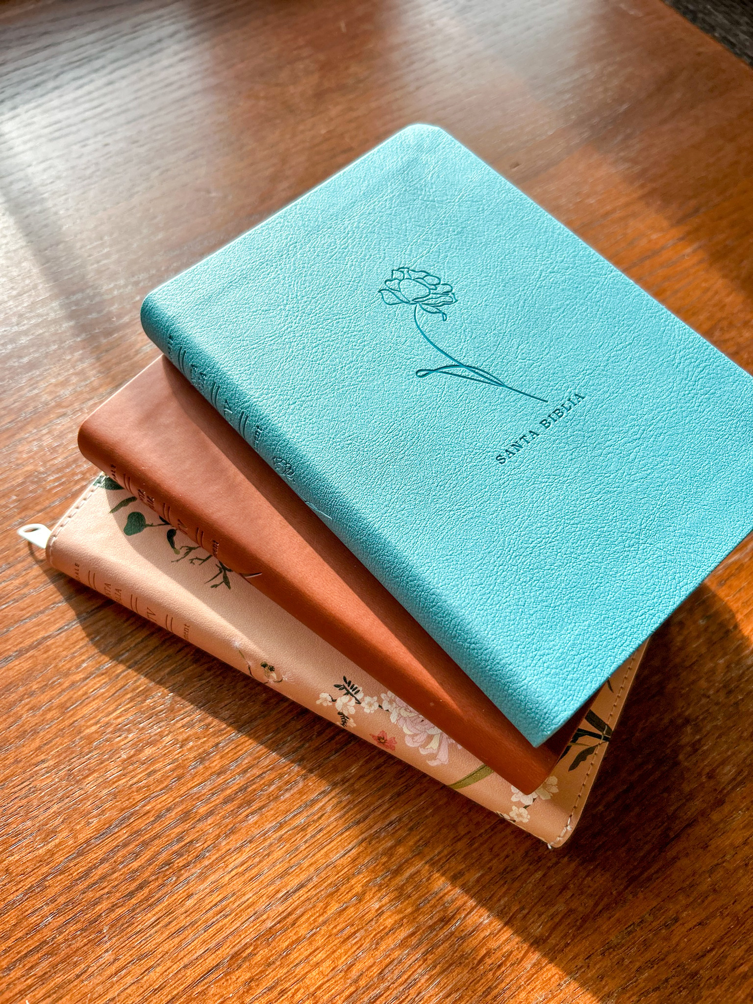
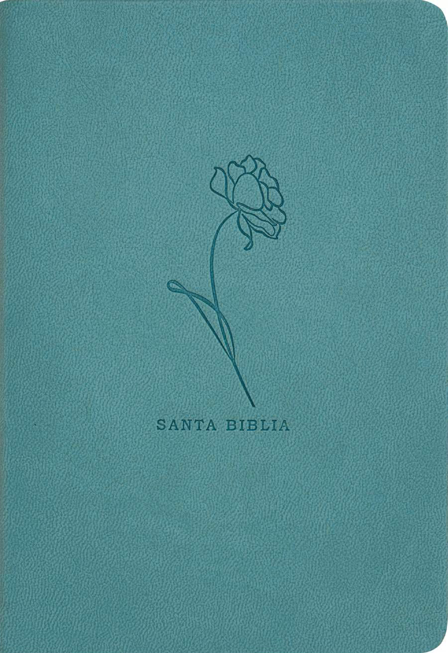
Teal, LeatherLike
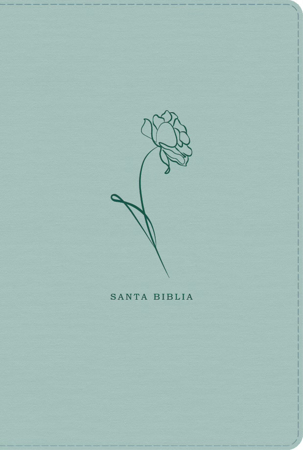
A minimalist approach featuring a delicate, single-line floral illustration. The debossed artwork leaves plenty of breathing room, allowing the rich teal color and soft-touch material to stand out alongside the simple, modern typography.
Purchase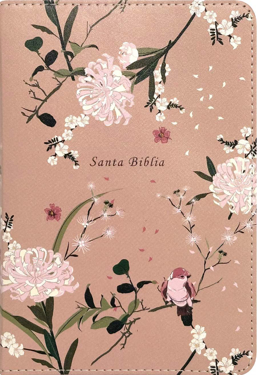
Coral Blooms, LeatherLike
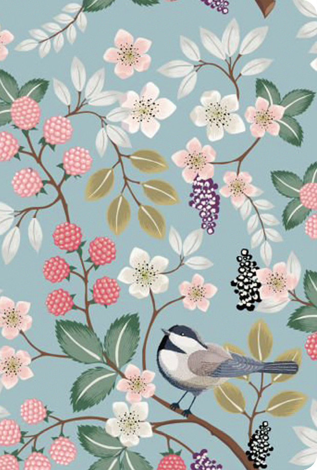
A vibrant botanical pattern positioned to seamlessly wrap the entire cover and spine. Special attention was paid to the layout, ensuring the floral details flow beautifully alongside the decorative stitching and protective zipper edge.
Purchase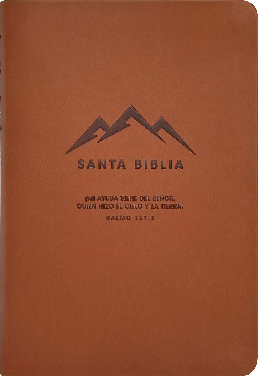
Brown, LeatherLike
A minimalist approach featuring a delicate, single-line floral illustration. The debossed artwork leaves plenty of breathing room, allowing the rich teal color and soft-touch material to stand out alongside the simple, modern typography.
PurchaseProcess

01
Project Objective
goal
Create a series of three Spanish Bible covers, designed to be heat-stamped onto a leather-like cover. These covers should be based on the three covers provided in subject matter and color, but can use unique artwork.
specifications
- 1 brown cover with a mountain motif (trim size: 4.125 x 6.125 in.)
- 1 teal cover with a flower (trim size: 4.125 x 6.125 in.)
- 1 printable PU cover with a full floral background, preferably pink or teal (trim size: 4.125 x 6.125 in.)
reference images
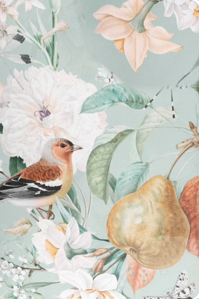
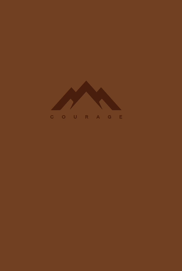
These reference images were provided by the Spanish acquisitions team. They are discarded cover compositions for English Bible covers that would be reused, unless I designed something better.
02
Concept Development
sketches
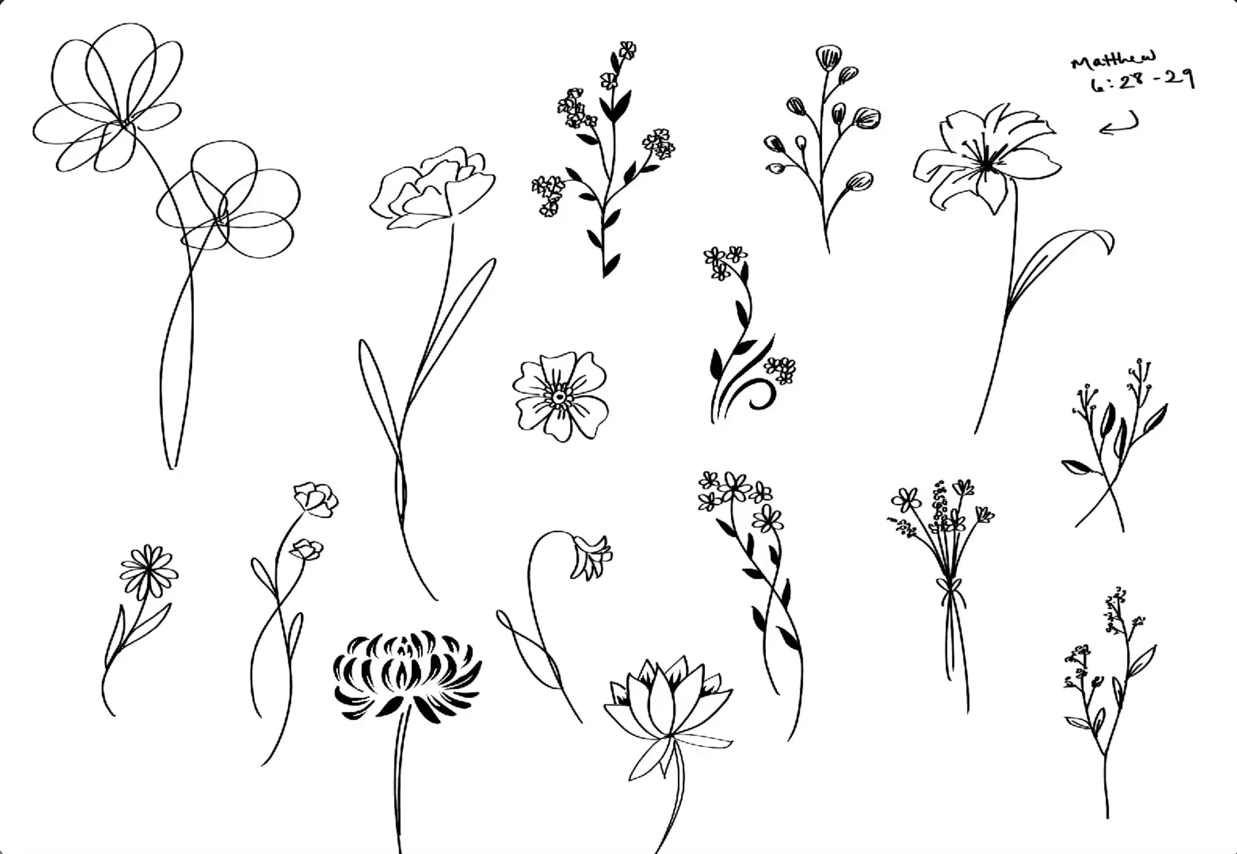
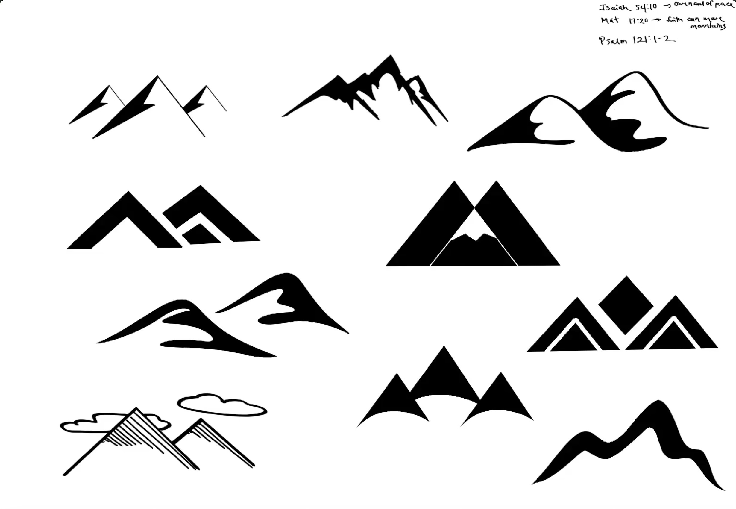
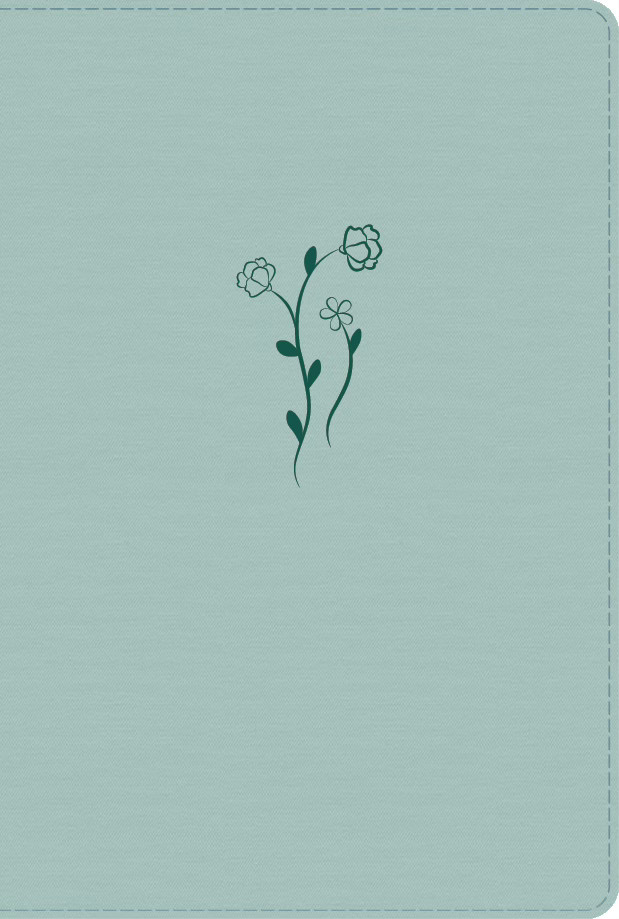
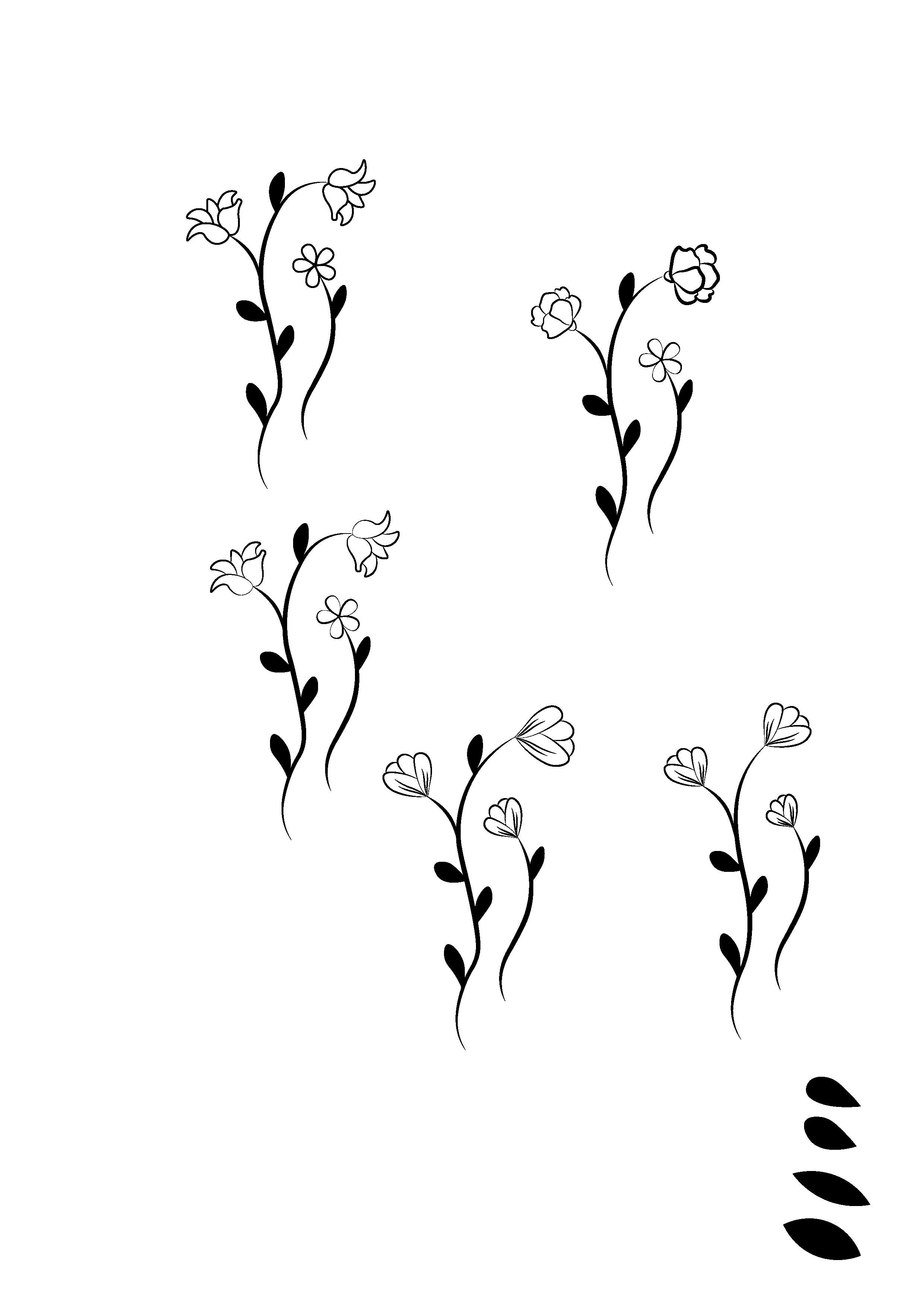
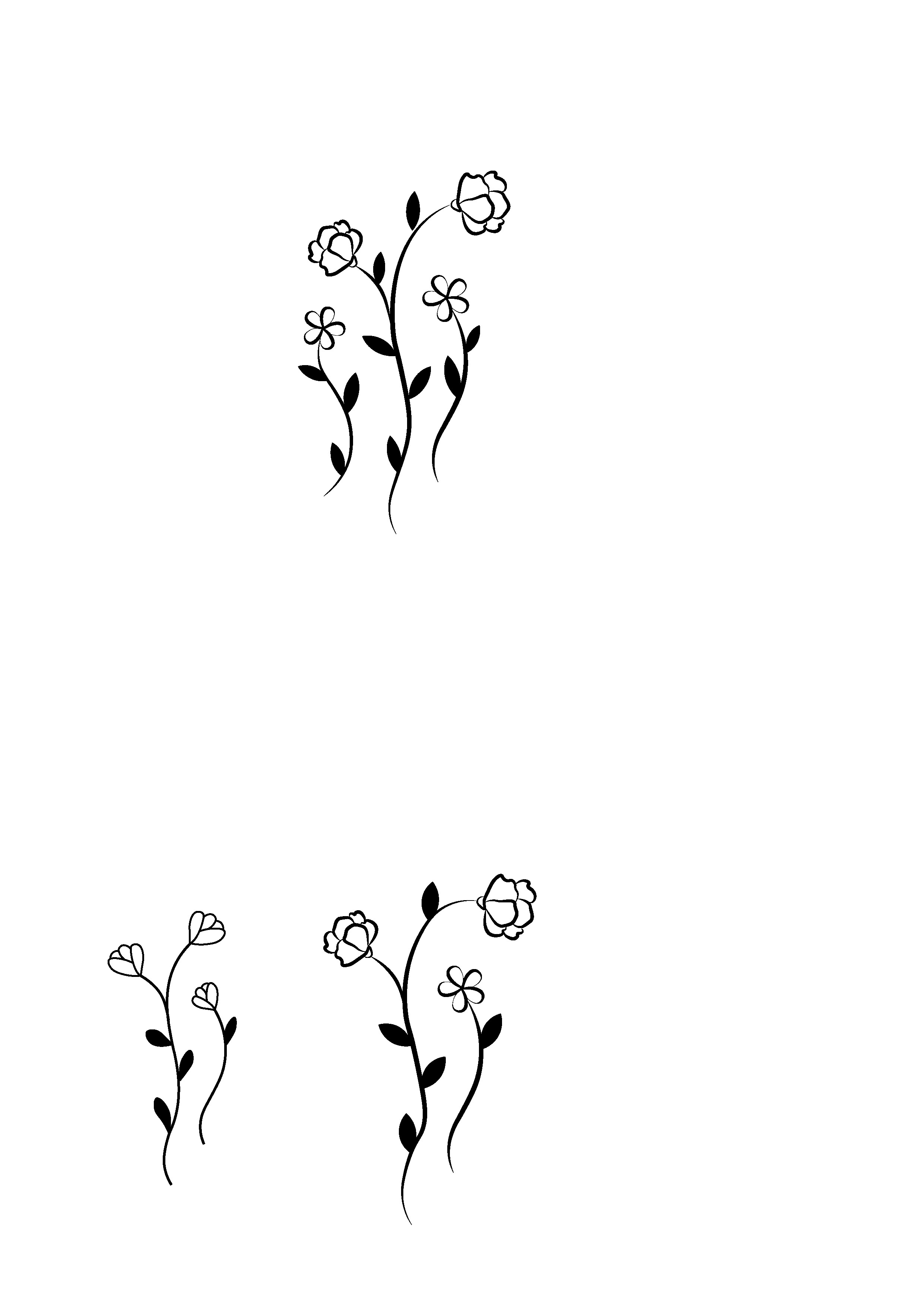
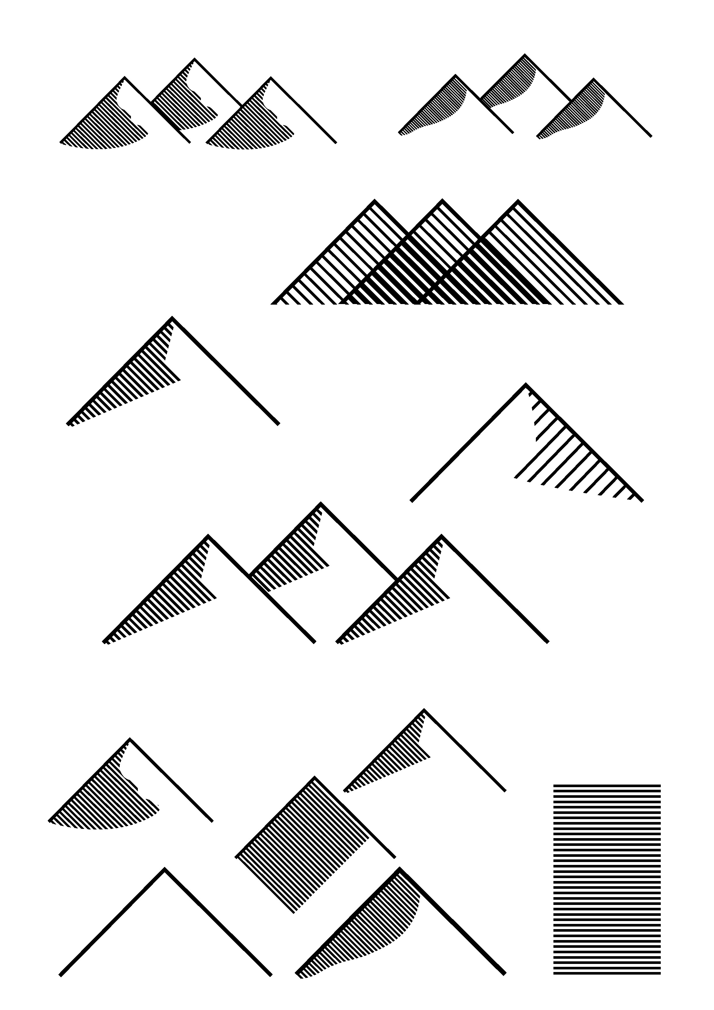
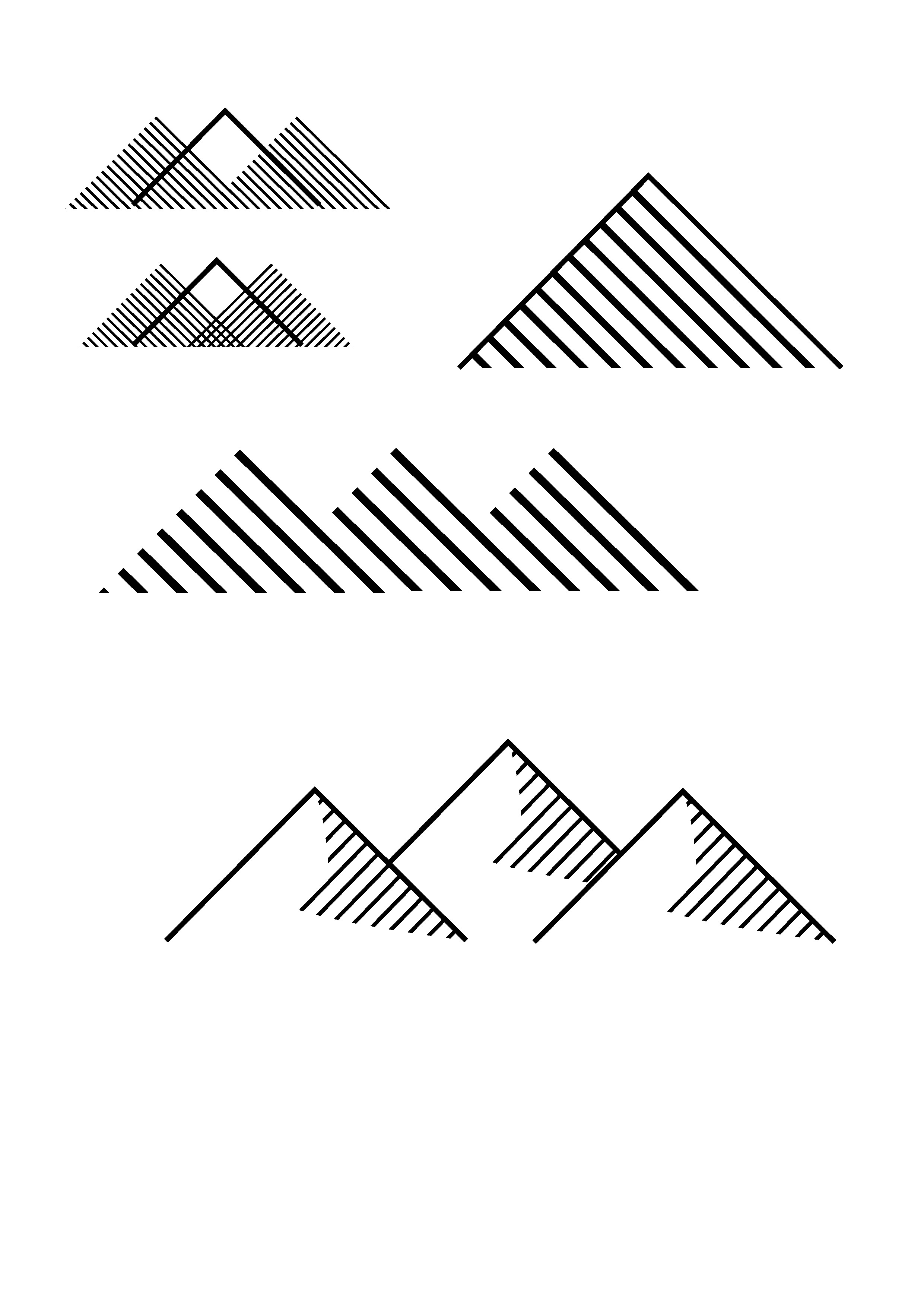
In my sketches, I kept to the simplicity of the reference covers, but with new geometric and flowing forms. I wanted to create something new and different from the hundreds of other Bible cover designs created by Tyndale.
vectors
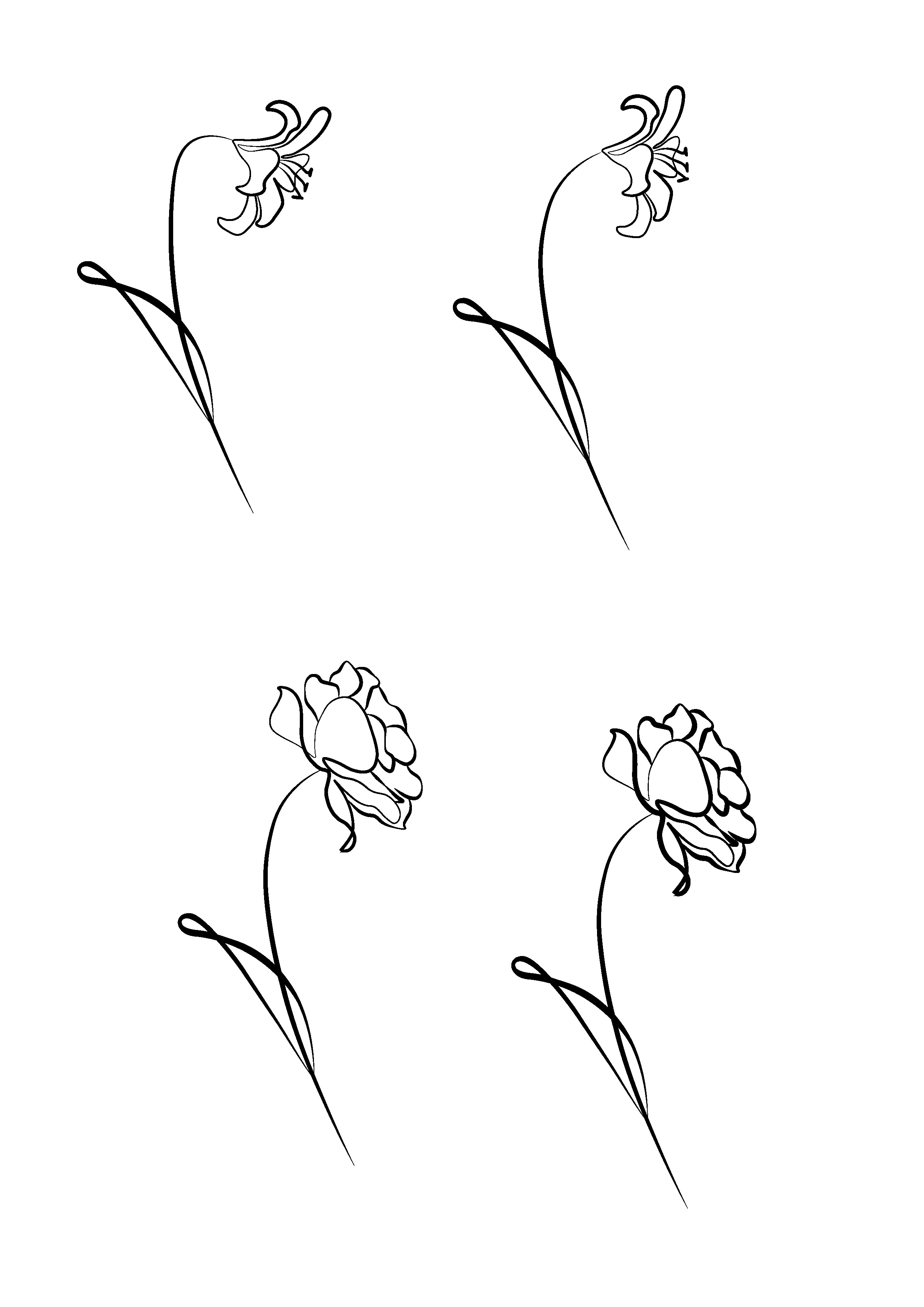
I then brought my sketches into Illustrator and vectorized them, testing them out on different cover layouts. I also kept in mind the final medium of the designs—heat stamped—which means they will have a texture that can be felt on the cover. Based on this, I tried to explore the texture of line work in my graphics.
stock imagery
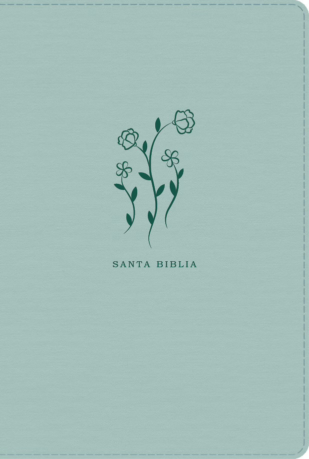
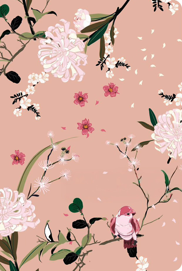
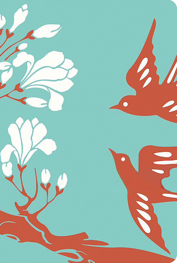
Tasked with sourcing feminine floral and bird imagery, I steered the design toward a more delicate, wider composition. I pitched three concepts to the acquisitions team, offering a spectrum from the original vision to a completely new stylistic approach.
03
Compositions & Presentation
compositions
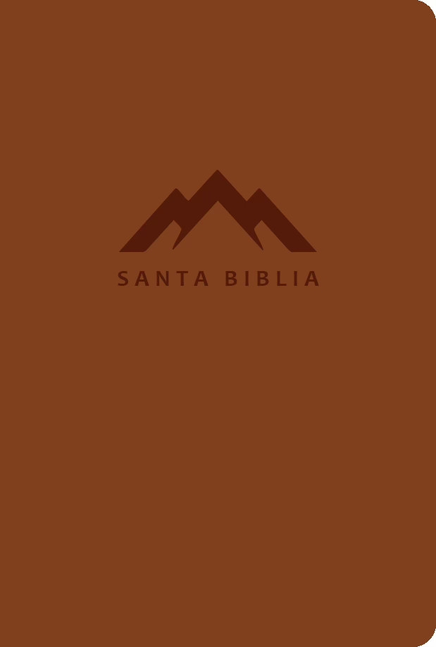
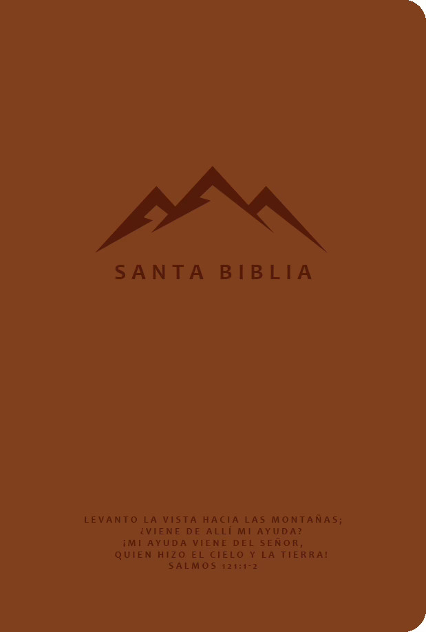
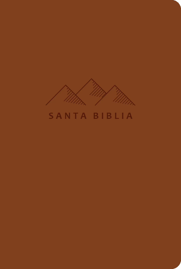
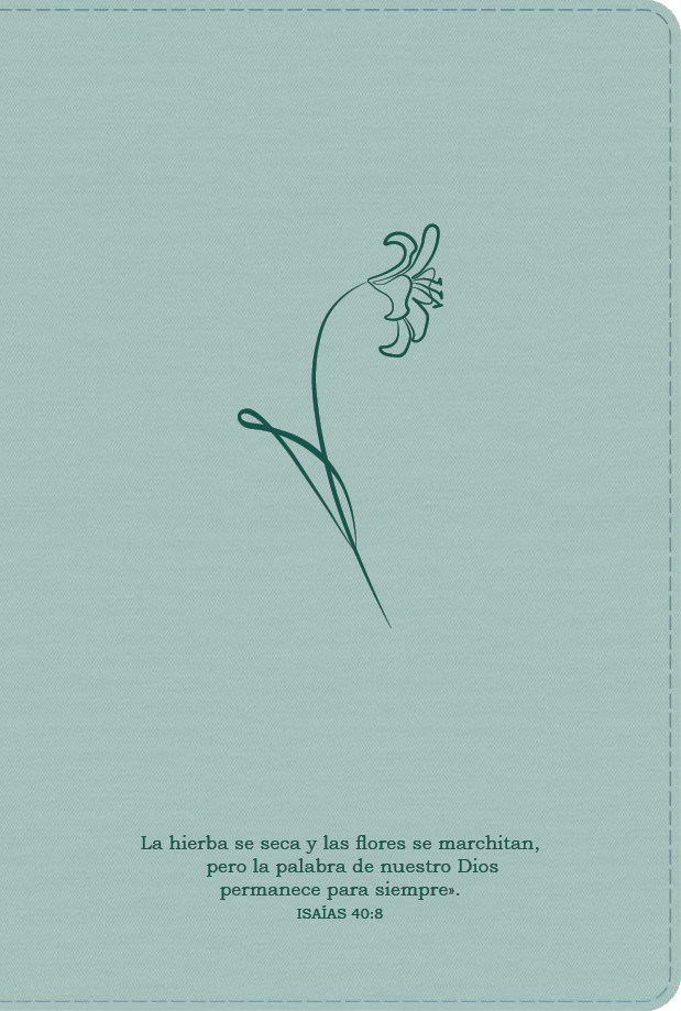
presentation
I presented my cover designs to the team, highlighting my thought process and how my designs met their original goals. I also learned to put my best foot forward and not be afraid to share which composition I thought was the strongest. View the full presentation here.
04
Revisions
incorporating feedback
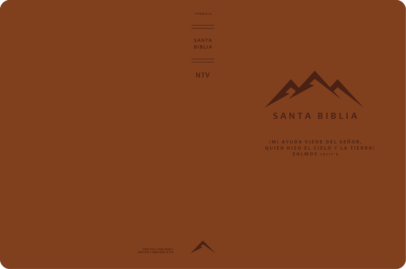
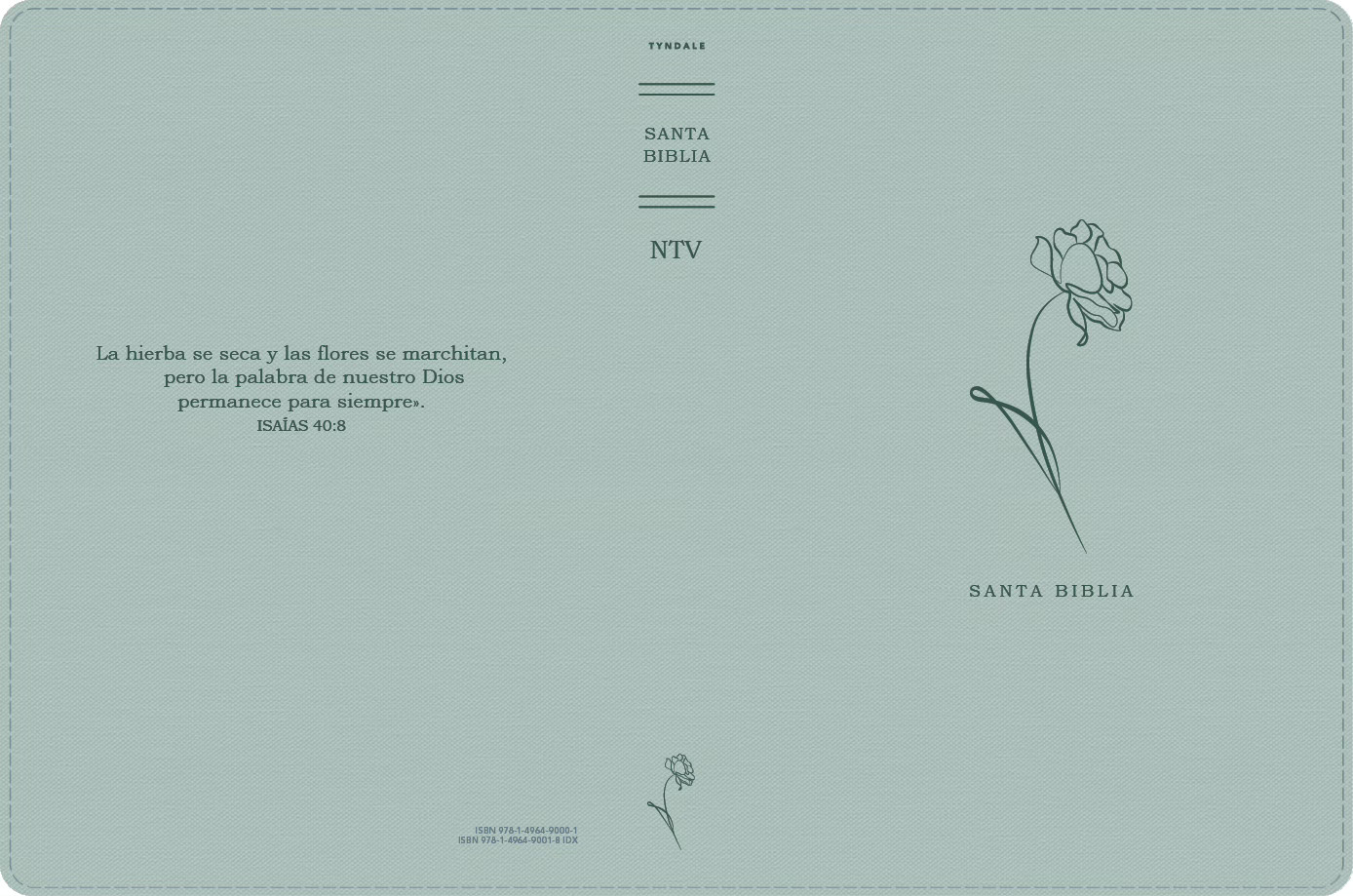
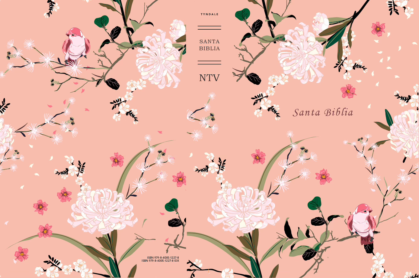
One of the most crucial steps is incorporating client feedback. During the presentation, I took notes on what the team preferred. They wanted the words “Santa Biblia” in the center of the floral cover and to move the subtext on the brown cover to directly under the main image. I made these changes after the meeting and sent the updated covers to the client in a follow-up email.
05
Final
full cover spreads
file prep and cover routing
After the final cover designs were approved, I cleaned each file and made sure every line was immaculate. I then exported the required file types, filled out a standard company form about the covers, and sent it to the proper person for routing.
Santa Biblia Compacta
Summer internship · book cover design
Tyndale House Publishers
client
Tyndale House Publishers
Date
2025
Tyndale House Publishers is a faith-based publishing company that produces books in both English and Spanish. As a summer intern, I completed these 5 published book covers in 3 months. I collaborated with the acquisitions teams, presented 3-4 compositions for each book, made revisions, and polished the final covers.
Process

01
Project Objective
goal
Design a cover for the book Difficult People that is approachable and not overly negative given the subject matter. Avoid imagery that is toxic, dangerous, or alarming.
specifications
- 1 final cover design
- 4 compositions to show the acquisitions team
- Softcover
- Trim size: 5.5 x 8.25 in
reference images
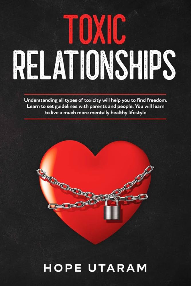
These are examples of what NOT to do, including harsh reds and yellows, toxic symbolism, and an overall negative impression.


02
Compositions



Process

01
Project Objective
goal
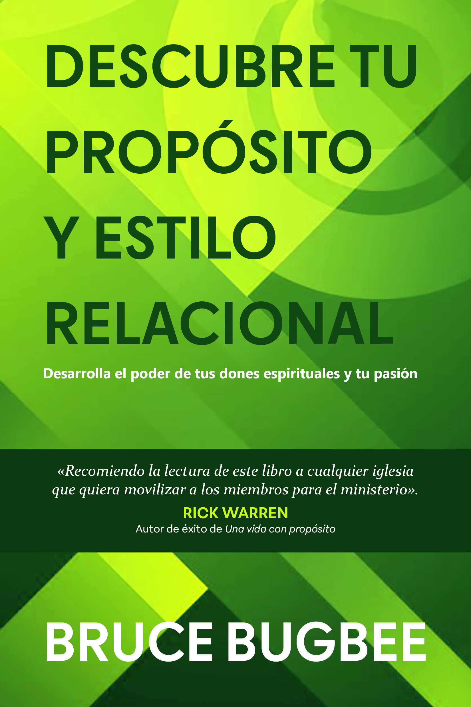
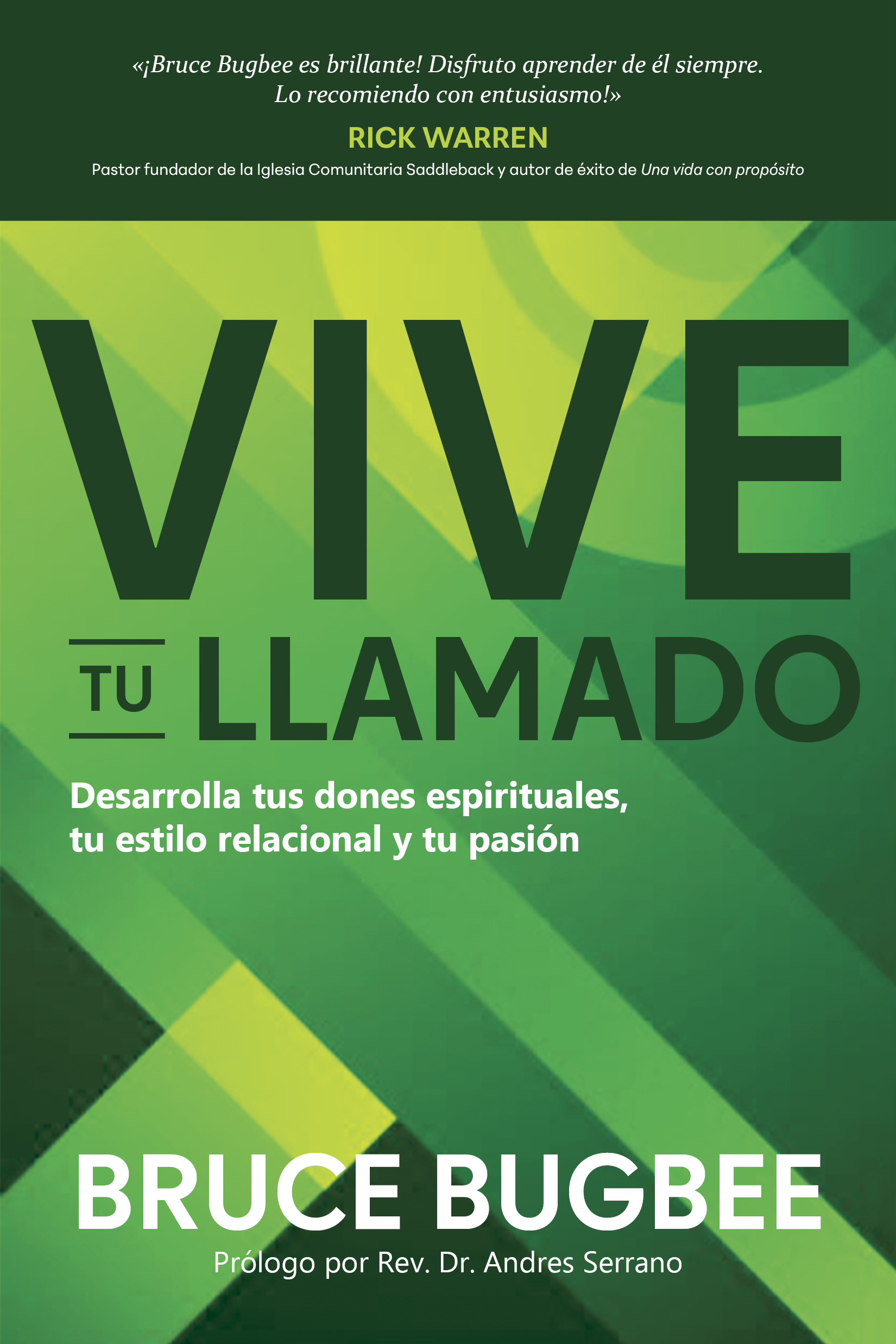
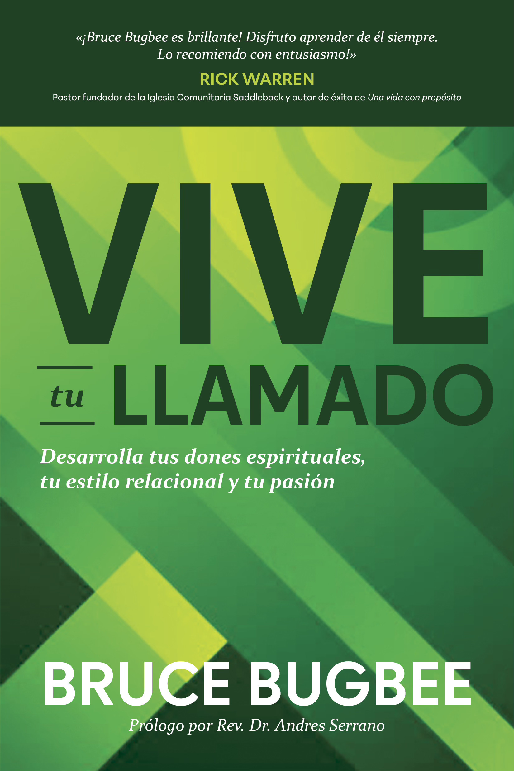
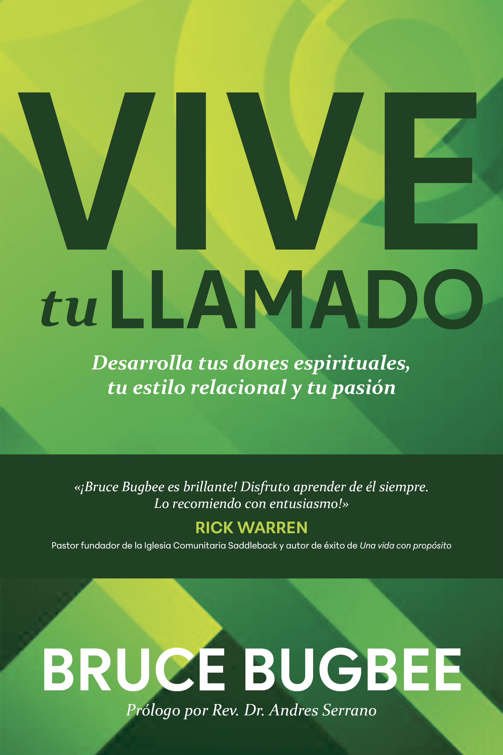
Design a cover for the book Vive tu Llamado that is green or blue, uses a geometric background, and features bold type. Both the title and the author name should be very prominent. The cover should also highlight Rick Warren’s endorsement.
specifications
- 1 final cover design
- 4 compositions to show the acquisitions team
- Softcover
- Trim size: 5.5 x 8.25 in
reference images
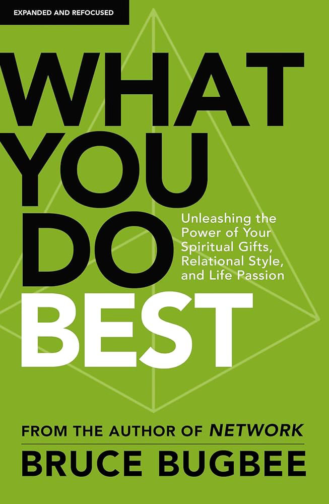
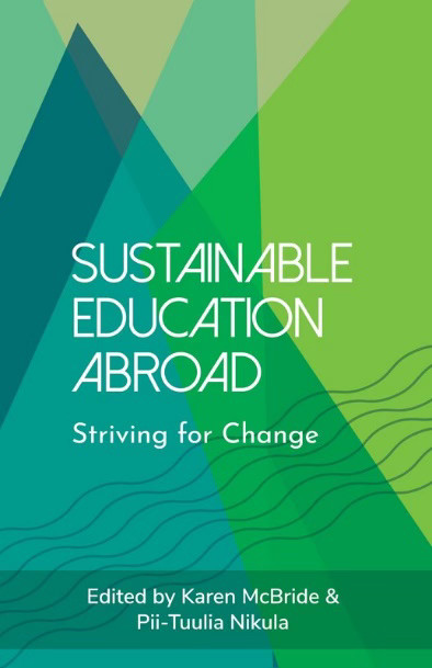
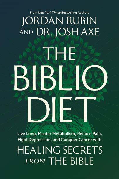
The first image is the English version of the book. The Spanish cover should look similar but unique.
02
Compositions
Round 1
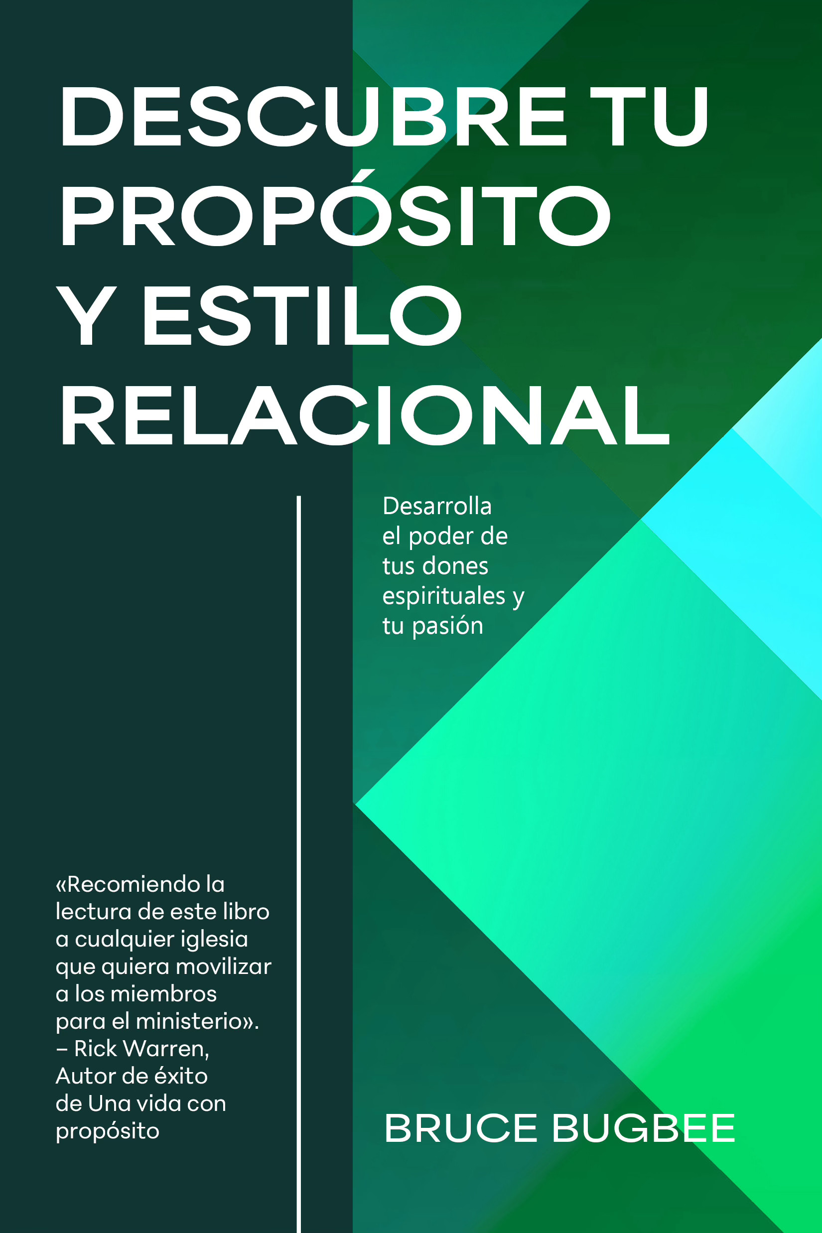
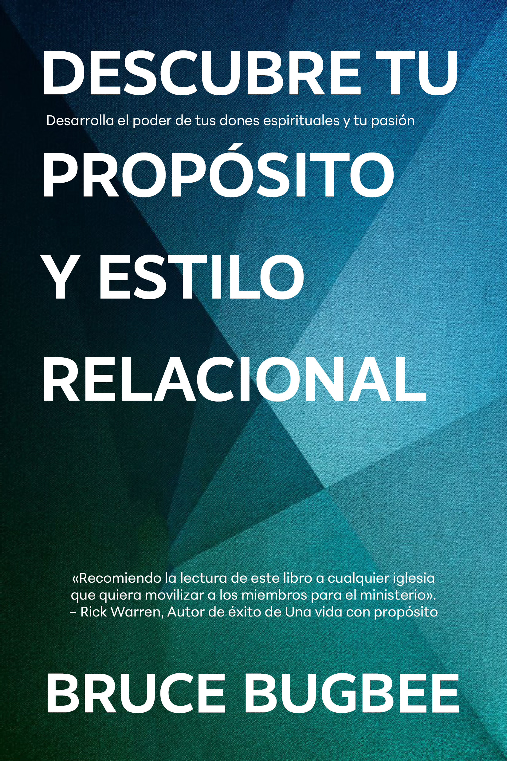
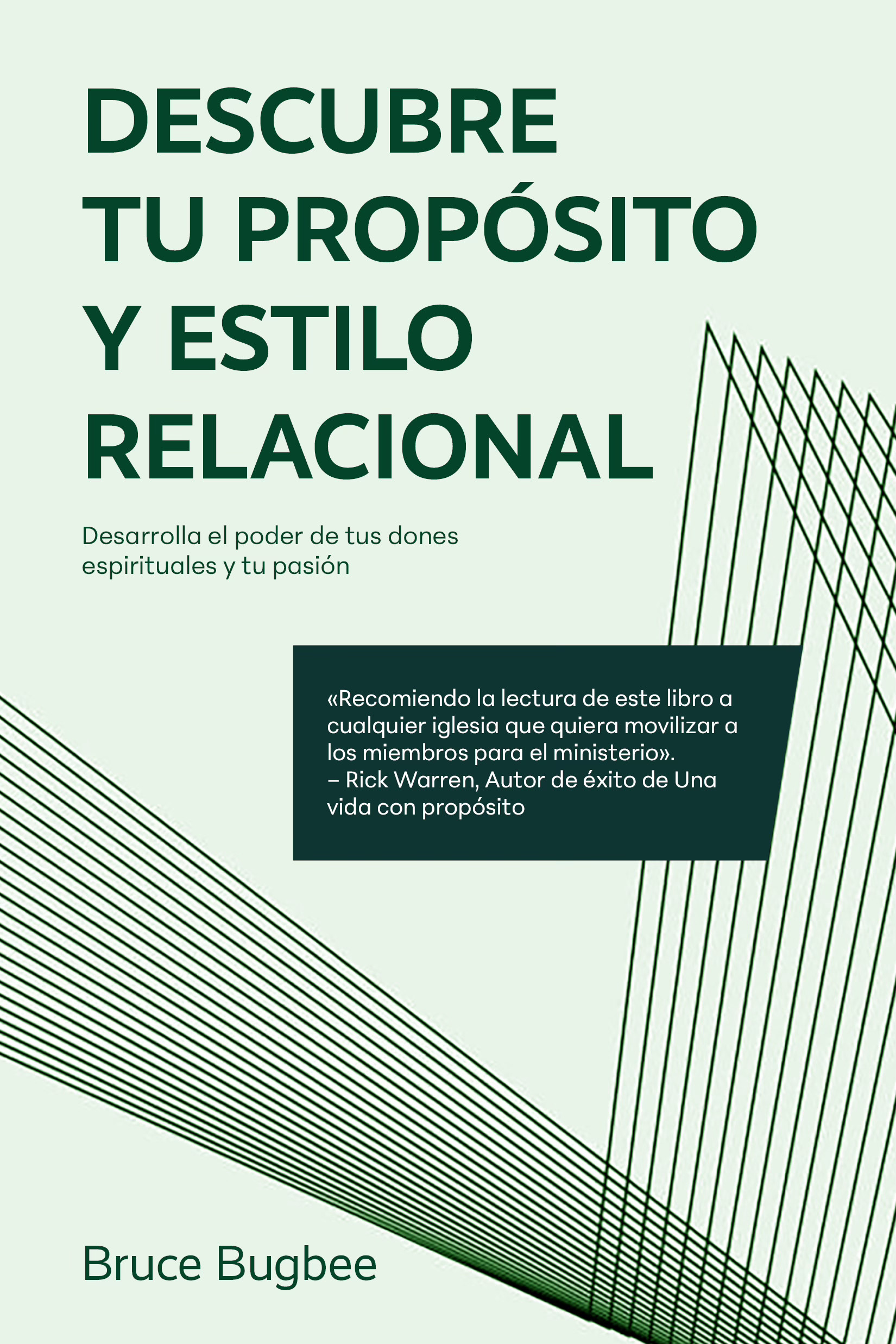
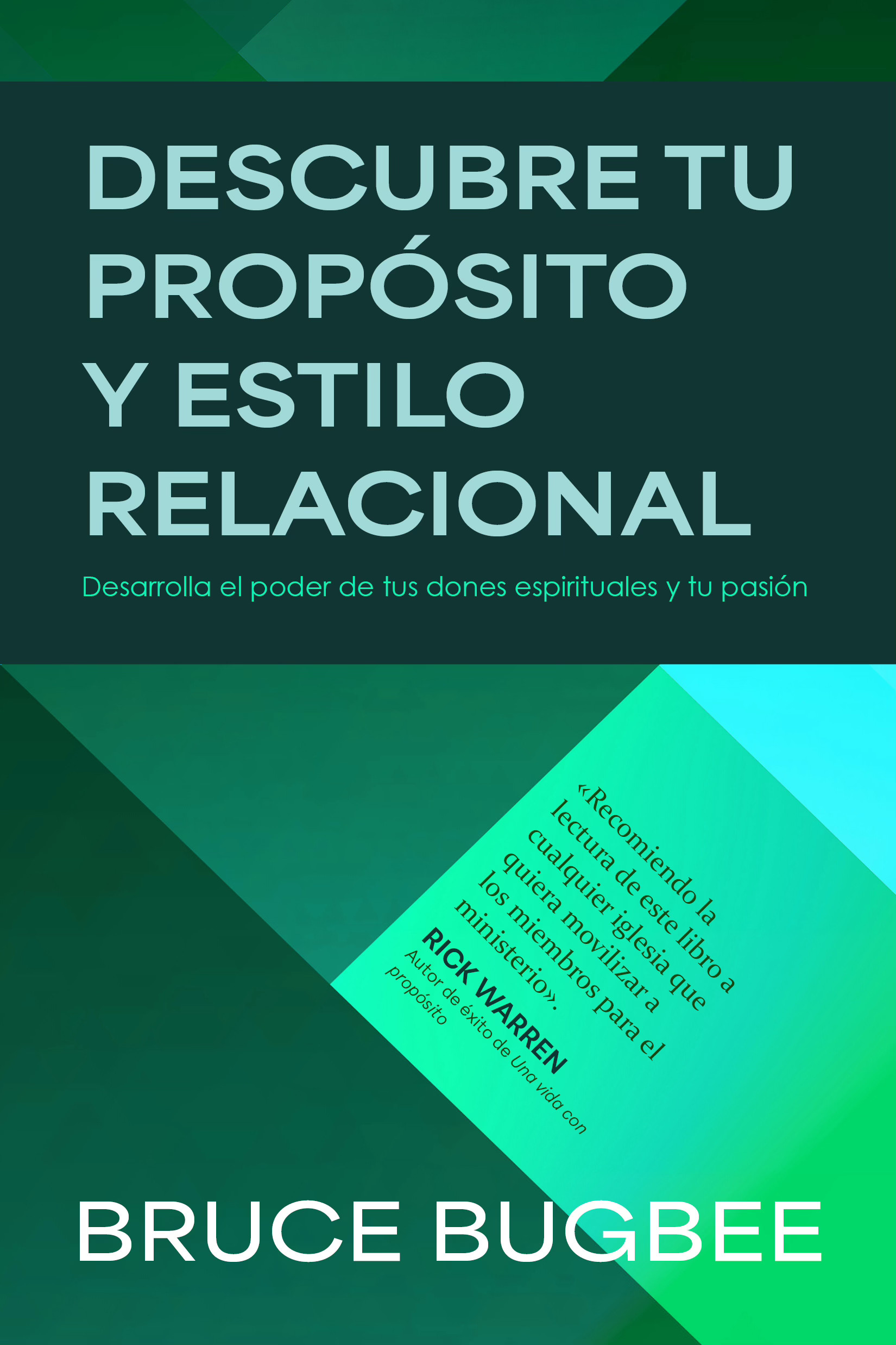
The original title for this book was much longer. These initial compositions all featured bold, sans serif type and a green geometric background in line with the author's preferences, but none were quite what the team was looking for.
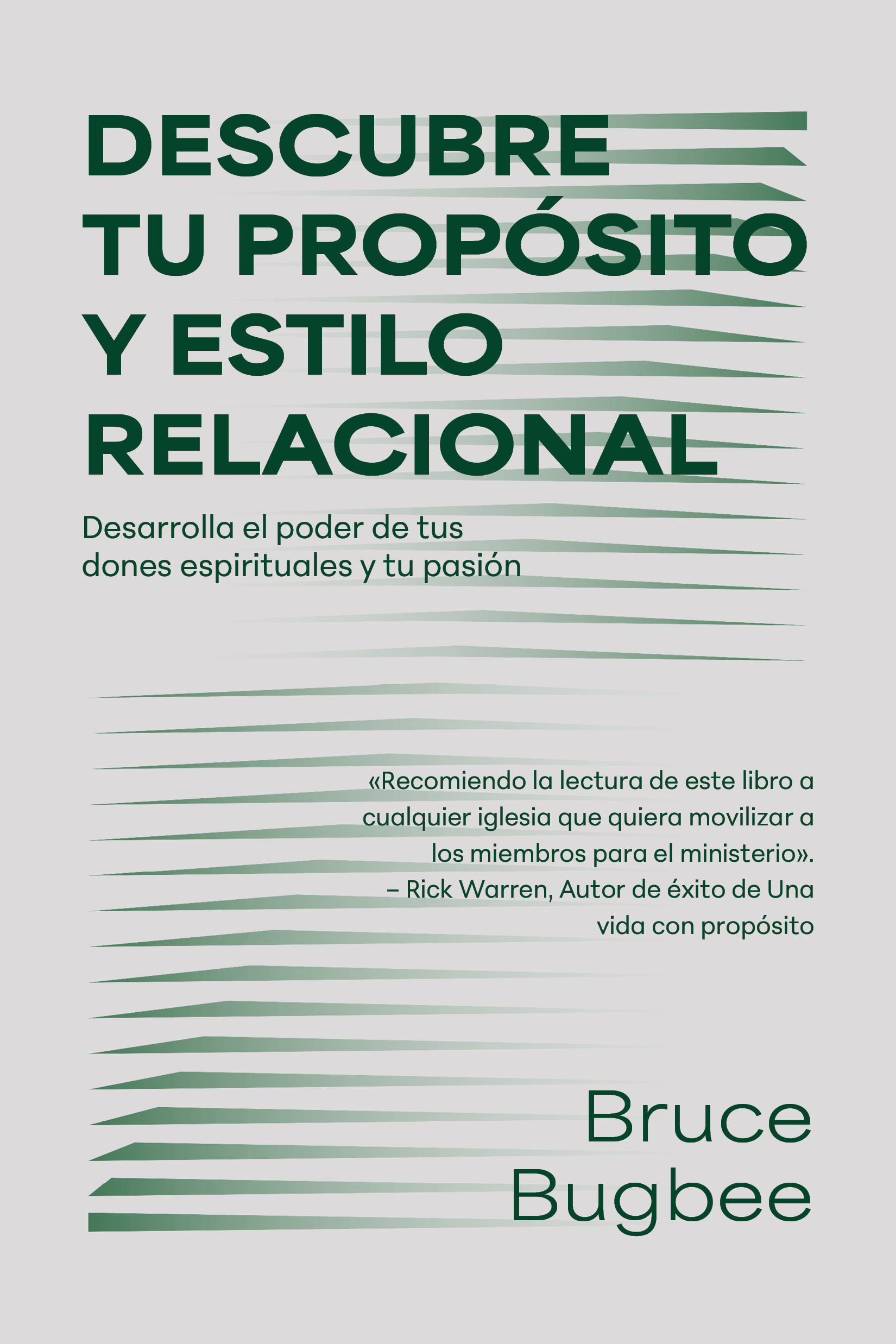
Round 2
The Spanish acquisitions team liked the last cover the best, after a few revisions.
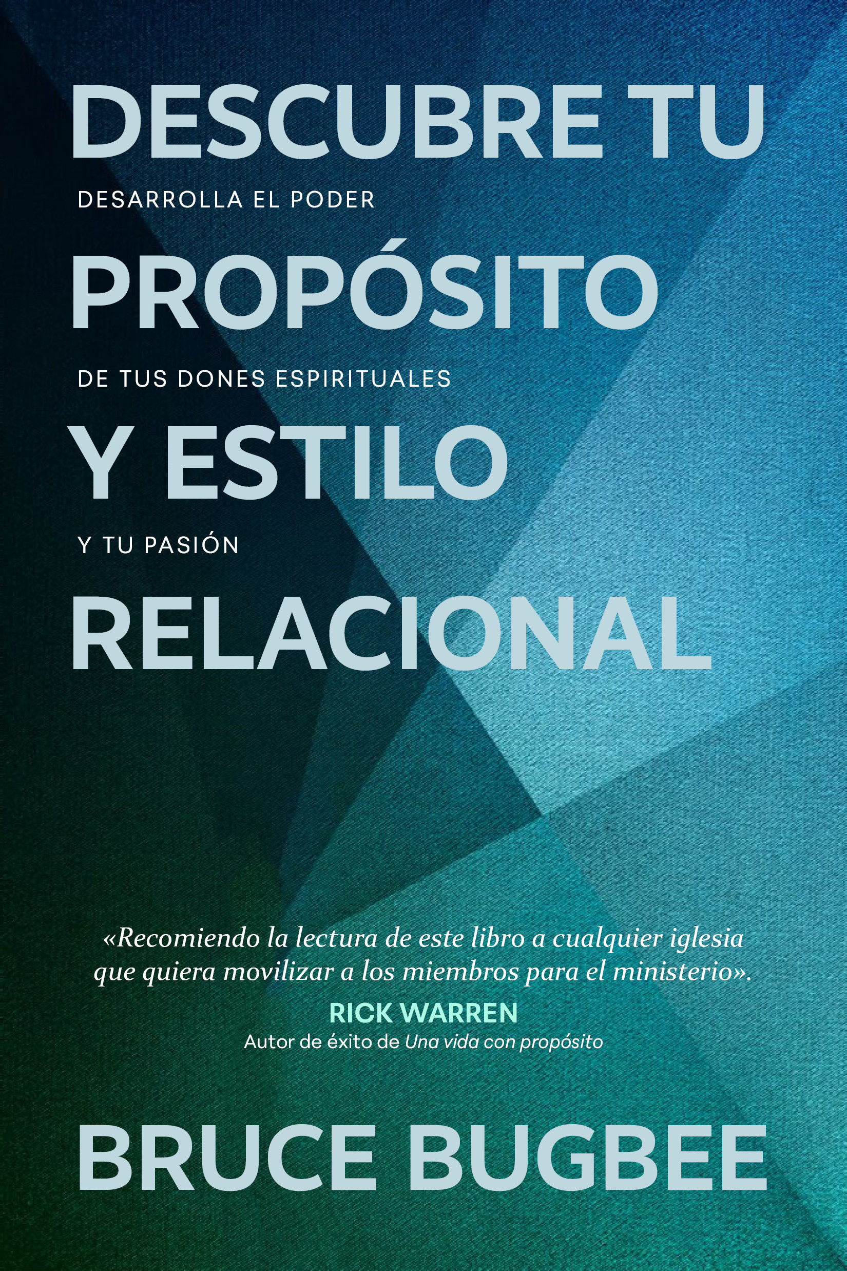
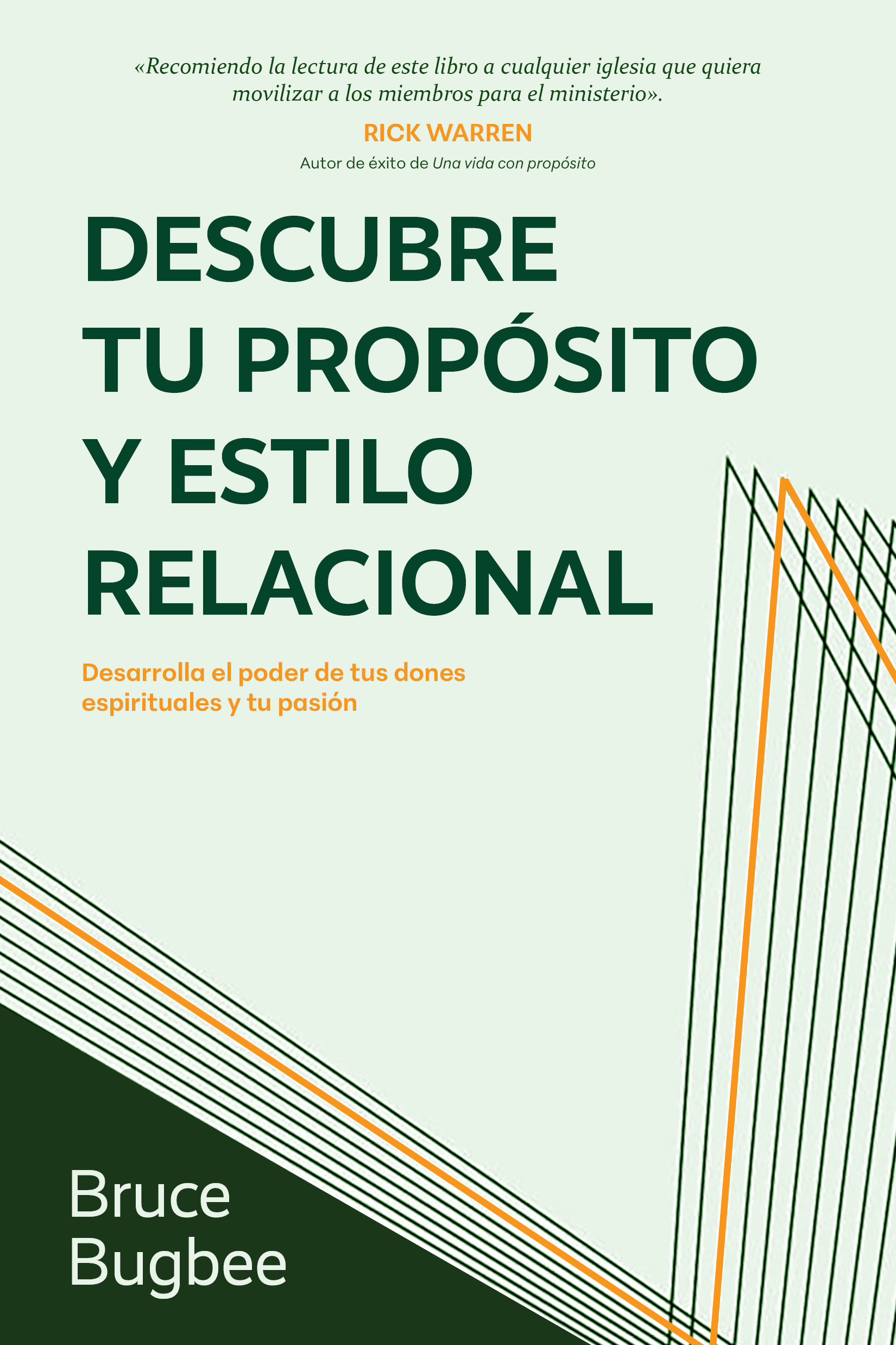
Round 3
Difficult People
Nonfiction book cover developed during a summer internship at Tyndale House Publishers. The acquisitions team requested a tone that felt approachable rather than confrontational, resulting in a playful visual interpretation of complex emotions.
Designer: Zoe Coats, Art Director: Ron Kauffman
PurchaseVive tu Llamado
Spanish-language book cover adapted from an English edition. Bold typography and geometric forms were developed within a two-day concept sprint, balancing editorial direction with a strong visual presence.
Designer: Zoe Coats, Art Director: Al Navata
Purchase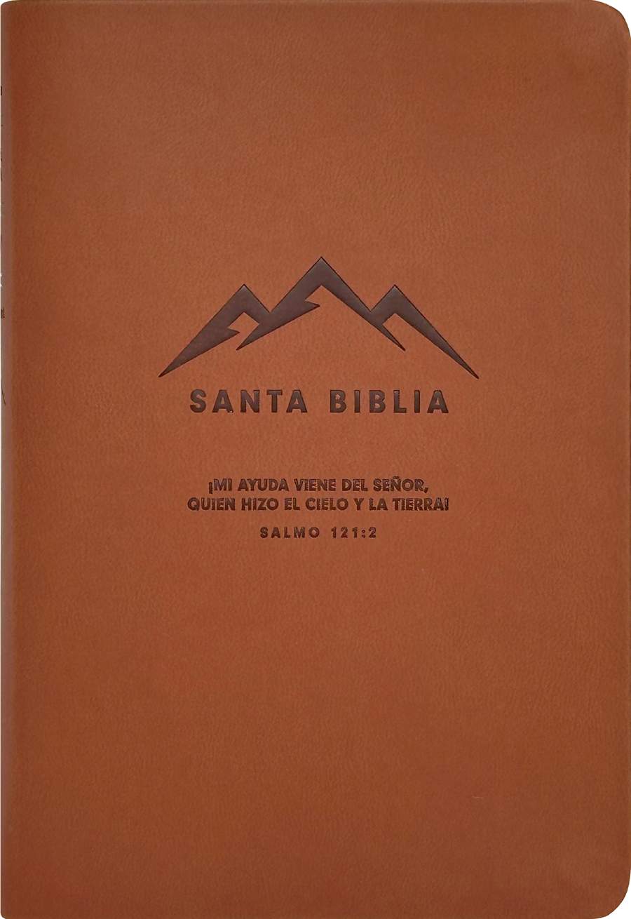
Brown, LeatherLike
A timeless approach to scripture design featuring a supple faux-leather finish, a minimalist blind debossed mountain motif, and traditional gold foil edging. Designed to age beautifully with daily use.
Purchase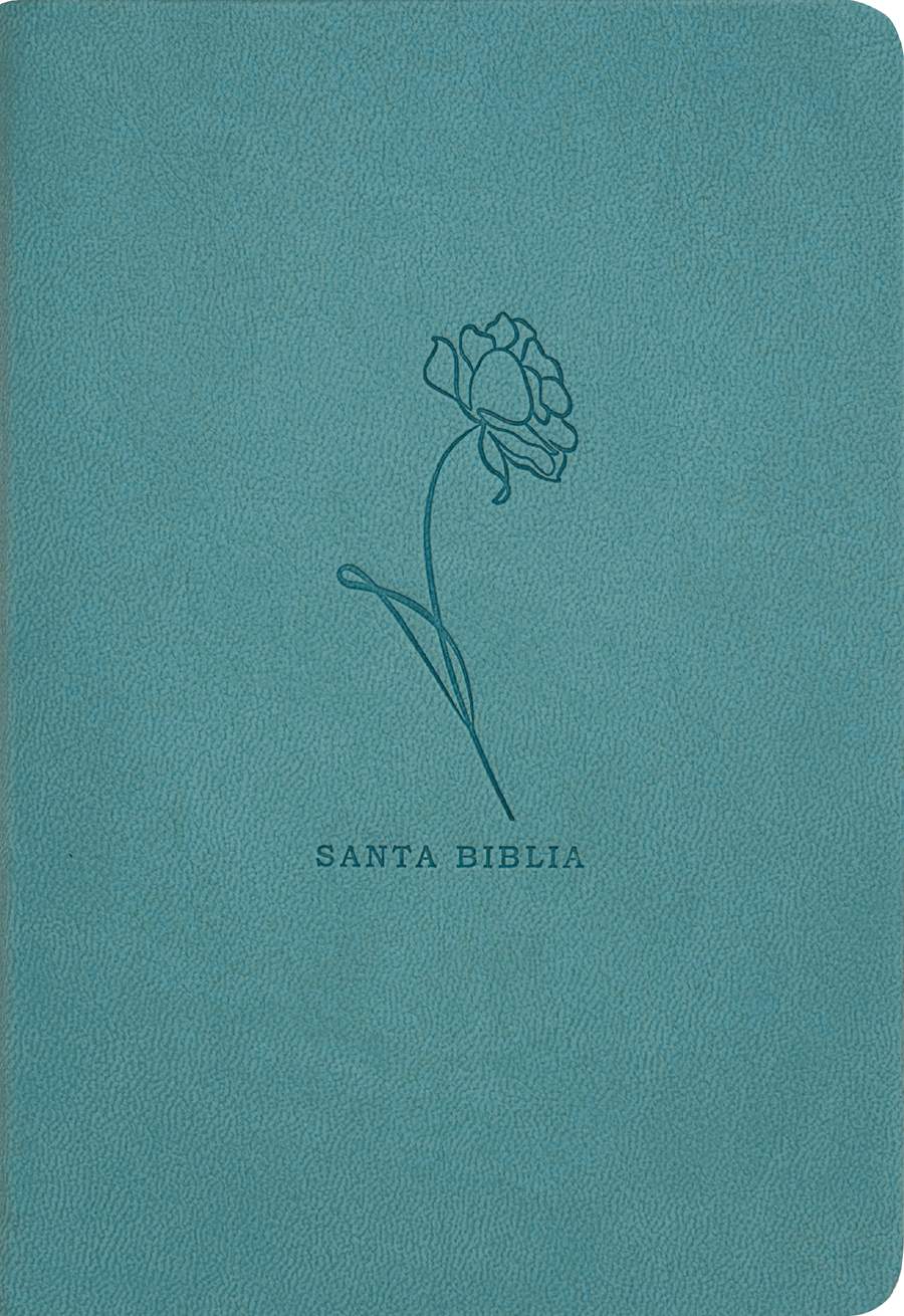
Teal, LeatherLike
A minimalist approach featuring a delicate, single-line floral illustration. The debossed artwork leaves plenty of breathing room, allowing the rich teal color and soft-touch material to stand out alongside the simple, modern typography.
Purchase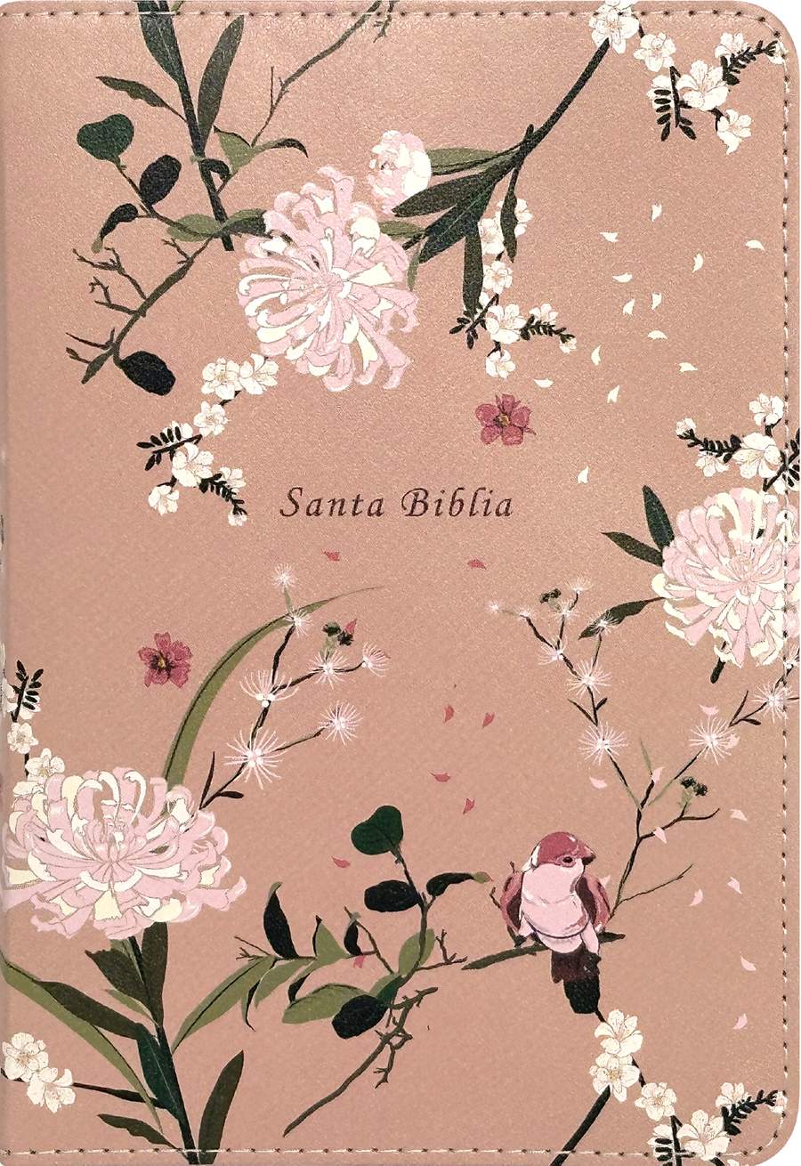
Coral Blooms, LeatherLike
A vibrant botanical pattern positioned to seamlessly wrap the entire cover and spine. Special attention was paid to the layout, ensuring the floral details flow beautifully alongside the decorative stitching and protective zipper edge.
PurchaseProcess

01
Project Objective
goal
Create a series of three Spanish Bible covers, designed to be heat stamped onto a leather-like cover. These covers should be based on the reference covers provided in subject matter and color, but can use unique artwork.
reference images
- 1 brown cover with a mountain motif (trim size: 4.125 x 6.125 in.)
- 1 teal cover with a flower (trim size: 4.125 x 6.125 in.)
- 1 printable PU cover with a full floral background, preferably pink or teal (trim size: 4.125 x 6.125 in.)
reference images
These reference images were provided by the Spanish acquisitions team. They are discarded cover compositions for English Bible covers that would be reused, unless I designed something better.
02
Concept Development
Sketches
In my sketches, I kept to the simplicity of the reference covers, but with new geometric and flowing forms. I wanted to create something new and different from the hundreds of other Bible cover designs created by Tyndale.
vectors
I then brought my sketches into Illustrator and vectorized them, testing them out on different cover layouts. I also kept in mind the final medium of the designs—heat stamped—which means they will have a texture that can be felt on the cover. Based on this, I tried to explore the texture of line work in my graphics.

stock imagery
Tasked with sourcing feminine floral and bird imagery, I steered the design toward a more delicate, wider composition. I pitched three concepts to the acquisitions team, offering a spectrum from the original vision to a completely new stylistic approach.
03
Compositions & Presentation
compositions
presentation
I presented my cover designs to the team, highlighting my thought process and how my designs met their original goals. I also learned to put my best foot forward and not be afraid to share which composition I thought was the strongest. View the full presentation here.
04
Revisions
incorporating feedback
One of the most crucial steps is incorporating client feedback. During the presentation, I took notes on what the team preferred. They wanted the words “Santa Biblia” in the center of the floral cover and to move the subtext on the brown cover to directly under the main image. I made these changes after the meeting and sent the updated covers to the client in a follow-up email.
05
Final
full cover spreads
file prep and cover routing
After the final cover designs were approved, I cleaned each file and made sure every line was immaculate. I then exported the required file types, filled out a standard company form about the covers, and sent it to the proper person for routing.
Santa Biblia Compacta
Summer internship · book cover design
Tyndale House Publishers
Tyndale House Publishers is a faith-based publishing company that produces books in both English and Spanish. As a summer intern, I completed these 5 published book covers in 3 months. I collaborated with the acquisitions teams, presented 3-4 compositions for each book, made revisions, and polished the final covers.
client
Tyndale House Publishers
date
2025
Process

01
Project Objective
goal
Design a cover for the book Difficult People that is approachable and not overly negative given the subject matter. Avoid imagery that is toxic, dangerous, or alarming.
specifications
- 1 final cover design
- 4 compositions to show the acquisitions team
- Softcover
- Trim size: 5.5 x 8.25 in
reference images
These are examples of what NOT to do, including harsh reds and yellows, toxic symbolism, and an overall negative impression.
02
Compositions
Process

01
Project Objective
goal
Design a cover for the book Vive tu Llamado that is green or blue, uses a geometric background, and features bold type. Both the title and the author name should be very prominent. The cover should also highlight Rick Warren’s endorsement.
specifications
- 1 final cover design
- 4 compositions to show the acquisitions team
- Softcover
- Trim size: 5.5 x 8.25 in
reference images
The first image is the English version of the book. The Spanish cover should look similar but unique.
02
Compositions
Round 1
The original title for this book was much longer. These initial compositions all featured bold, sans serif type and a green geometric background in line with the author's preferences, but none were quite what the team was looking for.
Round 2
The Spanish acquisitions team liked the last cover the best, after a few revisions.
Round 3
Difficult People
Nonfiction book cover developed during a summer internship at Tyndale House Publishers. The acquisitions team requested a tone that felt approachable rather than confrontational, resulting in a playful visual interpretation of complex emotions.
Designer: Zoe Coats, Art Director: Ron Kauffman
PurchaseVive tu Llamado
Spanish-language book cover adapted from an English edition. Bold typography and geometric forms were developed within a two-day concept sprint, balancing editorial direction with a strong visual presence.
Designer: Zoe Coats, Art Director: Al Navata
PurchaseBrown, LeatherLike
A timeless approach to scripture design featuring a supple faux-leather finish, a minimalist blind debossed mountain motif, and traditional gold foil edging. Designed to age beautifully with daily use.
PurchaseTeal, LeatherLike
A minimalist approach featuring a delicate, single-line floral illustration. The debossed artwork leaves plenty of breathing room, allowing the rich teal color and soft-touch material to stand out alongside the simple, modern typography.
PurchaseCoral Blooms, LeatherLike
A vibrant botanical pattern positioned to seamlessly wrap the entire cover and spine. Special attention was paid to the layout, ensuring the floral details flow beautifully alongside the decorative stitching and protective zipper edge.
PurchaseProcess

01
Project Objective
goal
Create a series of three Spanish Bible covers, designed to be heat stamped onto a leather-like cover. These covers should be based on the reference covers provided in subject matter and color, but can use unique artwork.
specifications
- 1 brown cover with a mountain motif (trim size: 4.125 x 6.125 in.)
- 1 teal cover with a flower (trim size: 4.125 x 6.125 in.)
- 1 printable PU cover with a full floral background, preferably pink or teal (trim size: 4.125 x 6.125 in.)
reference images
These reference images were provided by the Spanish acquisitions team. They are discarded cover compositions for English Bible covers that would be reused, unless I designed something better.
02
Concept Development
Sketches
In my sketches, I kept to the simplicity of the reference covers, but with new geometric and flowing forms. I wanted to create something new and different from the hundreds of other Bible cover designs created by Tyndale.
vectors
I then brought my sketches into Illustrator and vectorized them, testing them out on different cover layouts. I also kept in mind the final medium of the designs—heat stamped—which means they will have a texture that can be felt on the cover. Based on this, I tried to explore the texture of line work in my graphics.
stock imagery
Tasked with sourcing feminine floral and bird imagery, I steered the design toward a more delicate, wider composition. I pitched three concepts to the acquisitions team, offering a spectrum from the original vision to a completely new stylistic approach.
03
Compositions & Presentation
compositions
presentation
I presented my cover designs to the team, highlighting my thought process and how my designs met their original goals. I also learned to put my best foot forward and not be afraid to share which composition I thought was the strongest. View the full presentation here.
04
Revisions
incorporating feedback
One of the most crucial steps is incorporating client feedback. During the presentation, I took notes on what the team preferred. They wanted the words “Santa Biblia” in the center of the floral cover and to move the subtext on the brown cover to directly under the main image. I made these changes after the meeting and sent the updated covers to the client in a follow-up email.
05
Final
full cover spreads
file prep and cover routing
After the final cover designs were approved, I cleaned each file and made sure every line was immaculate. I then exported the required file types, filled out a standard company form about the covers, and sent it to the proper person for routing.
Santa Biblia Compacta