soup bowl

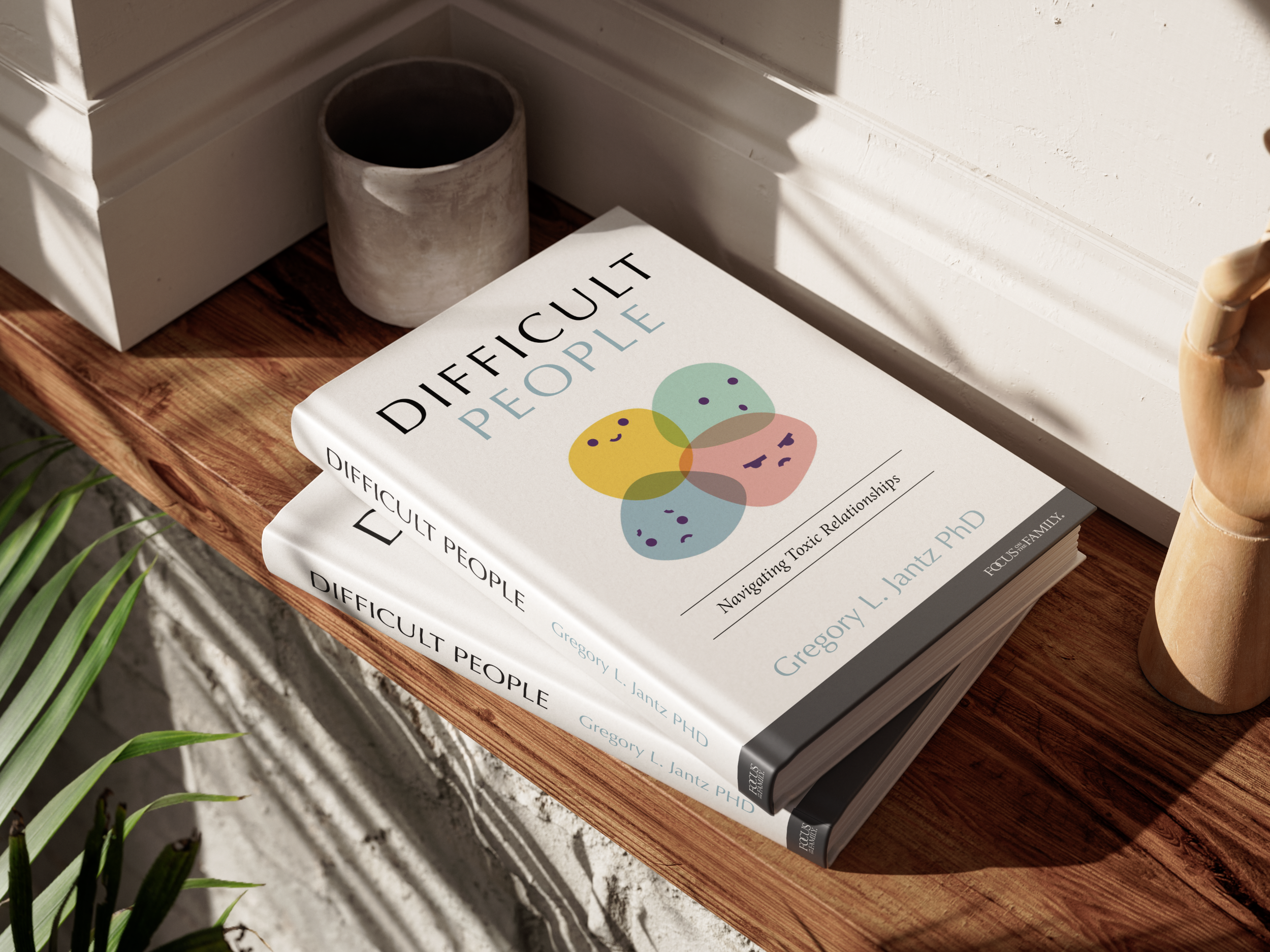
Difficult People

CLIENT

Tyndale House Publishers

Tyndale House Publishers is a faith-based publishing company that produces books in both English and Spanish. As a summer intern, I completed 5 published book covers in 3 months. I collaborated with the acquisitions teams, presented 3-4 compositions for each book, made revisions, and polished the final covers.

floral bible

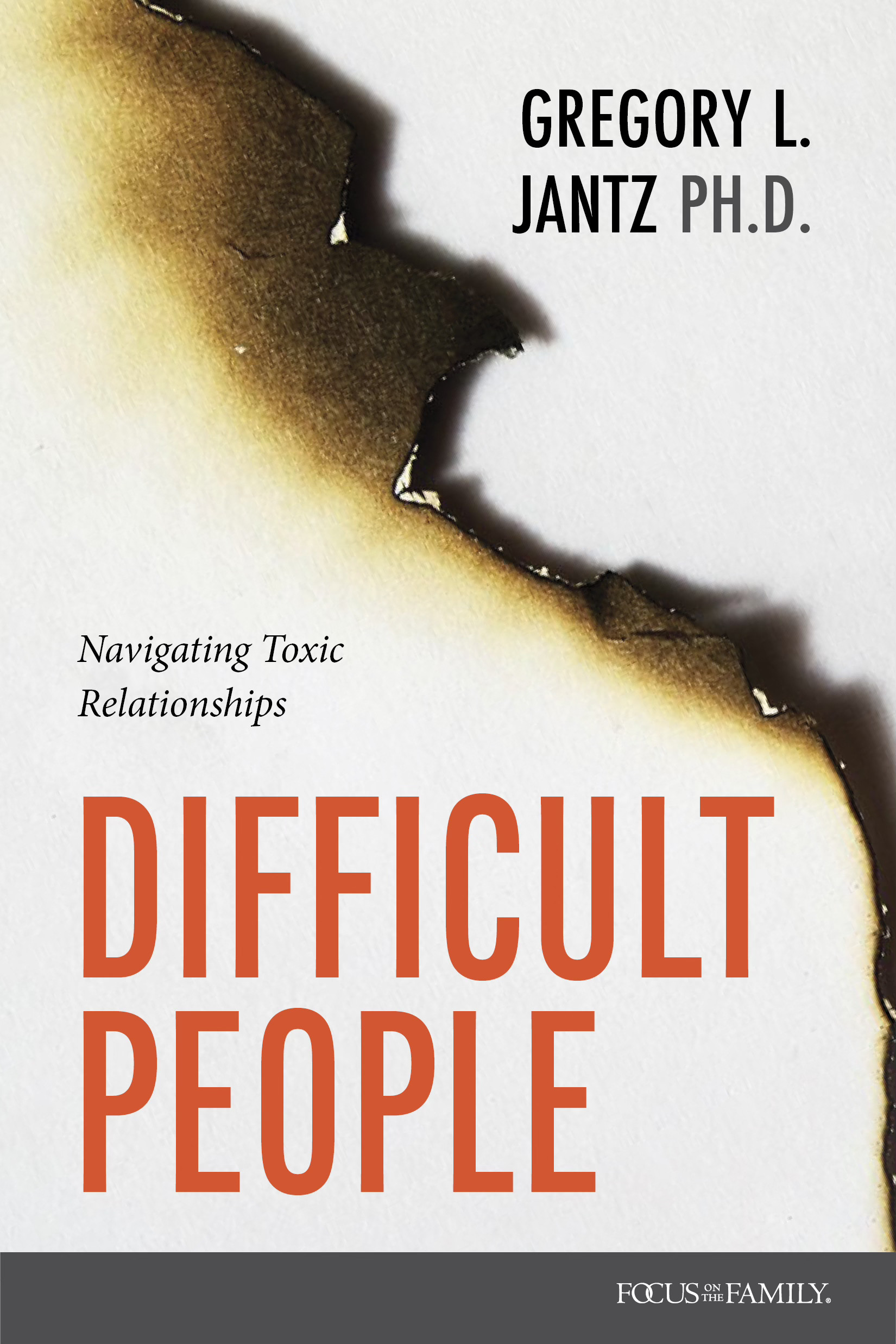
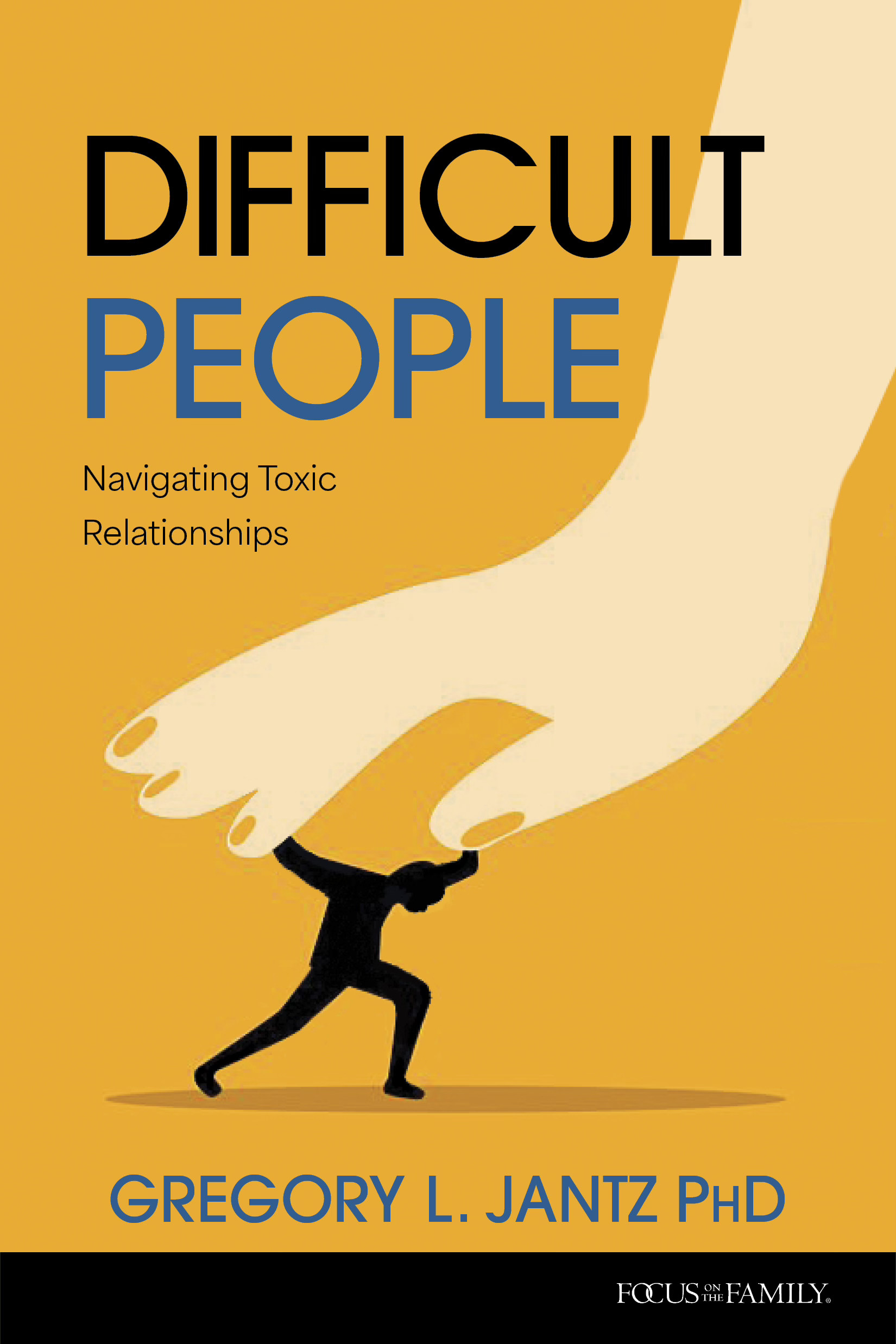
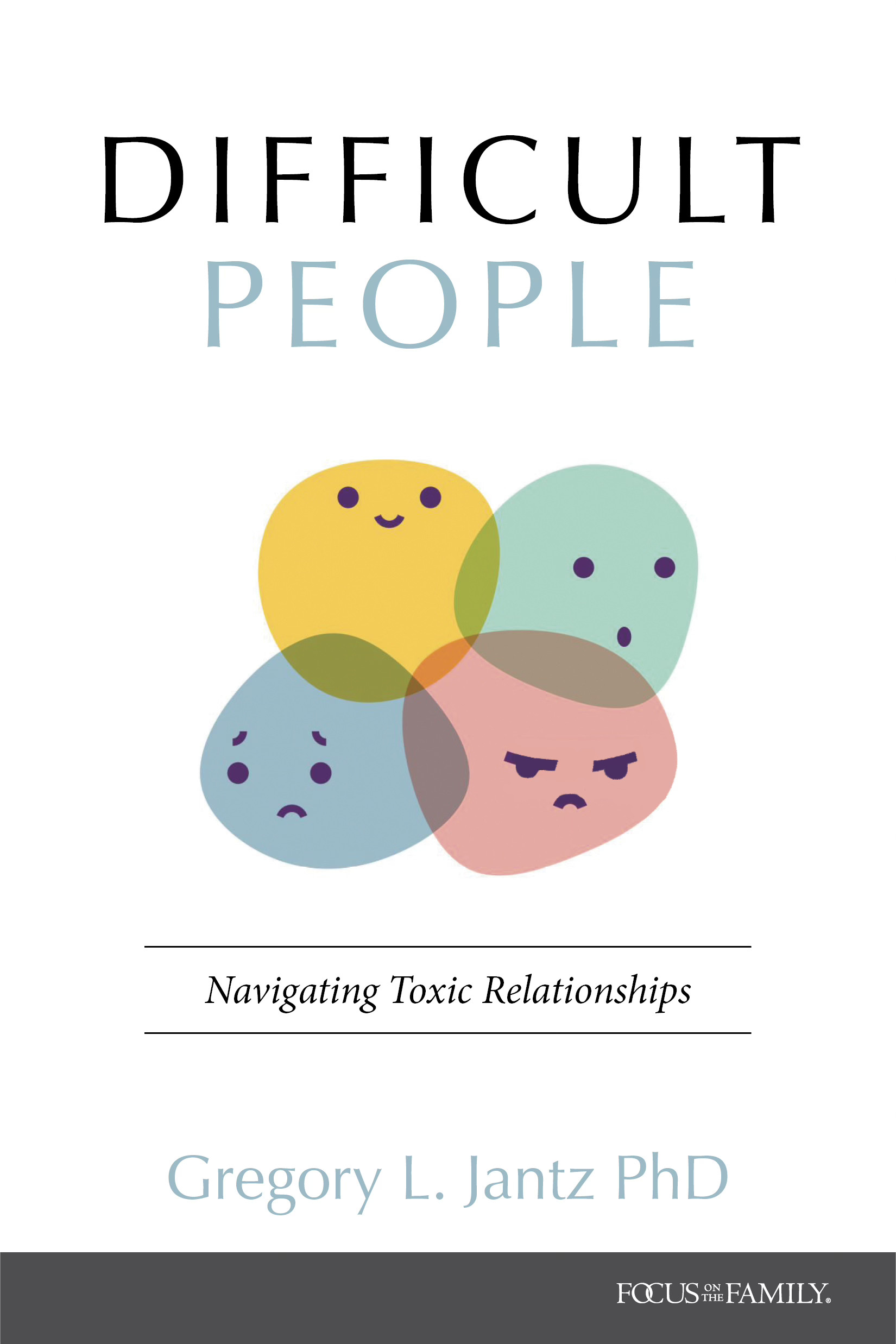
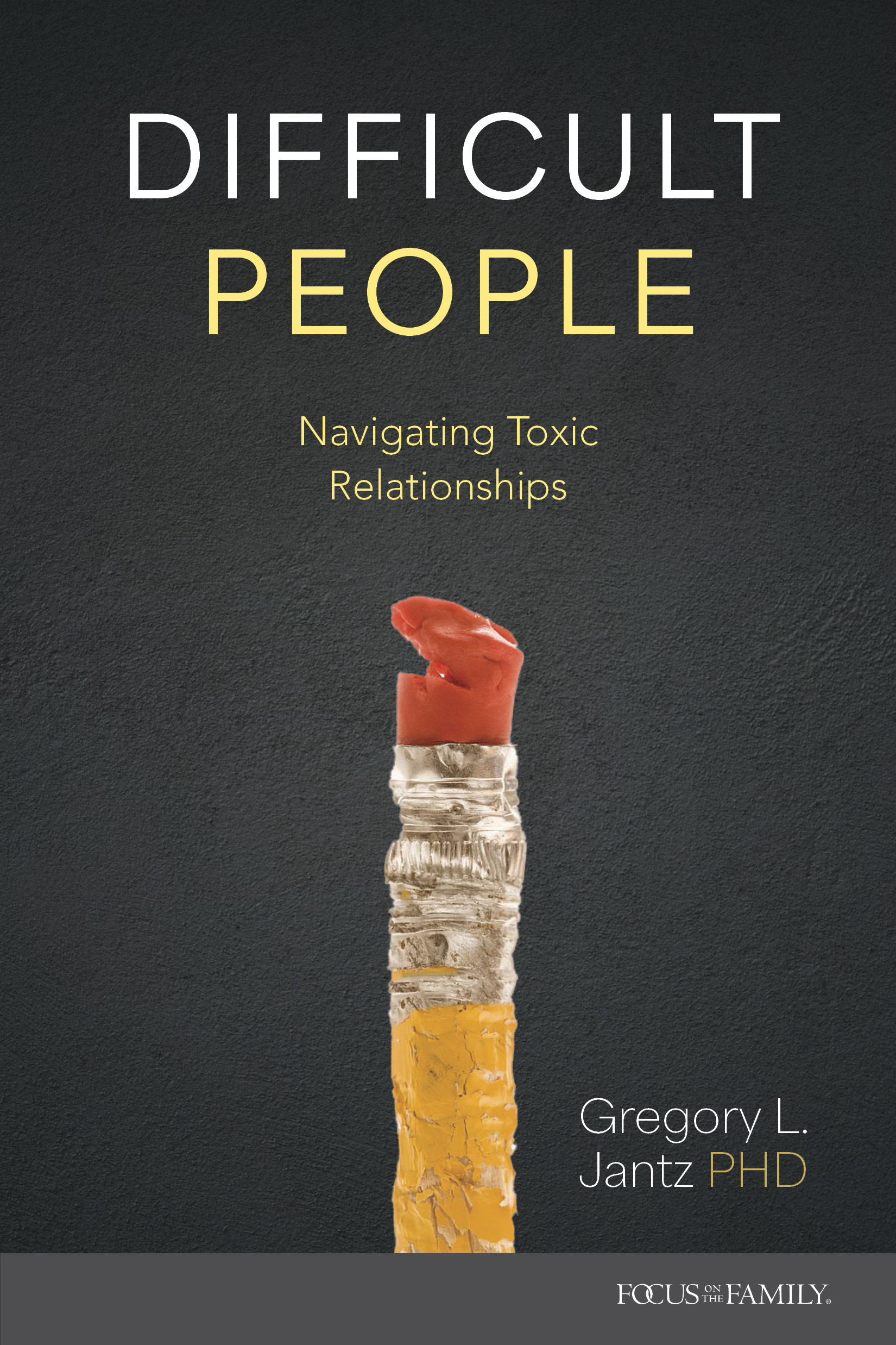
Nonfiction book cover developed during a summer internship at Tyndale House Publishers. The acquisitions team requested a tone that felt approachable rather than confrontational, resulting in a playful visual interpretation of complex emotions.


Designer: Zoe Coats, Art Director: Ron Kauffman

​

Purchase

Let’s work together

soup bowl

Difficult People

CLIENT

Tyndale House Publishers

Tyndale House Publishers is a faith-based publishing company that produces books in both English and Spanish. As a summer intern, I completed 5 published book covers in 3 months. I collaborated with the acquisitions teams, presented 3-4 compositions for each book, made revisions, and polished the final covers.
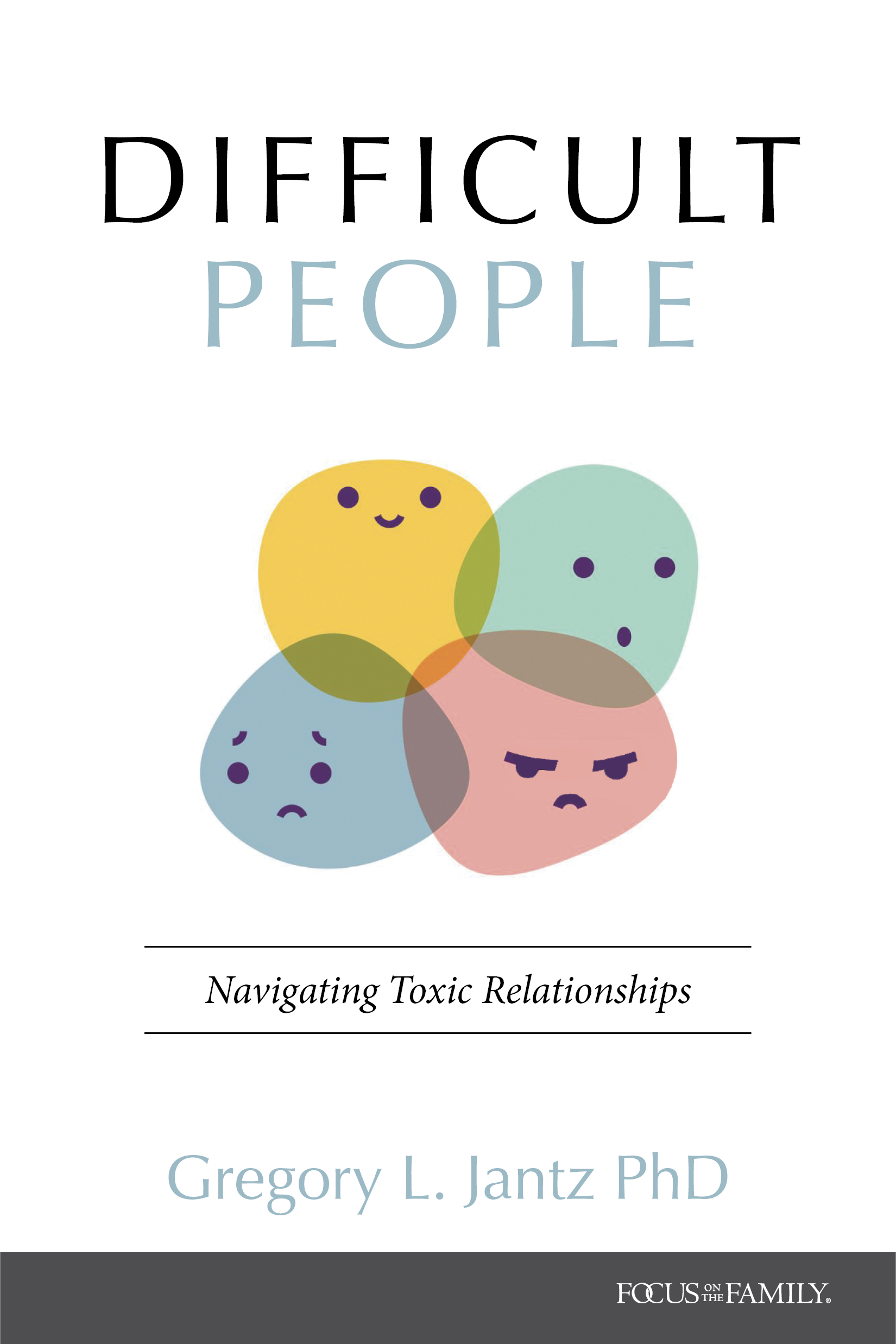
Nonfiction book cover developed during a summer internship at Tyndale House Publishers. The acquisitions team requested a tone that felt approachable rather than confrontational, resulting in a playful visual interpretation of complex emotions.


Designer: Zoe Coats, Art Director: Ron Kauffman

​

Purchase

Process

01

Project Objective

goal

Design a cover for the book Difficult People that is approachable and not overly negative given the subject matter. Avoid imagery that is toxic, dangerous, or alarming.

specifications

  • 1 final cover design
  • 4 compositions to show the acquisitions team
  • Softcover
  • Trim size: 5.5 x 8.25 in

reference images

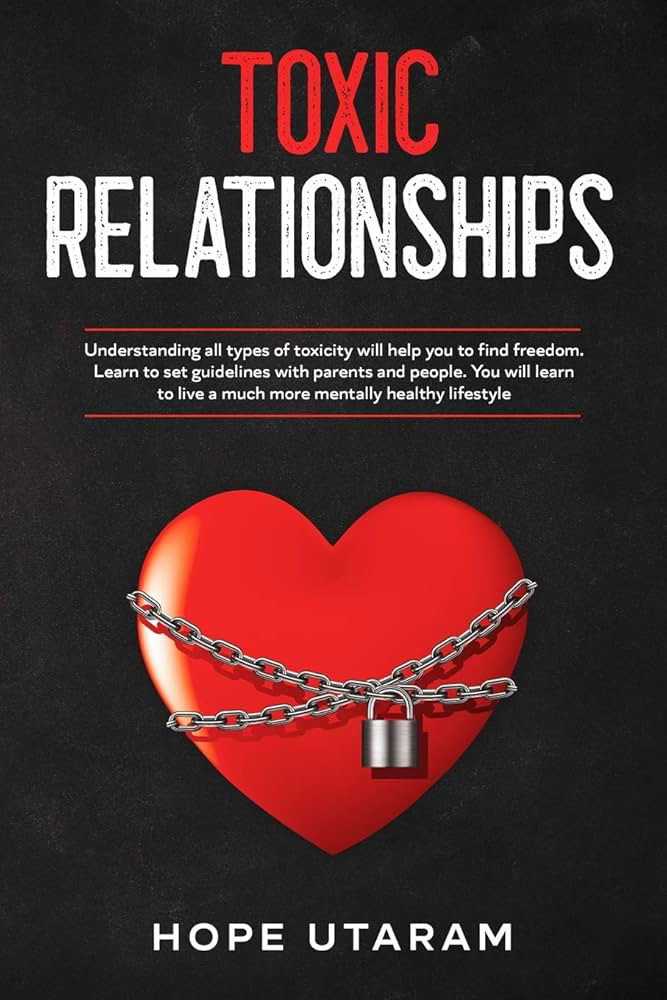
These are examples of what NOT to do, including harsh reds and yellows, toxic symbolism, and an overall negative impression.

sketch
sketch
sketch

02

Compositions

sketch
sketch2
sketch3
sketch4

Let’s work together

Z logo

about

soup bowl

Difficult People

CLIENT

Tyndale House Publishers

Tyndale House Publishers is a faith-based publishing company that produces books in both English and Spanish. As a summer intern, I completed 5 published book covers in 3 months. I collaborated with the acquisitions teams, presented 3-4 compositions for each book, made revisions, and polished the final covers.

Nonfiction book cover developed during a summer internship at Tyndale House Publishers. The acquisitions team requested a tone that felt approachable rather than confrontational, resulting in a playful visual interpretation of complex emotions.


Designer: Zoe Coats, Art Director: Ron Kauffman

​

Purchase

Process

01

Project Objective

goal

Design a cover for the book Difficult People that is approachable and not overly negative given the subject matter. Avoid imagery that is toxic, dangerous, or alarming.

specifications

  • 1 final cover design
  • 4 compositions to show the acquisitions team
  • Softcover
  • Trim size: 5.5 x 8.25 in

reference images

These are examples of what NOT to do, including harsh reds and yellows, toxic symbolism, and an overall negative impression.

sketch
sketch
sketch

02

Compositions

sketch
sketch2
sketch3
sketch4