soup bowl

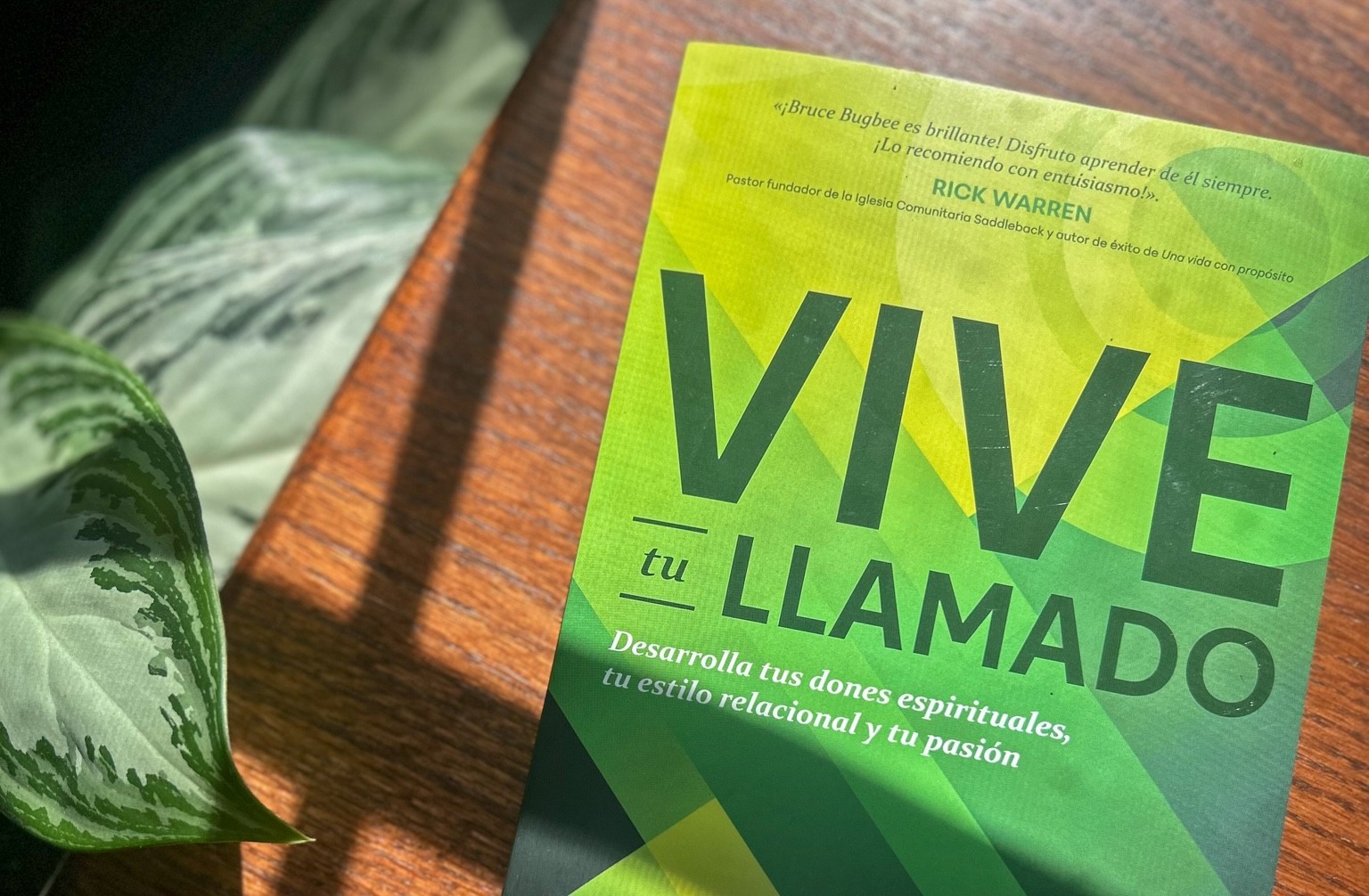
Vive tu Llamado

CLIENT

Tyndale House Publishers

Tyndale House Publishers is a faith-based publishing company that produces books in both English and Spanish. As a summer intern, I completed 5 published book covers in 3 months. I collaborated with the acquisitions teams, presented 3-4 compositions for each book, made revisions, and polished the final covers.

floral bible

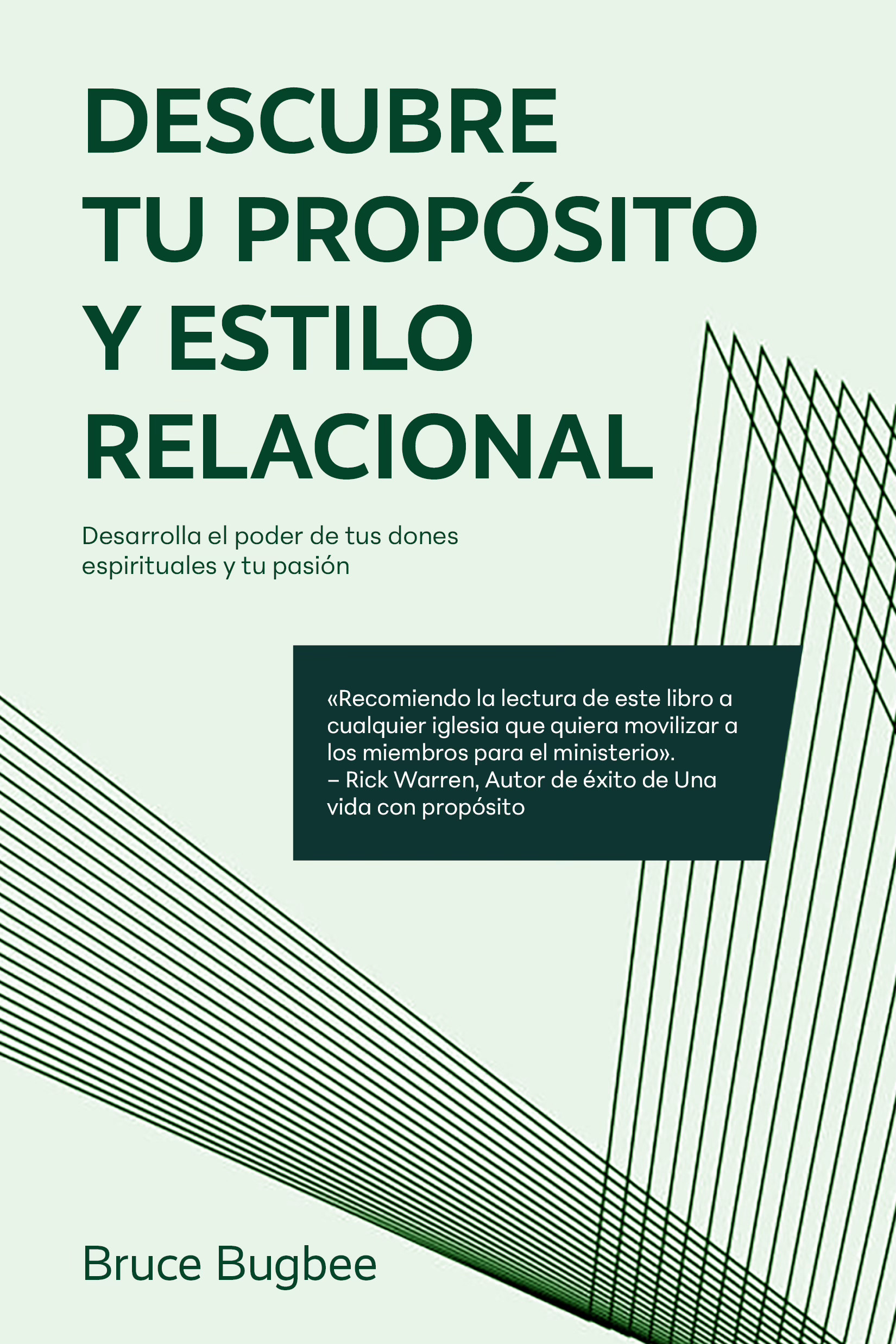
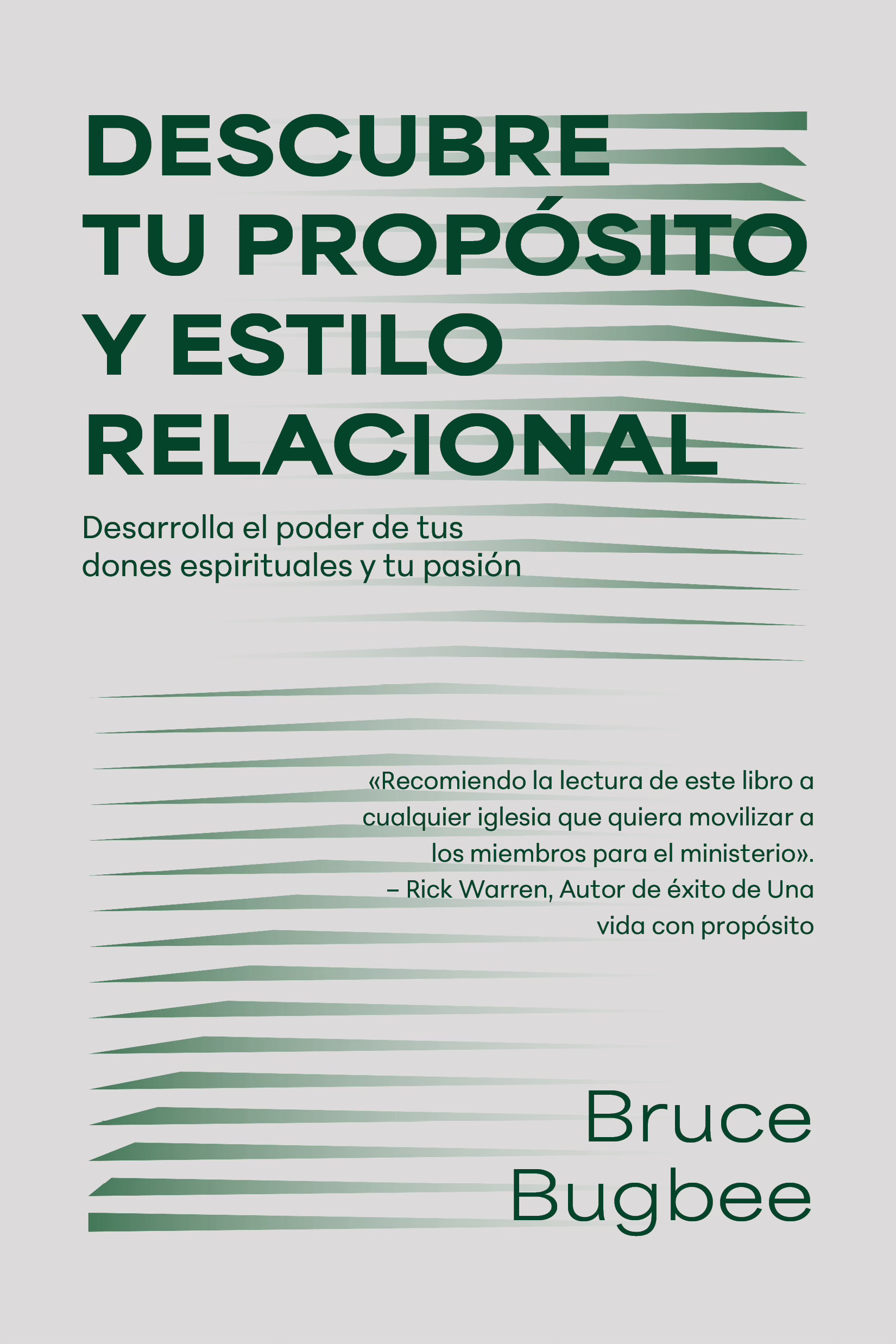
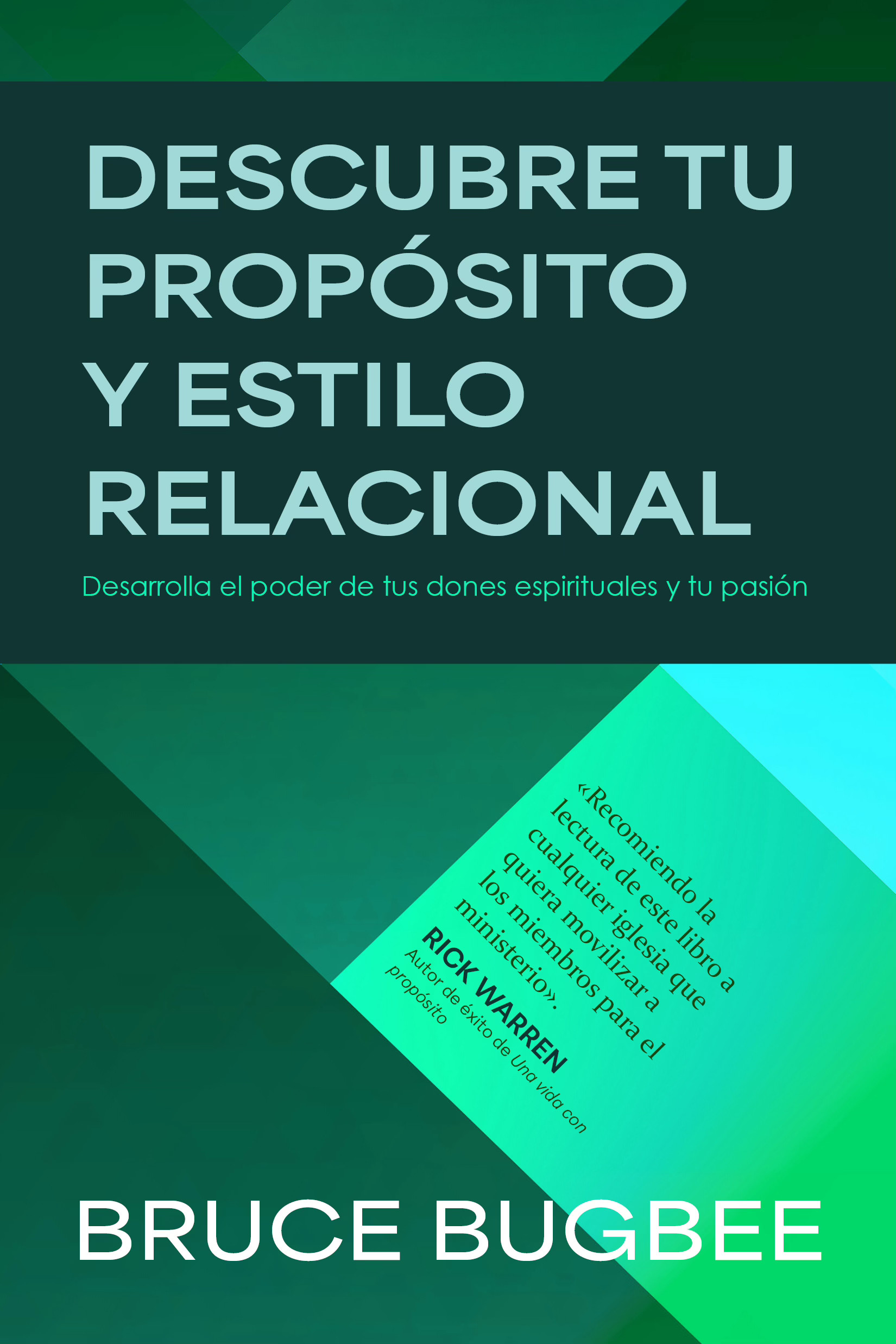
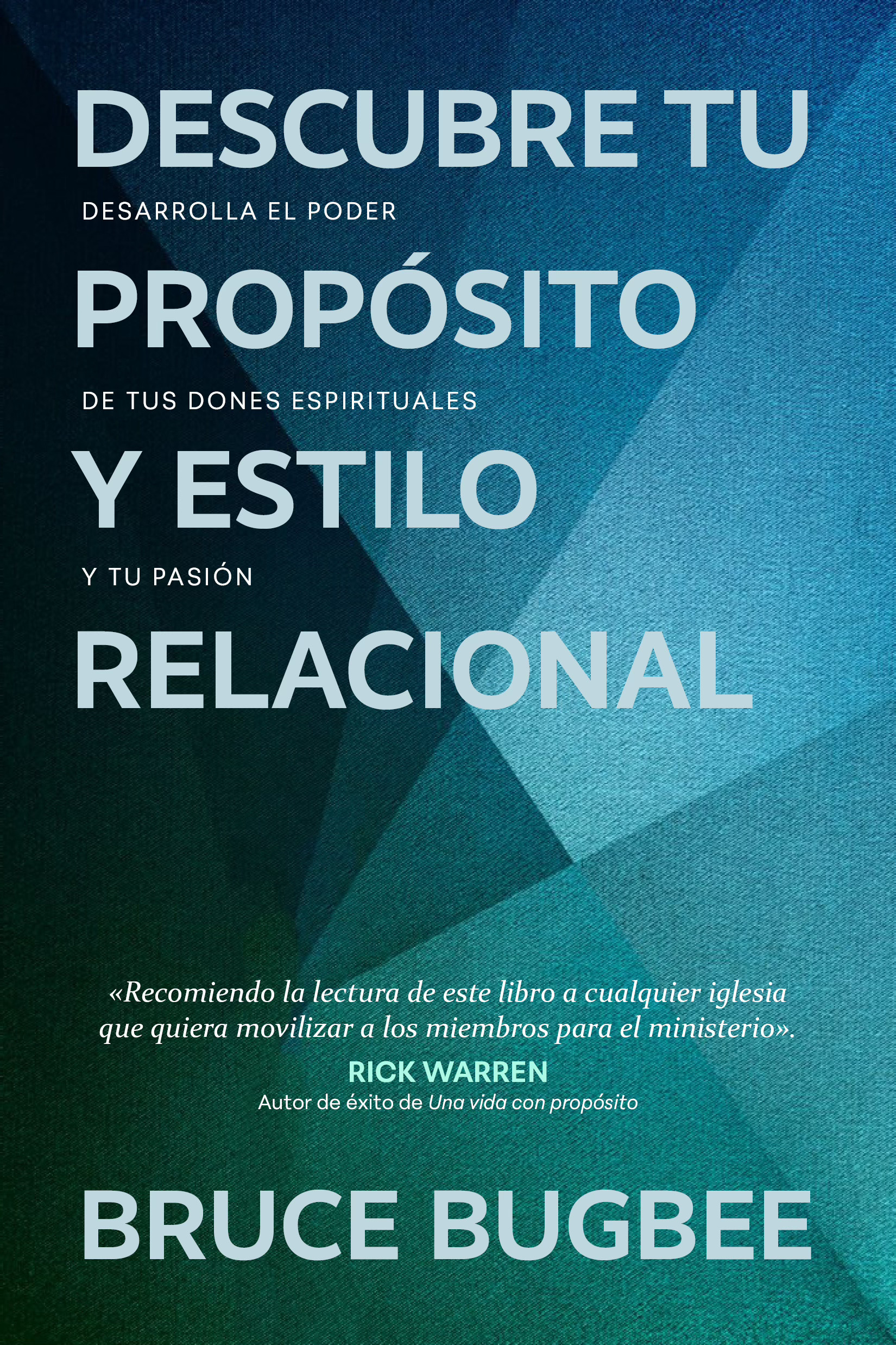
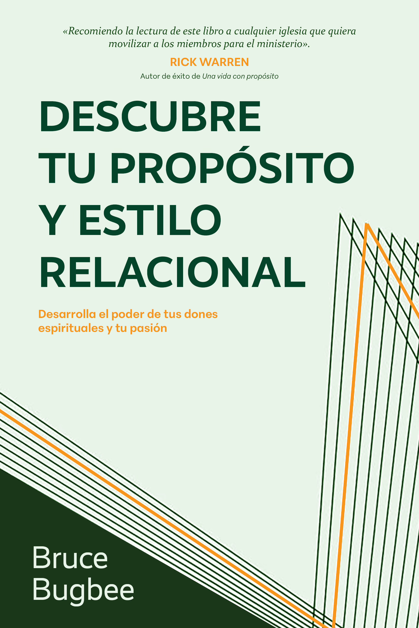
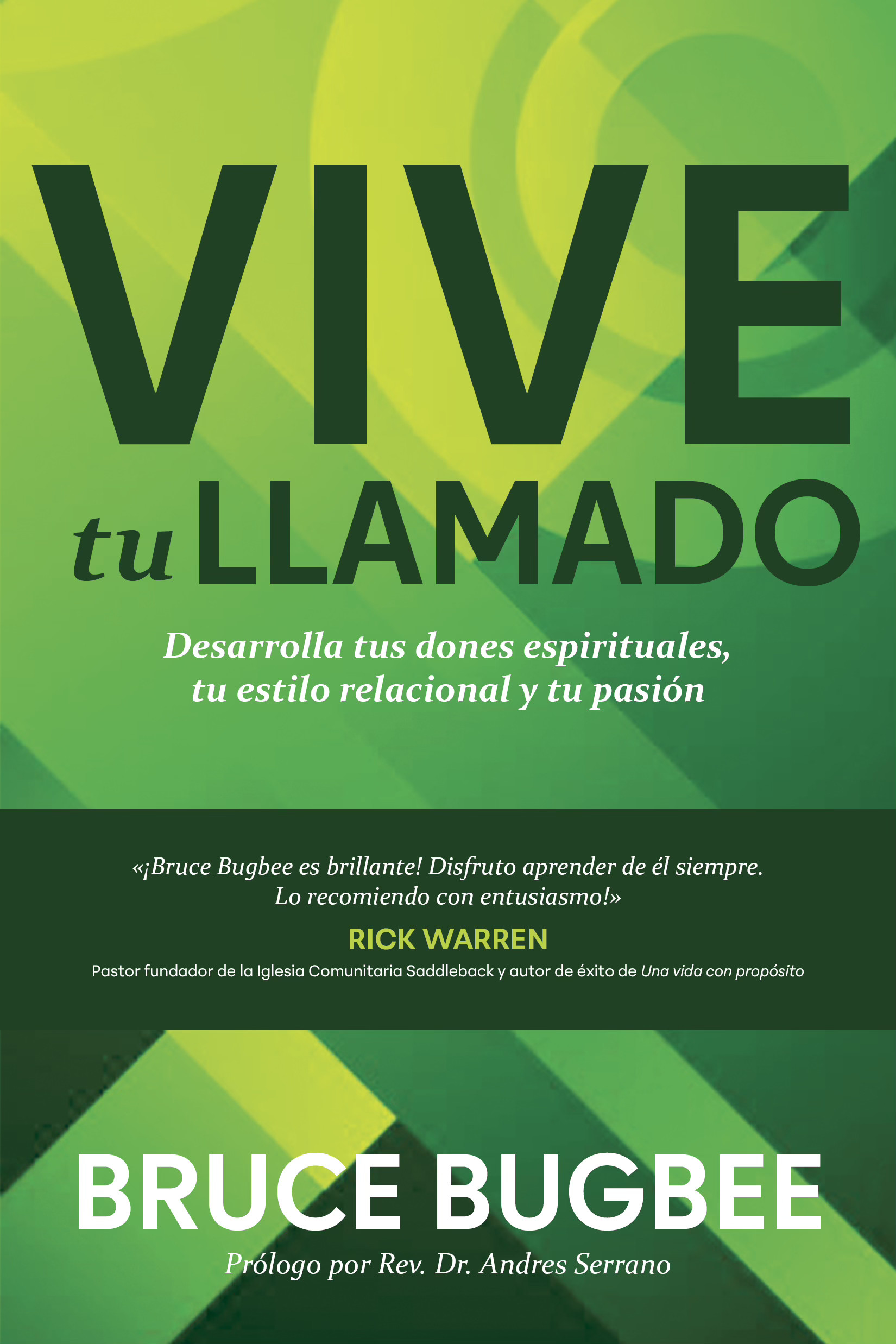
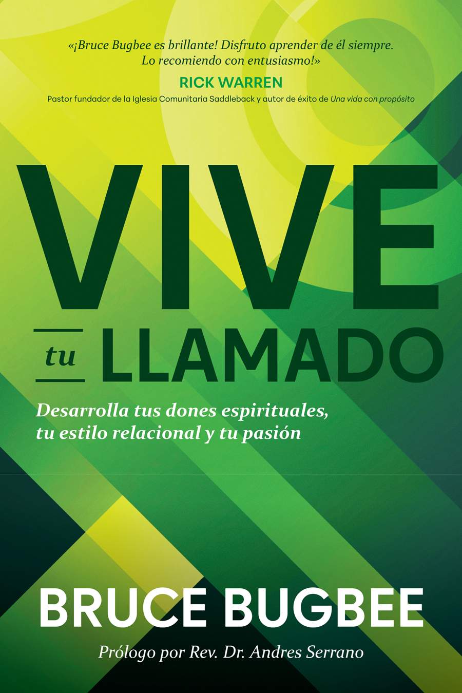
Spanish-language book cover adapted from an English edition. Bold typography and geometric forms were developed within a two-day concept sprint, balancing editorial direction with a strong visual presence.

​

Designer: Zoe Coats, Art Director: Al Navata

​

Purchase

Let’s work together

soup bowl

Vive tu Llamado

CLIENT

Tyndale House Publishers

Tyndale House Publishers is a faith-based publishing company that produces books in both English and Spanish. As a summer intern, I completed 5 published book covers in 3 months. I collaborated with the acquisitions teams, presented 3-4 compositions for each book, made revisions, and polished the final covers.
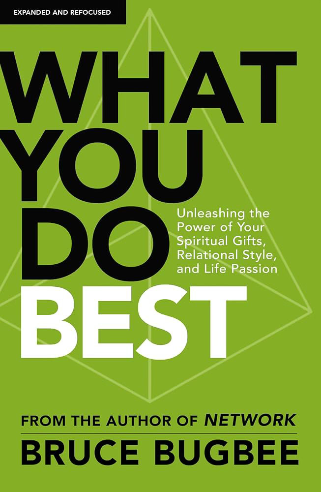
Spanish-language book cover adapted from an English edition. Bold typography and geometric forms were developed within a two-day concept sprint, balancing editorial direction with a strong visual presence.

​

Designer: Zoe Coats, Art Director: Al Navata

​

Purchase

Process

01

Project Objective

goal

Design a cover for the book Vive tu Llamado that is green or blue, uses a geometric background, and features bold type. Both the title and the author name should be very prominent. The cover should also highlight Rick Warren’s endorsement.

specifications

  • 1 final cover design
  • 4 compositions to show the acquisitions team
  • Softcover
  • Trim size: 5.5 x 8.25 in

reference images

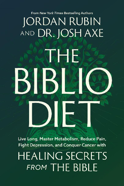
The first image is the English version of the book. The Spanish cover should look similar but unique.

sketch
sketch
sketch

02

Compositions

Round 1

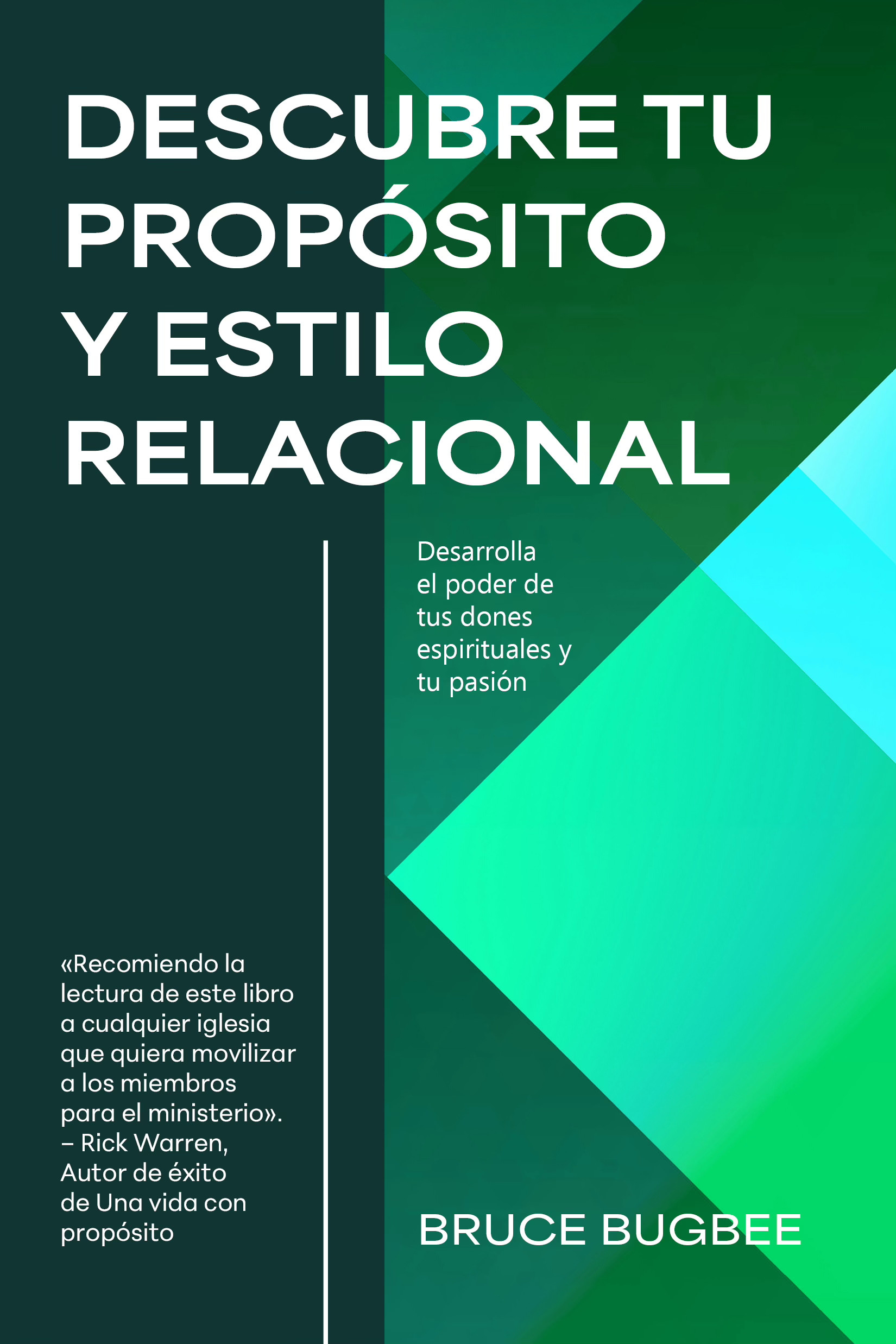
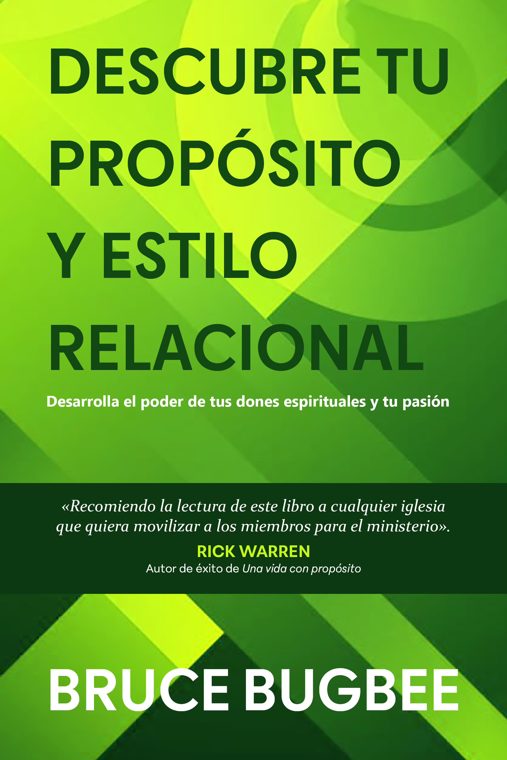
The original title for this book was much longer. These initial compositions all featured bold, sans serif type and a green geometric background in line with the author's preferences, but none were quite what the team was looking for.

sketch
sketch2
sketch3
sketch4

Round 2

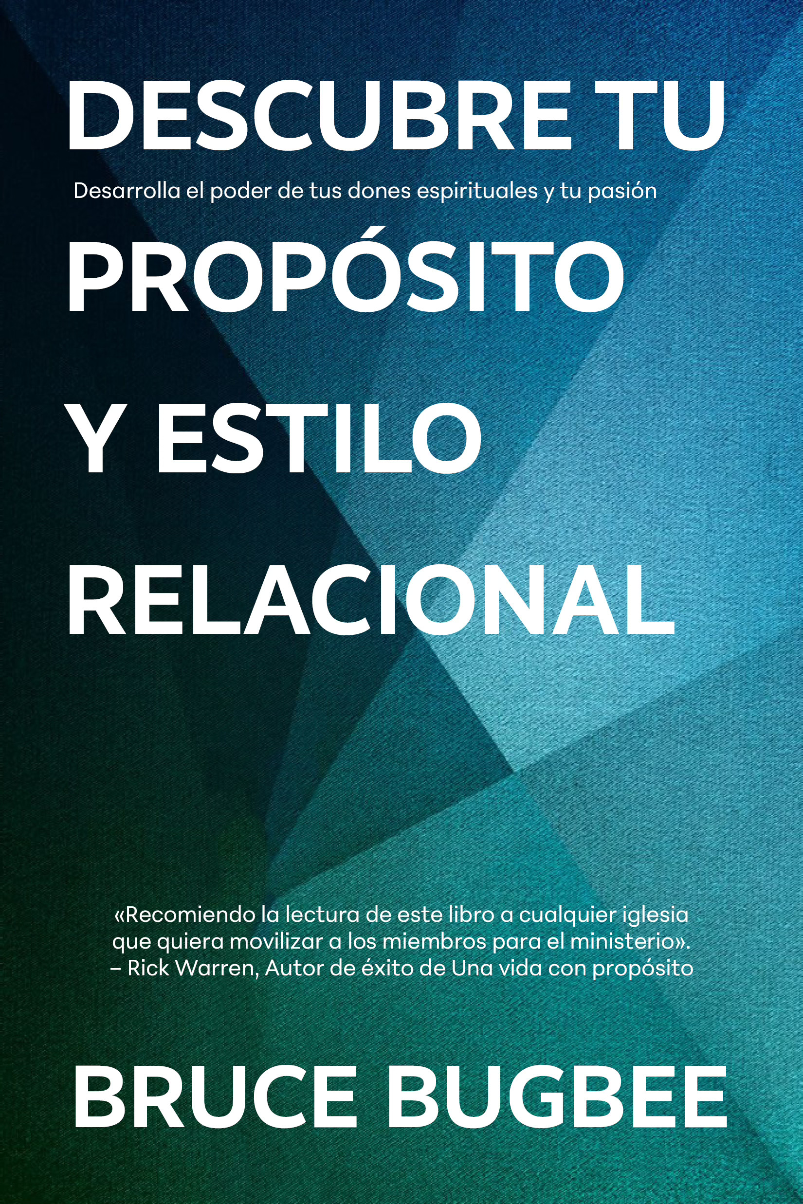
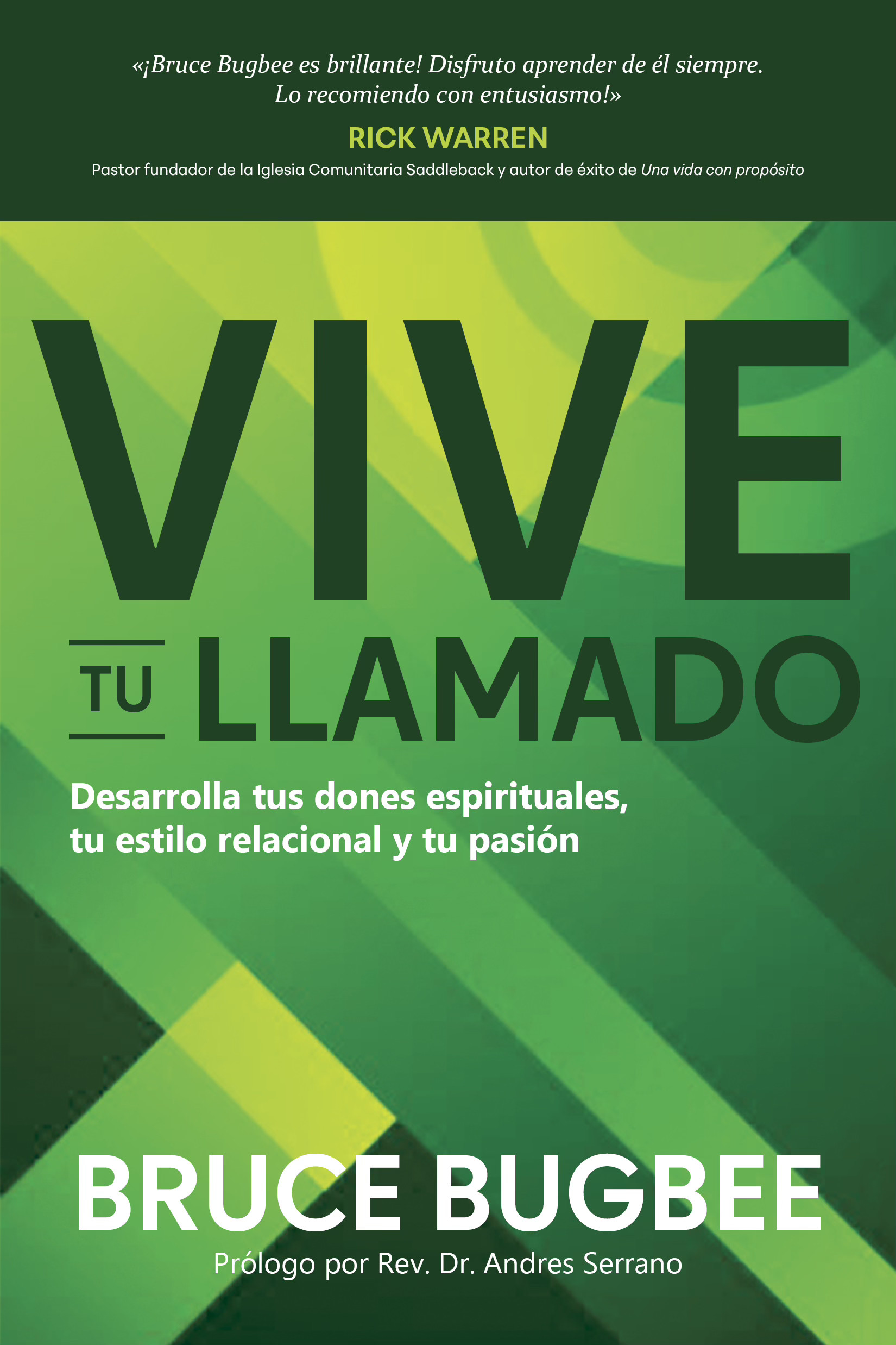
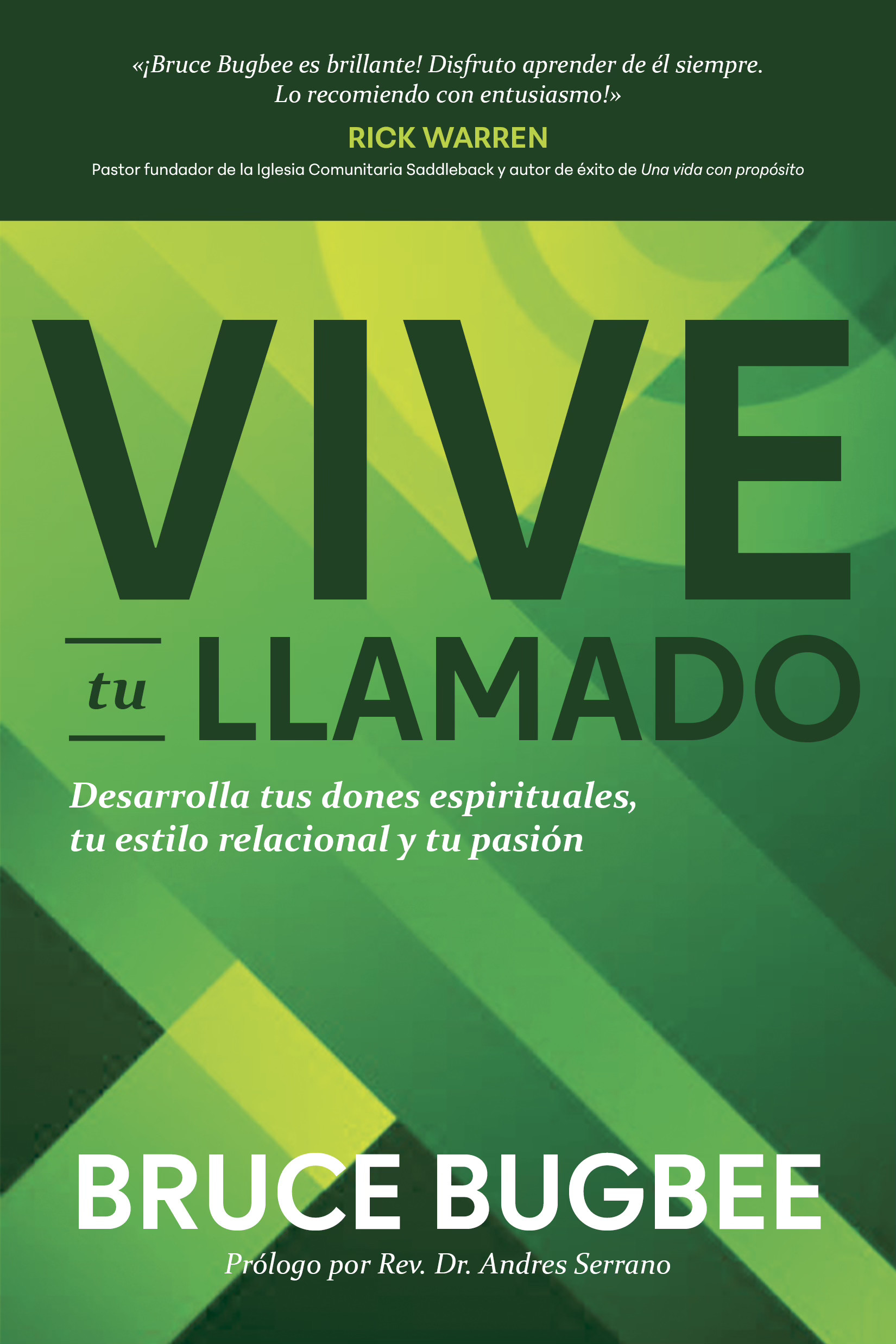
The Spanish acquisitions team liked the last cover the best, after a few revisions.

sketch
sketch2
sketch3
sketch4

Round 3

sketch
sketch2
sketch3

Let’s work together

Z logo

about

soup bowl

Vive tu Llamado

CLIENT

Tyndale House Publishers

Tyndale House Publishers is a faith-based publishing company that produces books in both English and Spanish. As a summer intern, I completed 5 published book covers in 3 months. I collaborated with the acquisitions teams, presented 3-4 compositions for each book, made revisions, and polished the final covers.
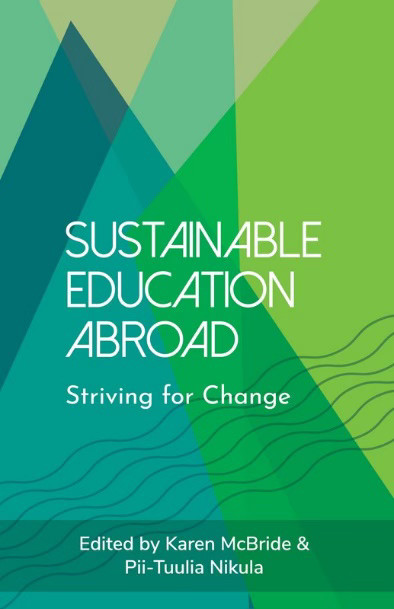
Spanish-language book cover adapted from an English edition. Bold typography and geometric forms were developed within a two-day concept sprint, balancing editorial direction with a strong visual presence.

​

Designer: Zoe Coats, Art Director: Al Navata

​

Purchase

Process

01

Project Objective

goal

Design a cover for the book Vive tu Llamado that is green or blue, uses a geometric background, and features bold type. Both the title and the author name should be very prominent. The cover should also highlight Rick Warren’s endorsement.

specifications

  • 1 final cover design
  • 4 compositions to show the acquisitions team
  • Softcover
  • Trim size: 5.5 x 8.25 in

reference images

The first image is the English version of the book. The Spanish cover should look similar but unique.

sketch
sketch
sketch

02

Compositions

Round 1

The original title for this book was much longer. These initial compositions all featured bold, sans serif type and a green geometric background in line with the author's preferences, but none were quite what the team was looking for.

sketch
sketch2
sketch3
sketch4

Round 2

The Spanish acquisitions team liked the last cover the best, after a few revisions.

sketch
sketch2
sketch3
sketch4

Round 3

sketch
sketch2
sketch3